In an increasingly crowded craft beer industry, beer brands are increasingly embracing brand refreshes. Around that 10- to 15-year mark, many craft breweries are looking to revamp their look. First opened in 2011, Charlotte, N.C.-based NoDa Brewing Co. just unveiled a significant brand refresh, marking a new era for the popular Queen City craft beer company. Sometimes a change of ownership or direction requires a makeover: New Jersey’s Three 3’s Craft Beer rebranded last year, using the help of AI, to better fit into the new owner’s vision, which inherited the brand’s look when acquired back in 2017.
A brand refresh can help align a brewery’s products with contemporary consumer tastes and preferences, and help customers better visually identify product offerings on a busy shelf. After 10+ years, Baltimore’s Union Craft Brewing recently debuted a core brand refresh, with designs better highlighting the stories behind each Union beer. These makeovers not only help communicate product history and company culture, they also create a competitive edge, ensuring beer brands remain relevant and appealing in a fiercely competitive market.
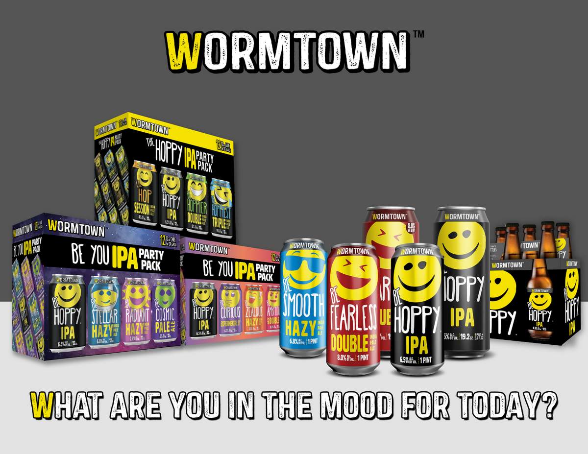
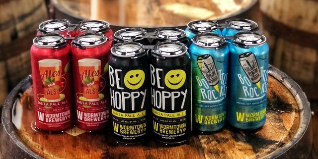
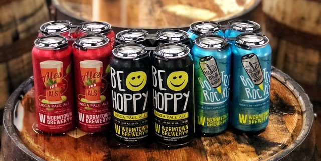
Here comes another one: Worcester, Massachusetts-based Wormtown Brewery recently announced the launch of its refresh via its Be Hoppy IPA brand, which can now be found on the shelf alongside Be Smooth and Be Fearless, two new IPAs from the brewery. From the press release:
“The original concept of the smiley face for Be Hoppy was the inspiration behind the brand refresh. This beer already had the attention of our customers, so this seemed like the natural progression,” says Dan Marc-Aurele, Senior Graphic Designer at Wormtown. “Be Hoppy is known for its smiley face, so we made that smiley face the focal point of the design. Now, if you’re looking for ‘the beer with the smiley face,’ it’s that much easier to find.”
Wormtown’s marketing team took the success of the “Be You” Variety Packs as inspiration for the new look and performed a deep dive into the brewery’s brand identity, target audience and branding goals.

“We were incredibly pleased with Be Fearless & Be Smooth’s trial performance in the IPA Variety Packs last year and listened to customer feedback calling for their consistent availability,” says Misty Campbell, Regional Sales & Chain Account Manager for Wormtown. “The refreshed packaging is clean and calls out the style, ABV and brewery name in large print. Wormtown has become synonymous with the smiley face and assigning each beer their own version gives the core lineup a cohesive look.”
You can now find Wormtown’s new look and new beers at liquor stores, bars and restaurants across the brewery’s New England footprint. The brewery is also releasing refreshed looks for its seasonal lineup which will include another new bee — Beach Fix — which is a Kolsch Summer Ale. Additionally, Wormtown’s local releases, collaborative brews and specialty beers will all be adopting an upgraded look as they are released throughout the year.
“After a lot of exploration, we narrowed it down to three areas of focus for the brewery’s mission which turned into a mantra we use internally: “your day, your sip, your smile,” says Avanah Weix, Brand Strategist for Wormtown. “These missions are accomplished through thoughtful beer names, expressive smiley faces, and making the style of the beer larger on the front of the can. Additionally, the new cans have QR codes that bring you detailed information about the beer. In an effort to be more connected to our community, we launched the “Be Here” campaign on the side of all our beer cans. This encourages people to take photos of where they are drinking their beer to be shared on social media.”


Leave a Reply
You must be logged in to post a comment.