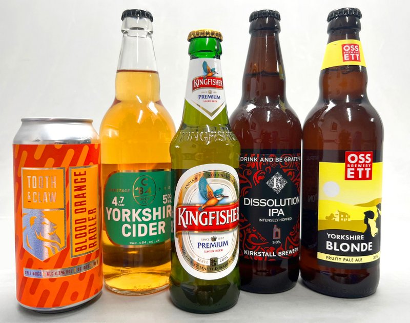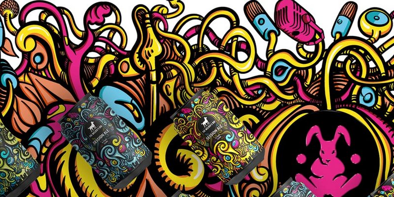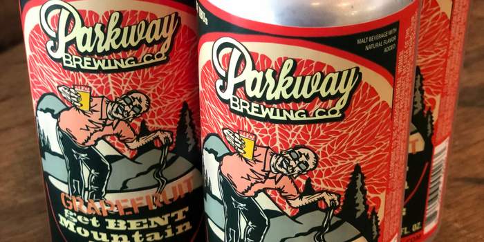
Today’s beverage market is highly visual. Beer is a product that appeals principally to the senses of taste and smell, however it relies on its one purely visual component—the label—to attract consumers and preview for the taste. It lets you express your brand identity and is the deciding factor that will persuade the consumer to buy your product over any of the others in a crowded marketplace.
Crafting an iconic label is an art as much as it is a science, a wonderful blend of creativity and cutting-edge technology. Great labels enable breweries to take advantage of the craft beer market’s explosive growth – but what goes into making a successful label?
Your identity
Part of the appeal of craft beer is, well, the craftsmanship. It has an air of exclusive luxury that gives a consumer a sense of discovery when they try it for the first time. It can be difficult to balance this independent identity while providing labels and packaging with the consistency and volume the rapidly expanding modern market demands.
When you have that identity pinned down, it can be much easier for everything else to fall into place, whether you’re brewing a fruity IPA or a pitch-black stout. This identity can inform your imagery and typography – things that’ll help your beer stand out in what is a fiercely competitive industry.
One way to keep that sense of exclusivity around your beer, even as you grow into a larger brand, is to produce short, limited-run lines. According to research by Instantly, 63% of consumers would be more likely to purchase a limited-edition product to try out a new flavor, while 42% would purchase based on “unique or cool” packaging. Depending on the length of the run, you can work with your printing partner to decide whether digital printing or a full HD flexo print run works best for you.
Label material
The substrate you choose to print your label on affects every other aspect of the design, from how its colors appear to how it should be applied. Do you want a smooth film or a paper label? Does your brand depend on vivid colors that really pop, or do you want a more sustainable or minimalist look? Think of your chosen materials like a foundation – they are what everything else is built on. If the foundation is wrong, then subsequent design steps will be much more difficult and the end result won’t be what you are looking for.
Sustainability
Sustainability is here to stay, and it’s more than just a buzzword. Increasingly, consumers see sustainably-produced labeling as non-negotiable – it is now the standard. A combined 72% of consumers said they were either very concerned or extremely concerned about the waste created by product packaging, according to intelligence firm McKinsey. The good news is that, at every level of the supply chain, companies are adopting sustainable practices to avoid being left behind. This means you can create a sustainable label without compromising on performance or quality. It can even be an interesting marketing hook to draw in increasingly eco-aware consumers.
If you have an eco-conscious brand identity, you may want to consider a recycled label made from fruit pulp or bagasse (a byproduct of the sugar cane crop). Bagasse offers more versatile printing opportunities and can be embossed or UV printed if needed. However, some brands may prefer fruit pulp labels, which have a more naturalistic look and feel.
Label feel

In the post-pandemic market, the tactile feel of your packaging can be a powerful marketing tool as consumers rediscover the value of touch. By selecting a printing partner that offers a range of face stocks and tactile labelling, you can add an extra dimension to your branding offer. Tactile labels instantly lend a label a premium feel, making your brand quite literally stand out. They are made using a tactile varnish that is carefully applied to certain areas of the label to create a variety of unique textures and can be used to raise lettering or to give a label a rustic, organic feel. Combining contrasting textures using different stocks and tactile varnishes alongside elaborate foiling or embossing is sure to make for an eye-catching result.
There are functional benefits to this approach, too. You can make your packaging more functional with tactile, rough touch varnishes to provide an improved grip on the can or bottle, even when it’s dripping with condensation on a hot day. Soft touch laminates and varnishes can also add silky feel to touch for a premium look.
Color identity
Before your consumer picks up your beer, though, it needs to catch their eye. The color of your label is the first thing a consumer will notice, so it needs to be carefully considered. It can help customers discern what sort of beer is in the bottle at a glance – certain colors carry specific connotations that you can take advantage of. For example, an amber beer might be complemented by a warm, golden color. A heavy stout may suit a predominantly black or dark brown label. However, you may have other ideas based on your brand identity – this is not a strict rule that must be followed!
You should again consider the substrate you’ll be printing on when using colors, especially if your brand relies on a very specific color tone. If your brewery is associated with a particular shade of red, for example, that red will print slightly differently on a clear label than it does on a paper label for a bottle. It is important to select a printing partner with experience in color management across a range of substrates to ensure your entire product range looks the way you expect it to look. Brand identity and color are intrinsically linked – if one of your products has an off-color look, it can undermine all the hard work you put into developing a distinct identity.
Label shape and size
The shape and size of your label is also a crucial way you can express your identity. Edgier brands could opt for unusual custom shapes in a multitude of different sizes – provided their printing partner has the capability for bespoke die-cutting. Consider what works for your brand, and how it’ll fit onto the size of the can or bottle you’re using.
Printing matters
You can design the most intricate, jaw-droppingly beautiful label the world has ever seen, but if it isn’t taken to a print partner who can deliver, this work will be wasted. Choose a printing partner who will work with you to truly ‘get’ your brand and what you’re going for, and with the technology and expertise to deliver on that vision.
Author: Susan Ellison, joint MD, OPM Group


Leave a Reply
You must be logged in to post a comment.