Brian Thompson founded Telegraph Brewing Co. in Santa Barbara, Calif., in 2006. He’s a craft brewer in the truest sense. Reflecting an approach used by pre-prohibition American brewers, Thompson sources local water and as many locally grown ingredients as possible, including citrus from groves just miles from the brewery. The resulting beers are as unique as California’s Central Coast, with styles and flavors different than what you find in other parts of the country.
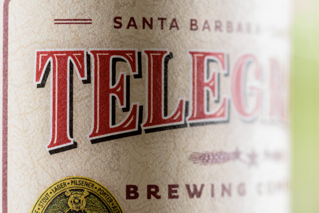
Telegraph’s brand image reflects this local focus. Its tasting room, a repurposed Quonset hut, has a translucent front façade that helps patrons enjoy the enviable climate. And, its bottles have an “old California” aesthetic: It’s broad-shouldered and brown, with a cork-and-cage stopper. The logo features an old-style typeface and an image of a horse-drawn wagon. Together, these elements offer an authentic, rustic feel.
Thompson is deeply involved in every aspect of the brewery, including branding. In 2014, he decided to update Telegraph’s logo and the label for its award-winning California Ale. He wanted the bottle to stand out better on store shelves that had exploded with craft choices since Telegraph entered the market in 2006.
A golden age for craft beer
According to the Brewer’s Association, craft was a $22.3 billion market in the United States in 2015, accounting for 21 percent of beer sales. The number of U.S. craft breweries has grown from just 284 in 1990 to nearing 5,000 in 2016 (with a sharp rise since 2009). For the consumer, this golden age means more choice than ever. For the brewer, it means shelf appeal is of major importance. It’s hard to get chosen if you’re not getting noticed. What’s on the bottle is as important as what’s in it.
With those dynamics in mind, Thompson engaged graphic designer Dave Caso of New York’s Studio Industria and Mepco Label Systems of Lodi, Calif. Mepco consulted with Avery Dennison on the project. Studio Industria has an extensive portfolio of eye-catching labels and packaging. Mepco serves clients nationwide, offering digital and flexographic printing through facilities in Lodi and Horn Lake, Miss. It’s a member of the California Craft Brewers Association and works with brewers in multiple states.
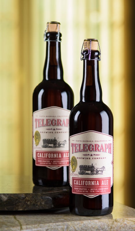
With the opportunity to print digitally on Mepco’s HP Indigo, Caso knew the extent to which he could push the limit with colors, and was able to suggest a unique die cut.
“We’re practical designers,” said Caso. “So, we look to get lots of impact without breaking the bank. We chose colors and a typestyle that speak to the old California heritage of Telegraph’s brand. And, we gave the label a certain shape to make it the driving force behind the shelf impact.”
California Ale’s new labels are printed on Avery Dennison “Estate 8” 60# stock. It’s paired with the S100R permanent adhesive, which is removable post-consumption. The construction is a sister product within Avery Dennison’s Craft Beer portfolio and is available through the company’s Ready-Width service program.
“We like the feel and the finish of the Estate 8,” said Thompson. “It’s a very toothy stock that holds the ink well and adds a lot of texture to the bottle. The matte finish has a refined look and feel, and it has that old California appearance to it. It doesn’t necessarily look like other beer labels on the shelves. It’s one more way to make our bottles stand out at the retailer.”
Getting consumers’ attention in the moment of truth
That focus on label design, feel and finish can have a major impact. According to research by the Clemson University CUshop Consumer Experience Laboratory, labels using higher-end media and facestocks are far more effective at getting and holding attention in that “moment of truth” when the buyer first sees a bottle on the shelf. What’s more, beer labels printed on higher-end materials are likely to be perceived as more expensive than those with paper labels.
“The craft beer industry is so competitive,” said Michael Rodenborn, VP of sales and marketing for Mepco. “And, many craft brewers sell a premium product, priced as such. So, they owe it to themselves to have a label that stands out. Consumers make the decision in just seconds. We tell brewers that if they spare no expense on the beer, they need to invest in the label as well. The label has to reflect the craft of what they’re brewing.”
Jeff Greenlief is a product manager with Avery Dennison Label and Packaging Materials. Greenlief oversees and manages the organization’s North American craft beer, wine and spirits and digital portfolios. In addition to his portfolio responsibilities, he stays abreast of segment trends through interaction with end users, designers and label converters.


RT @CraftBrewingBiz: Refined labels: @TelegraphBrew and @AveryDennison create a classic design on a ‘toothy’ stock. https://t.co/NCBrZYUJi…
RT @CraftBrewingBiz: Refined labels: @TelegraphBrew and @AveryDennison create a classic design on a ‘toothy’ stock. https://t.co/sTGMTyMsM5
RT @CraftBrewingBiz: Refined labels: @TelegraphBrew and @AveryDennison create a classic design on a ‘toothy’ stock. https://t.co/sTGMTyMsM5
Telegraph Brewing and Avery Dennison create new label for California Ale https://t.co/iwBg2VmTf9 via @craftbrewingbiz
#CraftBeer #LocalBrewery #DrinkLocal #Brewery #craftbeerporn Refined labels: Telegraph Brewing and Avery Dennis… https://t.co/xtTFyQVxcX
Refined labels: Telegraph Brewing and Avery Dennison create a classic design on a ‘toothy’ stock https://t.co/nnXBCxIHFv #beer #craftbeer