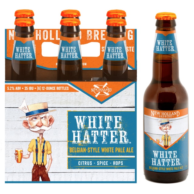
 The Mad Hatter meets Mark Twain on the new label design for New Holland Brewing Co.’s White Hatter Belgian-Style White Pale Ale above. Gotta say, we like it a lot. The Holland, Mich.-based brewhouse is in the midst of a rebranding campaign that looks pretty spot-on so far. It’s a portfolio-wide packaging update due to hit markets in March, continuing to roll out through the spring and summer. From the press release:
“Craft beer is growing. We are growing. With nearly 20 years in the industry, to stand out on the shelf and reinforce our brand is paramount,” explained Joel Petersen, New Holland Brewing VP of marketing in the release. “We’ve incorporated many key elements in the new design that should help us achieve this goal and create a New Holland beacon. Walking around Great American Beer Fest last year and immediately recognizing our New Holland orange tent made me realize we need to do more to own our brand color in the market; this packaging brings that to life.”
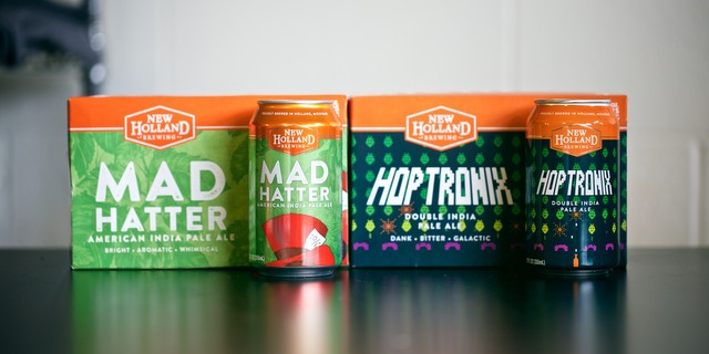
After two decades growing in the ever-increasing competition of the brewing industry, New Holland is clever enough to understand the subtleties of things like colors on packaging. These new designs definitely stay true to the corporate colors and brand characters that we know/love from New Holland, while reinventing its label art with designs that are both classic and contemporary (and yes, more readable, which is so important). Though we will miss the old, impish-looking Mad Hatter from logos past. We had more than a few good times together.
Here’s what you’ll be seeing in the new packaging:
Highlighted brand art
Each New Holland brand features a name and art that inspires the beer and helps tell its story. This will not change. During the creative process, New Holland took a step back, evaluated the strength of their brand imagery and moved in a direction to more clearly showcase the characters and visuals that makes each brand unique. This update allows the packaging to remain recognizable to long-time fans, as an ode to heritage, while better representing the future of the company brand.
Brighter colors with orange as a beacon
Shop-ability on shelf is key. The new packaging features brightened colors throughout, dedicated and consistent placement of the corporate orange and matching side and end panels. With these changes, the consumer can better spot the New Holland brands and learn about the beer no matter which way the carrier is displayed on shelf. The new designs will create a “billboard” effect where multiple brands are displayed. Bright orange crowns will top off all brands.
Reduced text for enhanced readability
It comes down to simplicity: What is the beer style, flavor profile and what flavors might it pair best with? New Holland is committed to reducing the noise on the packaging and allowing the consumer to read the most important details.
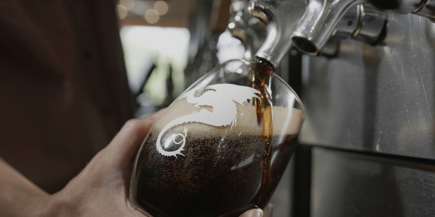
New Holland said it will roll out the new packaging as it makes sense with current packaging inventory. The first brands in new packaging — White Hatter, Belgian-style White Pale Ale, and Dragon’s Milk, Bourbon Barrel Stout — will hit shelves in March. The rest of the lineup will follow and be completed by the end of the summer.

7G Hop Head Beer Brigade liked this on Facebook.
Fabiano Brothers liked this on Facebook.
Jonathan Cahoon liked this on Facebook.
Danielle Kuglin Seago liked this on Facebook.
Jeff Platt liked this on Facebook.
New Holland Brewing launches new packaging designs https://t.co/tWr2RPFIgj via @craftbrewingbiz