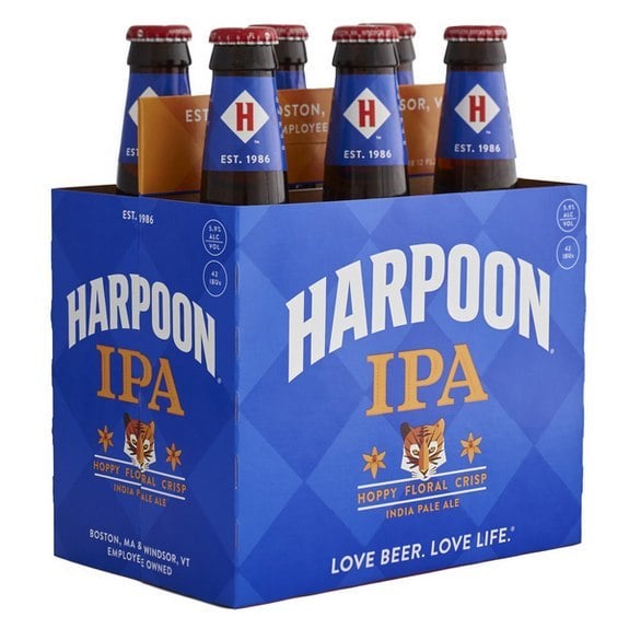
With so many new craft breweries (the most ever, actually), the older guard needs to defend its well earned turf. This usually means it is time for a new look. Great Lakes Brewing Co. did this not too long ago. Same for Deschutes. There are more, and this makes sense because we know the impact of marketing and labels in particular has been big on buying decisions. Next up for a refresh: Harpoon IPA — the first in a total brand redesign.

While there have been tweaks to the Harpoon look over the years, this is the first major design refresh in Harpoon’s history.
“As we head into our 30th year, it’s time for our logo and our branding to evolve,” said Harpoon CEO and Co-Founder Dan Kenary. “We are not changing who we are, or most importantly, the beer inside the bottle, can or keg. But we are working hard to do a better job of telling our story, especially to beer drinkers who may not know us well.”
The new design maintains several of the classic elements from the original Harpoon IPA package including the checked background pattern, the bluish-purple and orange color scheme and the tiger lilies. New elements include a bolder, larger Harpoon logo, a larger background check pattern and a tiger icon. The IPA package was designed by Harpoon’s in-house creative team, led by Creative Director Adam Bailey.
RELATED: Talking cut-and-stack labels with Oak Printing
“Our goal was to create something that would stand out on the shelves and draw the eye to the package,” Bailey said. “We needed to do a better job of communicating who we are in our packaging — we needed to let our personality shine through.” Boston-based brand strategy firm Catapult Thinking provided guidance through the process.
Next in line for the refresh is Harpoon Take 5 Session IPA, the brewery’s newest year-round beer released this past May, followed by their summer seasonal beer. The transformation will be complete by the end of 2016.
“The new IPA package and refreshed Harpoon logo are just the beginning,” Kenary added. “Change can be tough, but we love it. After all, if beer drinkers had not been willing to embrace change over the past 30 years, we would all still be drinking light yellow lagers and not knowing what we were missing! I couldn’t be more excited about what’s ahead for Harpoon.”


Check out the new Harpoon IPA label and packaging https://t.co/ASUBBlJ9iI via @craftbrewingbiz
Solène Ronnaux-Baron liked this on Facebook.
#CraftBeer #CraftBrewing #Beer #BeerBiz Check out the new Harpoon IPA label and packaging https://t.co/DcDGm4s2TG
Tom T-Bone McDonough liked this on Facebook.
Looks about the same