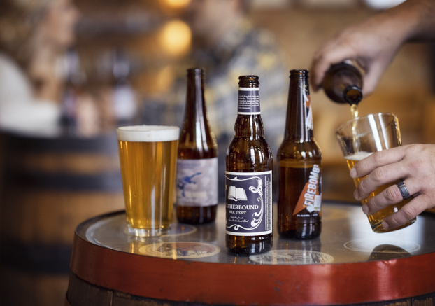
After crafting your finest brew, it’s time to think about the packaging that will deliver your creation to consumers. Beer packaging is the three-dimensional representation of your brand ethos. To your end-user, your beer and its package are inseparable. The package is the beer, and the beer is the package.
Packaging is at the intersection of numerous design choices that you must make. These decisions will impact the physical manifestation of your brand and will affect the total cost of goods.
As you work to move from a draft consumption experience to a packaged beer experience, a strong beer packaging strategy is a must. Before you roll out a new packaging design, take a minute to consider how bottle shape, capacity, size, color and closure will work together to ensure that your beer has a strong shelf presence.
Size does matter
Standard: 12 ounce
Rising to fame during World War II, the 12-ounce bottle became the industry’s standard single serve size. The European equivalent is the 330 millilitre (11.2 ounce). Although 12 ounce remains the most popular bottle size, sharing and other emergent trends in size are changing the way we drink and serve beer.
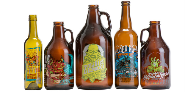
To share: 22 ounce and 750 millilitre
The 22-ounce bottle, or the bomber, is an innovative and strategic package size. This share size bottle is a favorite among master brewers for distributing special or limited run products. The 22 ounce is an contemporary alternative for that bottle of wine you plan on bringing to the next dinner party.
The 750-millilitre bottle offers many of the same conveniences as the 22-ounce bomber, but in a volume more similar to spirits bottles. This format is a true sharing size, promoting friendship and comradery. Beyond these popular share sizes are emerging trends that are driving new capacity options.
Emergent trends: 7 ounce and 16 ounce
Who likes to drink their beer warm? The 7-ounce bottle challenges the rising temperatures of hot summer days. This petite bottle size keeps beer cold and beach goers happy. The 7-ounce bottle provides a perfect size for trial use or a variety configuration that offers a flight of beer prepackaged! Alternatively, the 7-ounce can be used for high ABV beers, reducing alcohol levels.
Another emerging capacity trend is the 16-ounce bottle size. This masculine format offers larger physical dimensions within the consumer’s hand for a semi-customized grip. A true draft sized pint, the extra 4 ounce makes for the perfect 1 ½ size.
The size of your beer bottle communicates more than you may realize. These sharing and emergent bottle sizes are disrupting the standards of beer packaging and changing the way we pour, drink and socialize. While clearly size does matter, shape is another important aspect to consider when packaging your best brew.
Craft beer bottles: We look at purchasing trends and their value versus cans
Shape — your beer’s handshake
How will you define the physical space your bottle will take up on the shelf and in the hands of your consumers? The shape of your bottle is the handshake of your beer and the essence of your brand identity.
Think of your beer and your brewery as if it were a person. Now describe that person. Is it friendly, formal or flirtatious? Is it the quirky uncle, the girl next door or the grilling buddy? Your shape helps to define the character of your brew.
Cylindrical
A cylindrical shape is the prime geometric choice for the production and packaging of beer. This round footprint is efficient in its use of space and materials, and it is easiest to manage when it comes to labeling, filling and other considerations.
Longneck
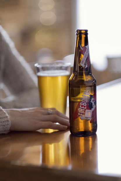
Think of the stereotypical beer bottle silhouette. The first shape that comes to mind is the longneck beer bottle. This bottle design has key dimensions adopted by large and small brewers. In addition to its iconic long neck, this bottle has familiar round shoulders and a steep indent label panel. This protects the label from scuffing and allows for flexibility in label and embossing options.
The longneck format conveys a strong modern design vernacular, which complements a wide variety of brands. This friendly and familiar beer bottle shape appears at neighborhood grill-outs, pickup basketball game cooldowns and movie marathons. Although the longneck shape is an unmistakable option, other shapes may increase your brand equity and recognition.
Belgium
The historical and masculine Belgium beer bottle shape, with traditional heritage and old world reference points, disrupts the visual expectations of the beer aisle. The double bumped shoulder helps prevent yeast solids from transferring into a glass when poured and making the beer cloudy in appearance. This makes it a popular option for wheat or Belgian-style beers. Stouts, porters and other dark beers pair nicely with this bottle as well.
A more modern take on this blast-from-the-past bottle features a stepped indent at the heel and just below the shoulder. These reference points provide label protection against scuffing during the production and packaging of your one-of-a-kind brew. With a stout, bright and friendly old world tradesman persona, the Belgium beer bottle would carry a Hobbit’s go-to drink, for example.
Champagne
Just like the name might suggest, this shape is inspired by champagne bottles. Originally, this bottle shape was used for packaging the higher CO2 levels that early bottle-conditioned beers often needed. The champagne bottle is marked by its signature elegant long S-curve neck. The impact of this design is a sweeping compounded surface geometry that reduces the amount of available labeling on both the main and neck label panes yet still provides multiple label branding options.
To maintain the gracefulness of its profile, the champagne bottle typically has a more subtle label indent than either the Longneck or Belgium beer bottle shape. A contemporary accented shoulder provides special order glass embossing decoration options. The champagne profile personifies the beauty and poise of the feminine figure. This elegant and voluptuous bottle shines during life’s achievements, celebrations and victories.
Stubby and Steinie
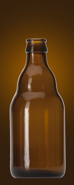
A short, compact bottle is often referred to as a stubby or originally a steinie. Introduced during the age of prohibition, the steinie derived its name from the similar shape of a beer stein. This short and compact design provides for a larger diameter. While there is a larger main label panel, the lack of a neck generally reduces the cost of additional labeling.
These bottles are disruptive at the shelf and have several operational advantages, including easy handling due to a lower center of gravity. Its stout stature also takes up less space for the bottle manufacturer, the brewery, the retailer and the end-user. Not only can you fit more of these beauties in a truck or on a shelf, but (more importantly) you can fit more in a cooler. The bottle is trending because of its nostalgic look and sturdy feel in the consumer’s hand. It speaks to the familiar in a contemporary voice. This bottle profile is now available as a stock option.
The stubby and steinie profile personifies a strong and trustworthy friend who has a sense of adventure and charm. A gregarious young man who is capable in the outdoors, yet refined at a Sunday dinner with friends or family.
Stay tuned for part II, in which we look at colors, closures, labels and glass quality.
Raul M. Paredes is director of new product development, O-I.


Leave a Reply
You must be logged in to post a comment.