Editor’s note: This article is by Cody Fague and Isaac Arthur. Be sure to check out all their brewery business insight on Craft Brewing Business.
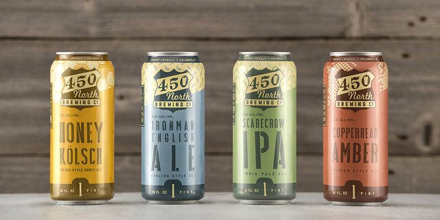
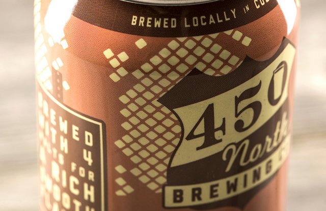
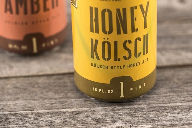
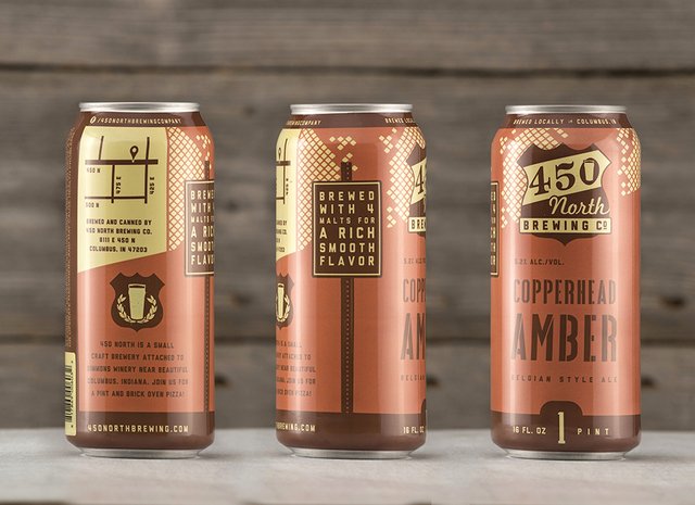
We first met Dave and his sons back in 2012 when we helped to brand 450 North Brewing Co. That first project was foundational, ending with a visual identity system. Earlier this year, we (the smart marketing folks at CODO Design) were excited when Dave called to have us design packaging for their four house beers; Scarecrow IPA, Copperhead Amber, Ironman English Ale and Honey Kölsch.
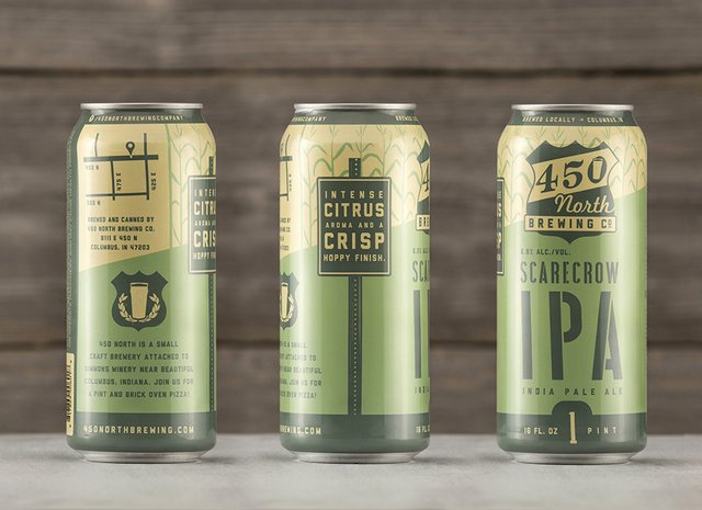
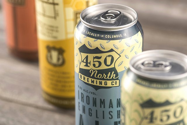
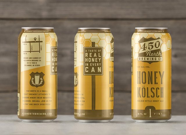
We had fun digging back into the same Indiana farm aesthetics we initially explored and developed a fun package design system that they can grow into as they continue adding seasonals and specialty beers. Cool details include a custom map to their destination brewery, name-driven patterning and colorations and industrial farm typography. See more at www.cododesign.com.
Photos by Chris Whonsetler — www.whonphoto.com.
This story was provided by the folks at CODO Design, a five-man branding firm based in Indianapolis, IN. They’ve spent years working with startup craft breweries on naming, branding and positioning, responsive web design, and package design. They’ve gathered their experience into a comprehensive Craft Beer Branding Guide to help startup breweries navigate the entire branding process. Check it out at www.craftbeerbrandingguide.com.


450 North Brewing debuts new can packaging http://t.co/M9UpmrYtMT via @craftbrewingbiz
RT @CraftBrewingBiz: 450 North Brewing debuts new can packaging. Love the Midwest aesthetics @CODODesign @450North http://t.co/6u1LSgrMLB
RT @CraftBrewingBiz: 450 North Brewing debuts new can packaging. Love the Midwest aesthetics @CODODesign @450North http://t.co/6u1LSgrMLB