In 2008, there were just over 1,500 craft breweries in the United States. Now? There are over 8,000. That growth has been consistent since 2014. All this is great for beer aficionados. We’ve never had so many options for new beer, new styles and new taprooms to hang out in. But it’s bad news for brewery owners. How is it possible to stand out and be known in such a competitive space? It comes down to having a simple, smart and sustainable brand. From positioning to packaging, here are three examples of brand done right.
1. Win fans for life by finding shared beliefs
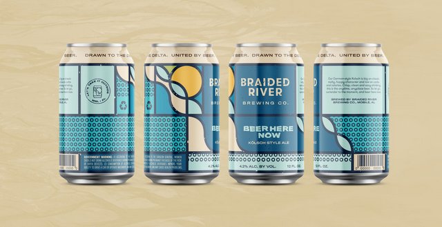
It’s a given that you make great beer. So what makes you different? Your attitude and values. And the best brands build a community around shared beliefs. Find ways to connect authentically with your community, and they’ll become your best advocates. Just ask Braided River Brewing Company in Mobile, Ala.
In a world where people want brands that stand for something, Braided River is building a following around their core beliefs. Braided River makes beer meant to be enjoyed outdoors, and everything they do is focused on getting people outside. Their beers reflect this position with names like Coastal Stout and Hoppy By Nature. Their messaging combines the community, their beer and their laid-back values. Their design feels earthy and weathered. They contribute actively to local environmental organizations, and even their brewery and taproom doesn’t get off easy: They’re pursuing LEED certification. All this adds up to a clear brand position: If you enjoy going outside and care about the environment, Braided River is the beer for you.
2. Help people find you with iconic design
Once you’ve connected with people, they need to be able to find your beer. Being recognizable and highly visible is critical. Design is the way to stand out, and that design needs to strike a balance between uniformity and novelty. Rhinegeist in Cincinnati, Ohio, is a great example of this.
Since 2013, Rhinegeist has been making classics like their Truth IPA and Cougar Blond Ale. They also do a wide range of seasonal and specialty brews. What makes them all hang together is Rhinegeist’s iconic ghost logo and segmented can design. While this approach may seem rigid at first, in reality it’s more flexible than it seems. Within the simple graphic rings, there is plenty of room to play with pattern, color and texture. All of a sudden, very different visual approaches come together in a cohesive brand. In a world of funky illustrations and offbeat typography, Rhingeist’s smart, iconic cans jump off the shelf.
3. Make life easier with a clear brand system.
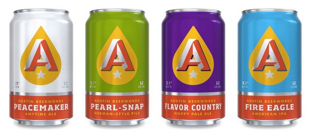
Your beer is flying off the shelves. Now you need to keep up and sell some swag. Time for a solid brand system. The beauty of system is that you can stop reinventing the wheel each time you need something new. You’ll know what elements to use and when to use them. Austin Beerworks has perfected the art of the identity system.
Simplicity makes life easy. But simplicity does not mean boring. Like Rhinegeist, Austin Beerworks has a standardized logo placement and clear system of color to make their beer easy to find. But unlike Rhinegheist, they venture into pretty playful territory with patterns, textures and layers for their expanded line of beers. That playfulness creates the tools necessary to extend the brand to everything from trucker hats to cufflinks to cycling jerseys. But don’t stop with swag. Your system should work in all the places people interact with your brand, from your taproom to your website to your social media. Take a lesson from Austin Beerworks. The right system makes it easy to extend your brand in all directions.
A great brand won’t make your beer better. But it will help you have greater success and allow you to keep doing what you love.
Neil Wengerd is a partner and creative director at Nonfiction, a graphic design and branding agency in Columbus, Ohio.


Leave a Reply
You must be logged in to post a comment.