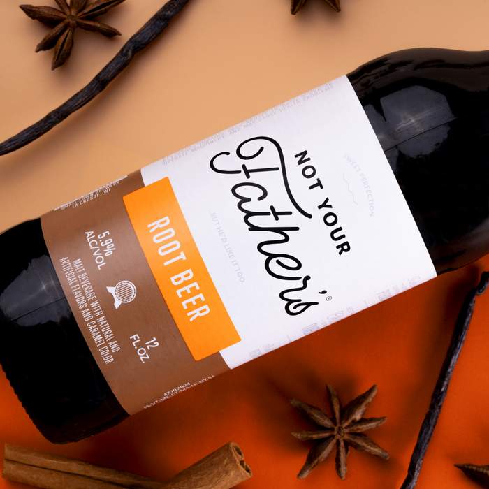
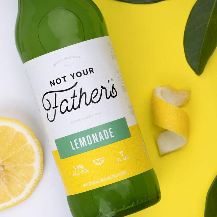
Remember that year when everywhere you looked you saw Not Your Father’s Root Beer? Then the boozey root beer nostalgia fad passed, and it seemed to disappear. Well, in the interim Not Your Father’s underwent a full rebrand, including updated labels, packaging, a new flavor and marketing strategy. The brand is now ready to return with an additional new flavor — Lemonade — and is hitting shelves this week.
The pivot in the Not Your Father’s design and target demographic were fueled by extensive market research pointing to a largely female audience, ages 21-35. The rebrand also brings with it a new lower price-point of $9.99.
“We learned that these women are buying 60 percent of the flavored malt beverage business,” said Associate Brand Manager of Not Your Father’s, Daniel Crawford. “We took the time to get to know her — what makes her tick, what motivates her and how she likes to spend her free time –it all guided the new look and the campaign we’re launching to introduce the new brand.”
Bolstering the new look and feel are strategic brand partnerships, like the one NYF has entered into with Create & Cultivate, an online platform and conference for women that sparks conversation around topics they are passionate about, like entrepreneurship, creativity, career growth, investing and more.
“Create & Cultivate is committed to sparking curiosity and breaking boundaries — qualities also strongly shared by the Not Your Father’s brand. Which is just one of the reasons why we’re excited to partner with NYF for our upcoming Austin and Palm Springs popups. We can’t think of better places to kick back, relax and enjoy one of life’s simple pleasures’ this spring,” said Jaclyn Johnson, CEO and founder of Create & Cultivate.
St. Petersburg, Fla.-based creative agency, Hype Group, rebranded the Not Your Father’s line. The Hype team developed the new packaging utilizing two-tone pops of color to denote flavor profiles, ranging from softer and subdued tones for richer flavors to vibrant colors for bolder flavors. The new primary mark brings the brand away from its previous textured logo and illustrations, introducing a clean custom logotype paired with an icon system to further differentiate flavors. The label also benefits from a fair amount of white space that allows the logotype to shine.
“This new, bold, yet simplified label system allows for the extensive progression of the Not Your Father’s line beyond the seven SKUs that exist in its current portfolio,” said Art Director, Nico Guidicessi.


Jake Riggins says
Oh that is old already and needs a relaunch?
Mike Eme says
It was horrible
Jonathan Ayers says
Hahahaha! What’s this? PBR’s back-up plan if suing Miller to keep making their beer does not work out? 🤣
Cody Fague says
Quick question, Does it still taste like dog shit?
A Spirited View says
“these women”,
at least he didn’t call them “little women”.