Who doesn’t love checking out a good old fashioned craft beer rebranding? Today we turn to Atlanta, where Monday Night Brewing, in its 11th year in business, and on the verge of opening its fifth taproom in 2023, is ditching its classic black-and-white necktie guy theme for a full vibrant rebrand.
“The necktie theme captured who we – Jonathan, Joel and I – were when we crafted our first homemade beers,” said Monday Night Brewing CEO Jeff Heck. The whole thing was an homage to when they’d ceremoniously loosen their neckties on Monday evenings to craft that week’s batch of homebrewed beer. “We have truly enjoyed seeing the ‘Tie Guy’ connect with beer drinkers throughout our first decade of business. The brewery, brand, and our beers have evolved so much in those 11 years thanks to the diverse groups of people that make up our team and our city.”
So, with ties firmly loosened / fully abandoned for the last decade, what’s next?
The Monday Night Brewing team enlisted nearby agency Matchstic to reimagine the brand’s entire look, which extends beyond the new logo and packaging to taproom decor, merchandise, and advertising.
For inspiration, Monday Night Brewing and Matchstic looked to the company’s mission statement: “We exist to deepen relationship over some of the best beer in the world.” Its key brand values – Craftsmanship, Connection and Creativity – imbue the new approach.
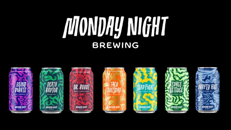
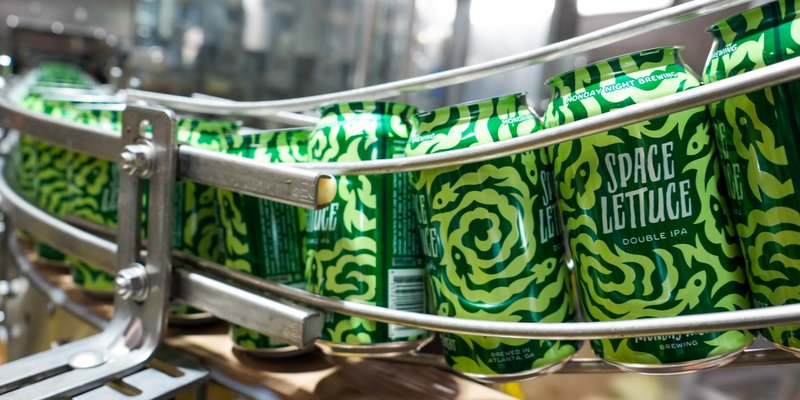
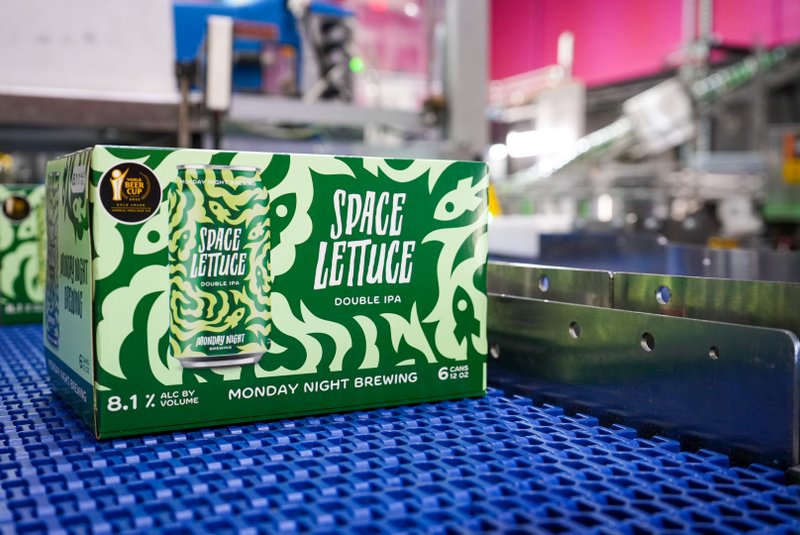
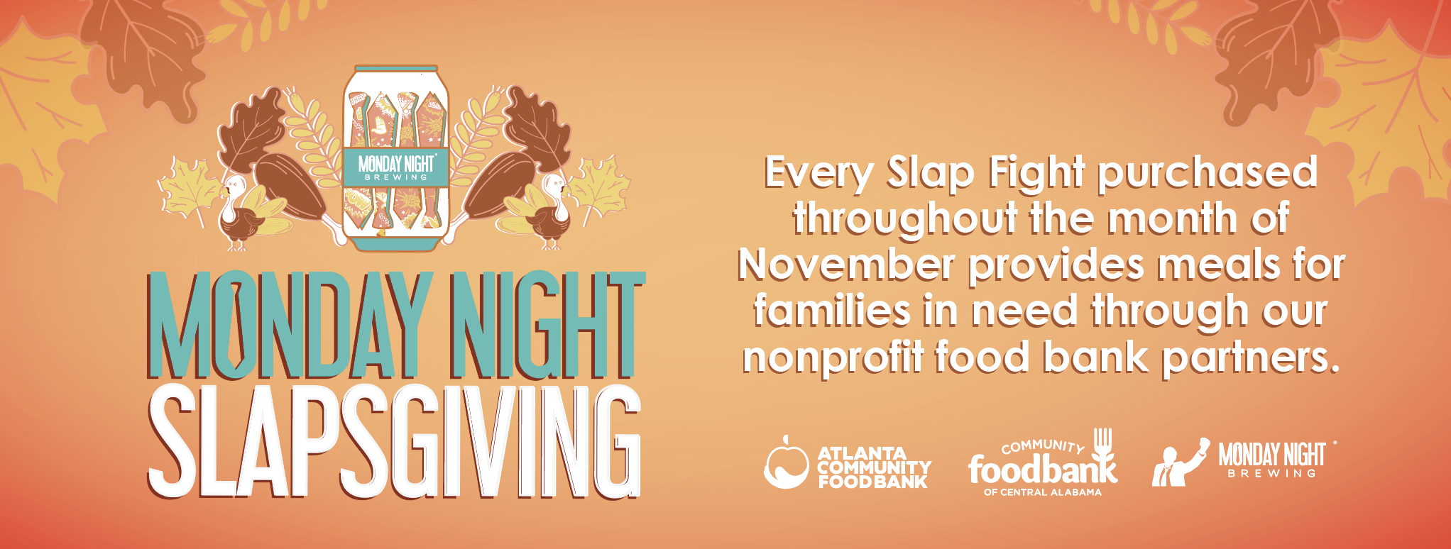
The new look features a hand-drawn logo and custom typeface, both created specifically by the Matchstic team for the brewery. The new program will launch with new cans for seven of Monday Night Brewing’s most widely available brands: Blind Pirate, Death Raptor, Drafty Kilt, Dr. Robot, Slap Fight, Space Lettuce and Taco Tuesday. Each can has its own unique color scheme and hand-drawn pattern.
Let’s take a look!
“It’s not every day we get to work with a brewery, so when Monday Night Brewing came calling, we answered running – and as it turns out, the team is as fun to work with as their beer is to drink,” said Meghan Murray, Matchstic Design Director. “From the beginning of our partnership, we set out to capture not only the creativity and craftsmanship of the beer, but the genuine enthusiasm and humor of the people behind the brand.”
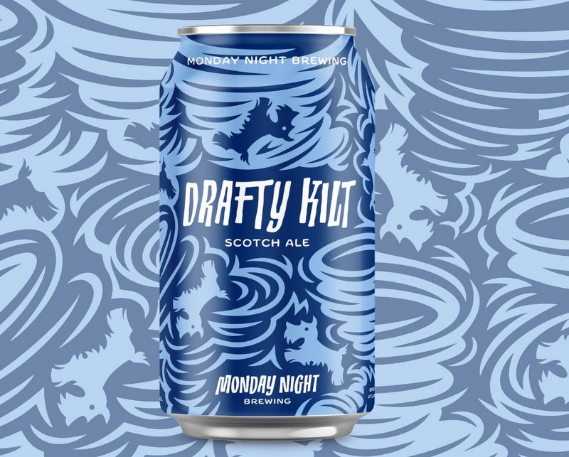
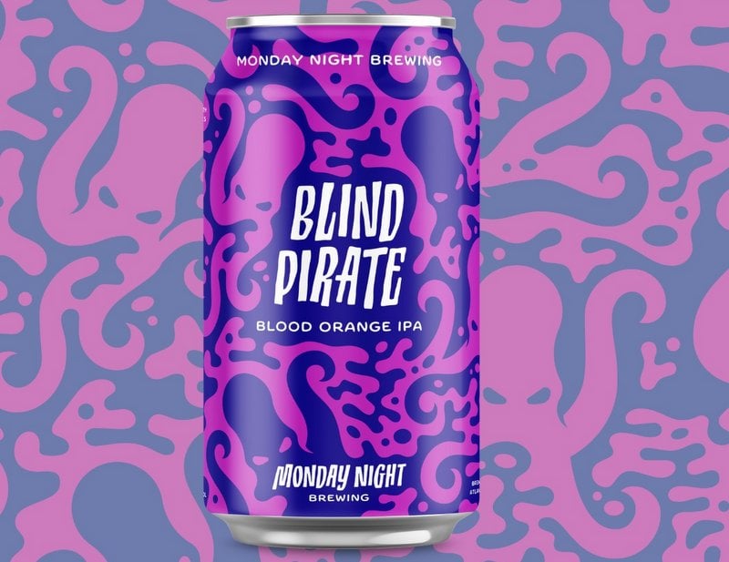
“The part we’re probably proudest of is the illustration style built on negative space,” Murray continued about the design. “We were inspired by the day/night contrast in the brewery’s name, and the cans made for a perfect canvas to explore and elaborate on that idea. Ultimately, we think this work captures the spirit of Monday Night Brewing, and really helps set them apart from other beers on the shelf – and from the rest of the national beer scene.”
“We are thrilled to introduce a more inclusive look and feel to our own teams as well as the communities that we continue to serve and bring together. Not to mention, we hate wearing ties now,” Heck says.

Leave a Reply
You must be logged in to post a comment.