This piece was provided by CODO Design, a food and beverage branding firm, and authors of Craft Beer, Rebranded. This book (and companion workbook) is a step-by-step guide to help you map out a successful strategy for rebranding your brewery. Join 5,000+ other brewing industry folks on the Beer Branding Trends newsletter to receive monthly field notes covering trends, currents and actionable advice from the front lines of beer branding.
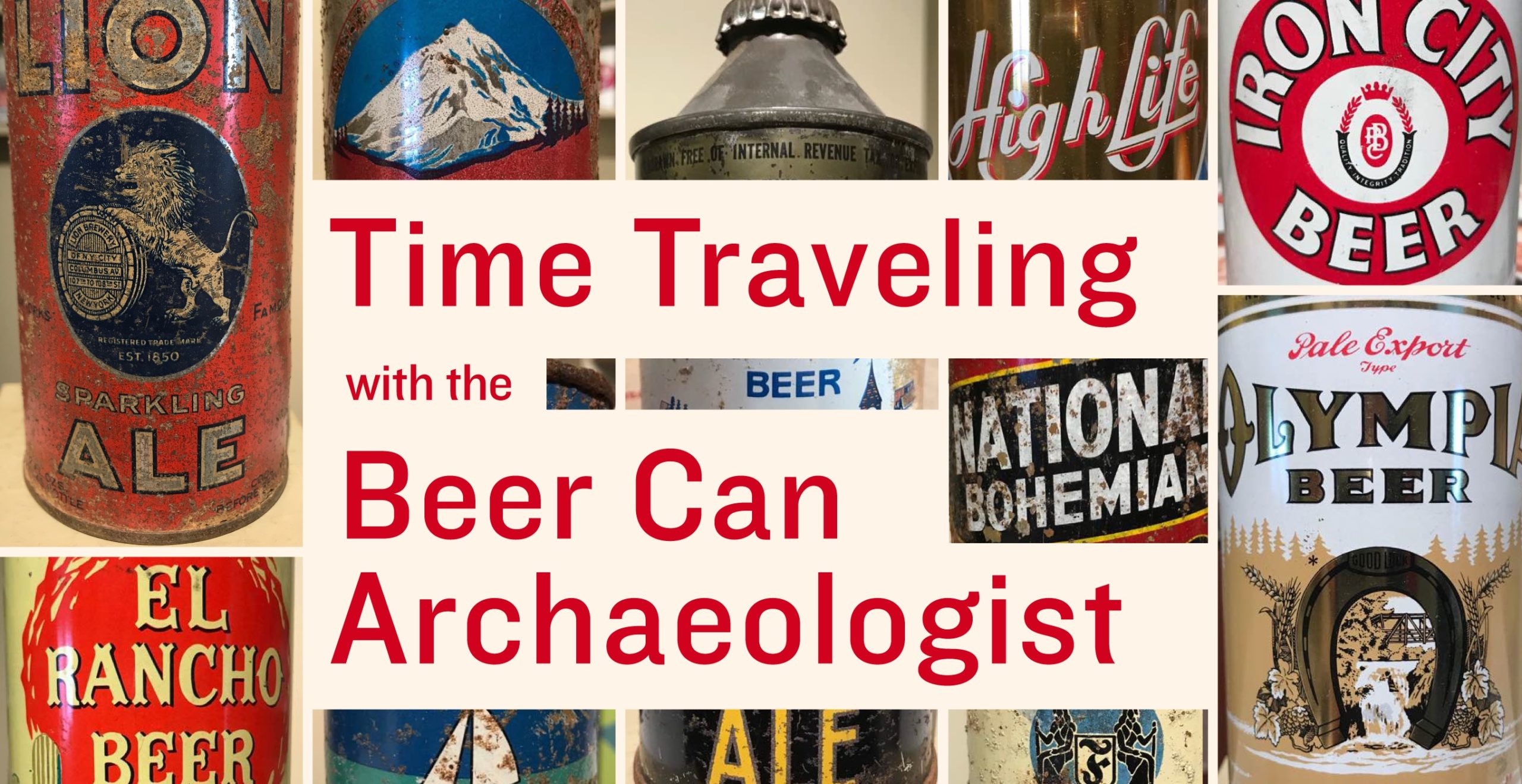
I was digging into beer packaging from the 1930’s and 40’s recently (visual research for a legacy brewery brand CODO is reviving) when I stumbled across a fun scientific journal article about the history of beer cans.
The paper’s author, David Maxwell, is an archaeologist and avid vintage beer can collector. Back in 1993, he combined these passions to write the paper, Beer Cans: A Guide for the Archaeologist, and has been an internationally-recognized expert on the subject ever since. I’ll let him discuss this in the conversation below without giving too much away here.
But for now, why are we interested in this?
Beyond looking at beautiful examples of classic beer packaging (which is reason enough for reading on, I suppose), why spend the time to break them apart and clearly define each era’s visual vocabulary? As we were looking through everything David sent, and comparing it to the other several dozen design trends we’ve identified and defined over the last decade, we realized how very little packaging concepts and aesthetics are actually new today.
Minimalism, maximalism, typography-driven, bifurcation, patterning, scrolls, seals, ribbons, different size formats, label violators, spurious claims, funny lines — it’s ALL been done before. And by people who didn’t have computers, by the way — amazing.
Almost everything in contemporary beer packaging echoes the past in some way, even if the designer has no idea they are doing it. There’s a canon to beer packaging that finds its foundations in the earliest days of can manufacturing.
Let’s explore this concept in more detail with the Beer Archaeologist himself.
Isaac (CODO): Hi David. Please introduce yourself and give us some background on this paper, why you wrote it and your favorite thing about collecting vintage beer cans.
David: My name is David Maxwell, and I am a lecturer (teaching professor) in Archaeology at Simon Fraser University (SFU) in Burnaby, British Columbia. I received an MA in Archaeology from SFU, and a doctorate in Anthropology from the University of Arizona. I began collecting beer cans and other forms of breweriana as an 11-year-old, obtaining most from the roadside near my parent’s cottage in Washington State. As I discovered that there were other can collectors — and as I started to find obviously older and very different looking cans — I became interested in the history of beer cans, initially just as a way of knowing approximately how old my own specimens were. When I was working on my MA, one of the professors at SFU was teaching a class on historical archaeology, and asked if I would give a short talk to his class about beer cans. When I was finished, he took me aside and suggested that I should really consider publishing a guide for historical archaeology. After a semester of research (at Arizona), I put together a paper for publication in the journal Historical Archaeology; this was reprinted in a special publication comprising “essential” readings in material culture put together by the Society for Historical Archaeology in 2000, and continues to be my most searched-for publication.
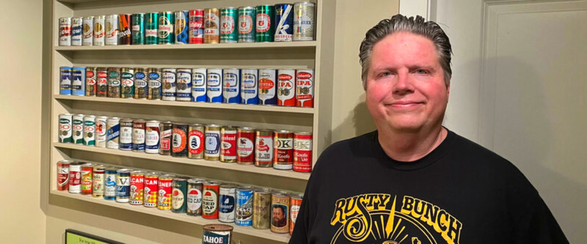
CODO: From 2010 to 2020, hundreds (thousands?) of breweries came to market with vaguely retro / vintage / throwback branding. We always refer to this aesthetic as “Nostalgic Regional.” When you see a craft beer can today that carries historic design like you’re so well versed in — whether it attempts to genuinely look like it is from a certain era, or, it is a contemporary reimagining of a vintage design — what is your gut reaction? Is it positive or negative?
David: My reaction is mostly quite positive. It’s funny, but about 20 years ago I was in a local antique shop and came across some older Canadian bottles and thought it would be interesting if a brewer was to start putting out beers with the same names and labels as these long-forgotten brands.
I have noticed that there are quite a few brands in the US that have magically re-appeared after years (decades in some cases) of being non-existent. Some recent examples: Brouwerij West in San Pedro, California, did a nice job of recreating “Blue ‘n Gold”, a brand that dates to the 1950s at least; although I’ve only seen a small photo, the label from San Pedro looks an awful lot like the original version on my shelf. Similarly, it’s interesting to see the reappearance of “Mr. Boh” on National Bohemian (G. Heileman) cans, especially since the ones I have with Mr. Boh mostly date to the 1950s. A few years back there was even a can designed with opening instructions (Churchkey Pilsener by Two Beers Brewing in Seattle), which was fun to see.
My only negative reactions have been with some Canadian examples produced by the mega-brewers. In the early 2000s, both Labatt and Molson issued a series of cans showing their respective labels through time, and both of them got their own histories quite incorrect. Molson included a label that was never used on cans. Labatt omitted their wonderful “tulip” labels from the 1960s (and then claimed that their labels from the 1970s were from the 1960s). Quite recently, Moosehead did a very nice retro-style can label, although it was a design never actually produced on cans in the past.
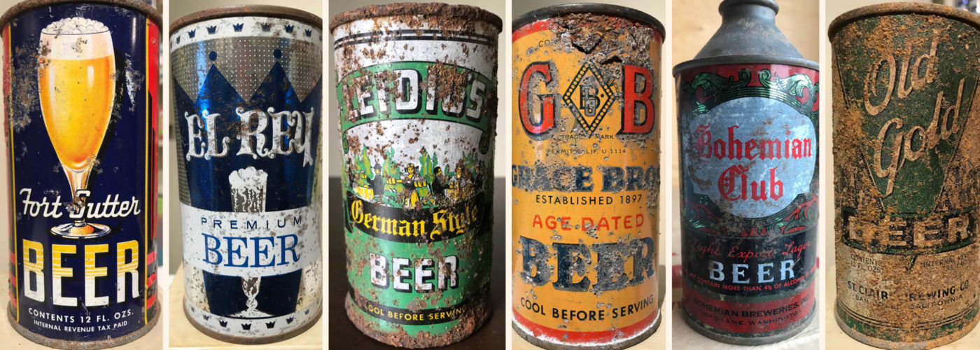
CODO: The amount of cans that clearly state “BEER” is interesting. Education was a big theme in American craft beer over the last 10 years. E.g. there was a big push to educate consumers that cans are a better vessel than bottles. And now with a big shift towards putting 6-packs in boxes, you have to educate people that those boxes house cans. Were there any other interesting quirks surrounding educating the public? Maybe with pop tops or punch top cans?
David: Absolutely, and there are many cans with statements designed right into the labels. In the late 1950s, a number of brewers started to use aluminum lids on their punch top cans, as these were easier to open than steel lids. These are often described as “soft tops” with this feature mentioned right on the label itself. When self opening cans were introduced in 1962, brewers pointed this out using a number of terms, again right on the can labels; one of my favorites actually tells the consumer to “Zip, Tip, and Sip” their beer. By the later 1960s (at least in the western US) and into the mid-1970s, some brands decided to inform consumers about what a bargain their beer was by incorporating the price right onto the label with statements like “6 for 99 cents” and so on. I don’t think it would be a bad idea to inform consumers that the 6-pack box houses cans.
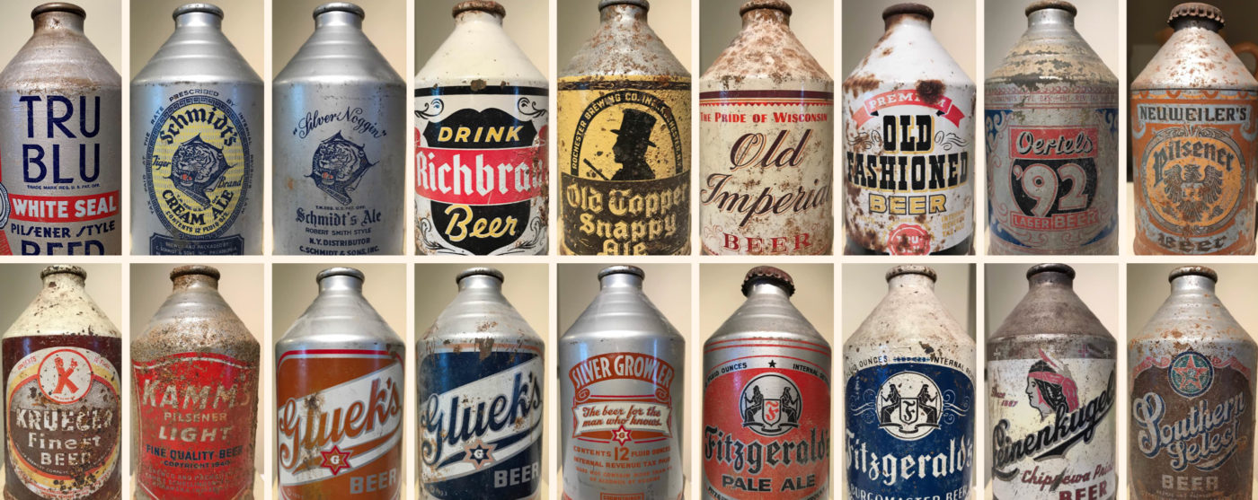
CODO: Was there any aesthetic or messaging reasoning behind the transitional “cone top” or “crowntainer” cans or were they born out entirely because they would work with existing bottling lines with minimal modification? (It’s also interesting that the same discussions and decisions being made today about 12-oz vs 16-oz cans vs 12-oz bottles and bottling vs canning lines, were the same discussions and decisions being weighed by breweries 90 years ago.)
David: Advertising from the 1930s directed at brewers indicated that consumers would prefer to drink beer from a familiar looking package and attempted to sell breweries on the idea that cone top cans were essentially metal bottles. This may have worked to some extent, but I think price was the real driving factor, as Schlitz was the only major brewer (second in sales only to Anheuser-Busch in those days) to use cone tops. Both Pabst and Anheuser-Busch went exclusively with flat top cans; Miller and Coors were both only regional brewers in the 1930s, but they both went exclusively with flat top cans as well. I love the fact that craft brewers have the option of hand filling cans, making this option more affordable even for the really small brewers.
Read the rest of this conversation over on CODO’s site: https://cododesign.com/time-traveling-with-the-beer-can-archaeologist/
Join CODO’s Beer Branding Trends newsletter for monthly field notes covering trends, currents and actionable advice from the front lines of beer branding.


Leave a Reply
You must be logged in to post a comment.