This piece was provided by CODO Design, a food and beverage branding firm, and authors of Craft Beer, Rebranded. This book (and companion workbook) is a step-by-step guide to help you map out a successful strategy for rebranding your brewery. Join 5,500+ other brewing industry folks on the Beer Branding Trends newsletter to receive monthly field notes covering trends, currents and actionable advice from the front lines of beer branding.
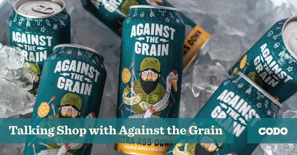
Against the Grain (AtG) has some of the most immediately identifiable package design of anyone in the beer industry today. And that packaging has won over many fans, while alienating others (a dynamic that has earned their outfit a rabid following). We had a great conversation with Sam Cruz, cofounder of AtG to discuss how they think about their community, how they make relevant beer styles and how they’ve managed to keep their branding consistent for since day one. There are a lot of great insights in here for growing breweries. Let’s dive in.
Isaac (CODO): Hi, Sam. Please introduce yourself and tell us what you do at Against the Grain.
Sam: Hey, I’m Sam J Cruz, one of the co-owners at Against The Grain. I am the Chief Marketer, fancy for top level management of marketing and sales, as well as point man for our business development. I spend most of my time vetting new business concepts and pursuing those that make sense. I am also a regular customer at all of our places, so I’m the not-so-secret shopper.
CODO: Can you give us a quick rundown on Against the Grain — founding date, annual production (bbls), distribution footprint, well known beers, etc?
Sam: Against The Grain is a multifaceted company. We are a restaurant group. We currently operate two brewpub locations that are different food concepts and are in the process of conceptualizing the next brewpub location. In addition to that, we also operate a couple of bar/ venue concepts, while also having a partnership and licensing agreement for an Against The Grain brewpub location in Ishigaki, Okinawa, Japan.
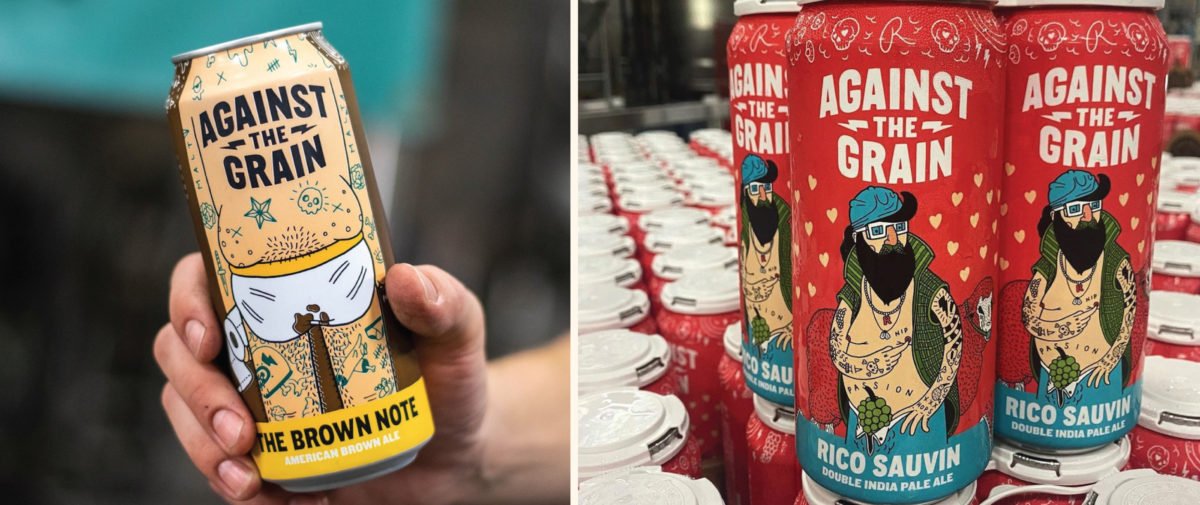
As for our history, we were established on October 2, 2011. Our average bbl production over the last five years has been in the range of 7,500 to 10,000 bbls. We currently have distribution in 26 states, with the majority of that being sold in Kentucky, Indiana and Tennessee. We also do semi-annual exports to a variety of international locations around the world. We are most known for our flagship double IPA called Citra Ass Down. It’s a full flavored DIPA with big citrus flavors and aromas, but balanced out with a strong malt profile. That being said, we have been well regarded as a quality producer since the outset of our company. So there are many brands that stand out, not only for the quality of the liquid, but also our unique and irreverent branding. (re: the Brown Note! lol)
CODO: You’ve got a lot of titles — Chief Marketer / Business Development / Co-Owner at Against The Grain. What does a typical work day look like for you?
Sam: I do … we all do in our company. We are doing a lot these days. A typical day for me starts with a strong cup of coffee and a deep dive into my email. I think the most important part of my job (and likely all of our leadership team) is to be clear, concise and communicative. I personally get an onslaught of emails daily ranging in the 100s. So I tackle those and then head into the city to check in at each location. Since each space has its own vibe and brand elements, it’s my job to guard the sanctity of the ATG mission and core values, while also helping guide the company to profitability with sound strategy and operations. The most important daily activity I share with my partners would be the daily check-ins with each location’s management, and our marketing and sales team. I’m interfacing with each leader within those departments to make sure they have the necessary tools to execute their responsibilities to the fullest. Lastly, and likely the least glamorous, sometimes things are broken or need built/installed, etc … this is where you may find me on any given day. I’m definitely not above fixing a broken toilet!
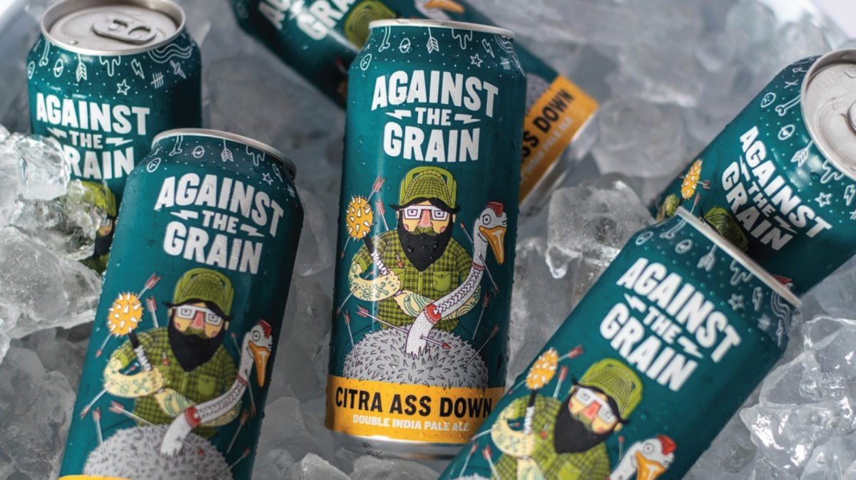
CODO: Your packaging is heavily illustrated. And it’s been consistent for years (no small feat when you consider the possibility of a key designer / illustrator leaving). What has your workflow looked like over the last several years as you develop a beer / name and take it all the way to launch?
Sam: To me the most important thing is intention. With every brand, there is intention in the product and story. This has been instrumental in a seamless workflow with graphic production and storytelling. Typically, we start with a name for the product. Once that is established the product is defined by my partners and I as a set of characteristics for the beer. Once we hit that point, I have a questionnaire that we fill out. This questionnaire was developed over time by myself and the primary designer we use for the illustration on the cans. In addition to the questionnaire, we created a brand standard that structures the label architecture, as well as a system that dictates the design direction.
Without spending hours explaining each nuance, it comes down to the type of beer being made will dictate the character and characteristics of each of the designs on the label. Once we have all those directions established, our designer has freedom within the parameters to create. It works well. Then the come to market strategy is built out of our brand identity, cultural events affecting the market and the place we want the brand to live within the portfolio.
CODO: I was at a cookout a few years ago and someone brought out a pack of AtG’s Brown Note. I remember pulling a can out of the cooler and hearing an older guy say the can was disgusting (I maintained fierce eye contact with him the entire time I drank it). I would chalk that up to an age difference, but it actually highlights something really powerful — knowing who your audience is and not trying to be everything to everyone. How does Against the Grain think about your audience and positioning?
Sam: I can only echo the intention of the product again. We have spent a lot of time navigating the market to make sure we are speaking to those that hear what we say. I think knowing your audience is the absolute most important thing our team does. We look at it as the bread and butter for all that we do. Certainly it makes sense that those who drink craft beer will be the broad audience for us. But with an industry that has exploded from 2,000 brewers in the United States when we opened, to now around 10,000 brewers — it’s exceedingly important that we do not waste our resources trying to reach folks who would not identify with our brand or products. So we work diligently to know our audience and if necessary evolve with them or to include others.
CODO: AtG has some of the most iconic, fun, brash (crude?) illustrations in the game. What is the funniest complaint you’ve heard about your packaging?
Sam: I once got a late night email from a disgruntled person about the Brown Note. In a nutshell he sent a death threat, but also mentioned he would like to piss on my grave. I didn’t take it all that seriously, it seemed like an inebriated message and I thought it was kinda funny that my company had moved this guy so emotionally. We have an apartment in his drunk brain.
CODO: What was Louisville missing when you opened up shop? What did AtG bring to the market that has been so successful?
Sam: We entered the Louisville market at the right time for the growth of our industry. There were a handful of breweries making some decent beer. But not a lot of experimentation. We brought that to the table, as well as a modernized approach to marketing. We utilized social media out of the gate, we put on events out of the gate, and most importantly we align ourselves with a myriad of different industries to show that craft beer is more than aficionado’s drinking weird beer … but also that it aligned with the food industry, philanthropy, and community.
CODO: Tell me about your beer categories — Session, Hop, Whim, Malt, Dark, and Smoke. Is this a handy way for your fans to find something they like or do you use this as a guide to ensure you’re consistently making a wide variety of beer? Also, why no Glitter category? Missed opportunity?
Sam: This was our internal innovation guide. We are artists at some level and the desire to create really drives the joy we get in this project. So we created the categories as a way to allow us the space to create/innovate, but also as a guide for our customers to safely choose what they want, but also it forced them to expand on their understanding of beer and all its beautiful nuance. In addition to that, when we began packaging, it allowed us to use the categories to characterize the beers and create visual representations of the brands that while different, still shared cohesion and similarity to keep our customers engaged, while also fulfilling the need for consistency for them.
Read the rest of this post over on CODO’s site right here.
Join CODO’s Beer Branding Trends newsletter for monthly field notes covering trends, currents and actionable advice from the front lines of beer branding.

Leave a Reply
You must be logged in to post a comment.