This piece was provided by CODO Design, a beer and beverage branding firm. Join more than 6,000 other beer industry pros who receive the Beer Branding Trends newsletter each month covering trends, currents and actionable advice from the front lines of beer branding.
Good George Brewing began as a small brewpub in the former St. George’s Church in Frankton, New Zealand back in 2011. Since that time, they’ve waged a relentless campaign, opening bars and dining halls, launching beers and ciders and spirits, and breaking into nearly every relevant beverage category there is. They even introduced their own patented beer vessel along the way, the 946-mL glass Squealer, serving as something of a go-between at the axis of can and growler.
In their time they’ve helped to define the New Zealand sensibility for craft beer, craft spirits and beyond.
People here in the States have been taken aback whenever we’ve mentioned Good George. Wait, they’re a brewery that also produces a leading cider brand? They’re a hospitality group with a distilling arm? They’ve got a hand in RTDs and NA products? They actually produce all of these things themselves?
Yes. The answer to all of these questions is yes.
We’ve worked with more than 70 breweries since 2010, and Good George may be the best we’ve seen when it comes to effectively executing both the hospitality and production / distribution sides of this business. The breadth and depth of what they’ve accomplished (and have planned) at their scale is inherently impressive.
So this begs the question: Why rebrand when things are going so well?
When every new product you release is a smash hit and people in far flung markets are actively clamoring for you to open a brewpub in their town, why would you feel the need to change things up across the board?
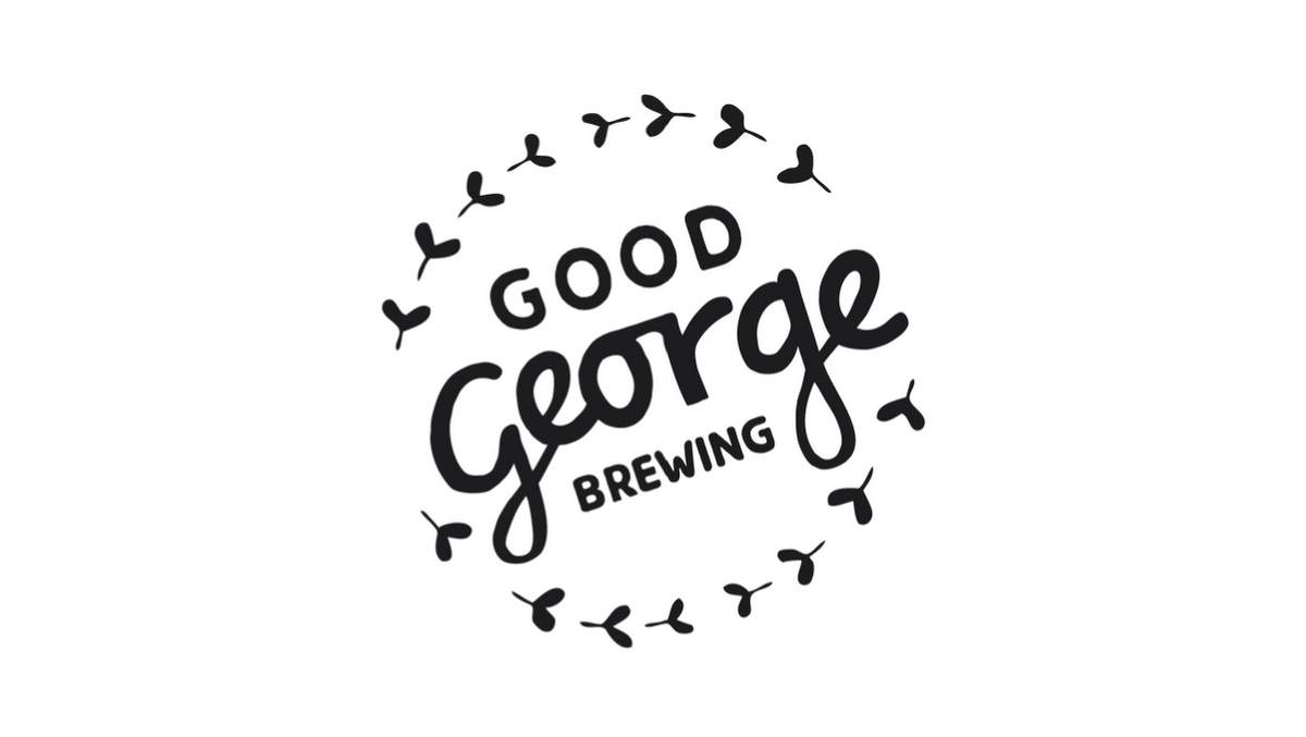
What were we brought in to solve? Somehow, in the course of creating this incredible enterprise, Good George’s ownership group never slowed down long enough to develop proper organizational branding and positioning, let alone Brand Architecture.
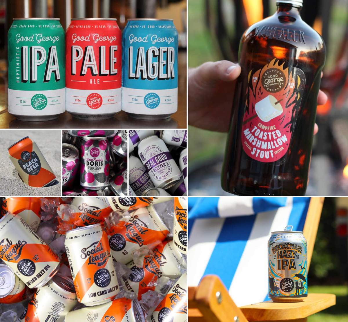
They had a logo and attractive packaging across the board, owing perhaps to their creative internal culture that values running and gunning and throwing ideas up against the wall to see what sticks without being overly precious.
But with a burgeoning portfolio that spans several beyond beer categories and a growing roster of physical locations, it became clear that their overriding pain points might soon begin to inhibit growth. Here are a few issues we heard in our kickoff work:
- We have no clear, central brand story.
- Our packaging is attractive, but none of it hangs together on shelf.
- Our packaging and physical locations work in silos and are completely unrelated in look and feel.
- We need an identity system that better supports a merch program.
- We need to define our Brand Architecture so we can better direct new releases within our existing portfolio and guide new product development moving forward. We need a tool that helps us match the break neck speed at which we develop, refine and release new products.
—
Yes, everything was going well for Good George. But they decided that it could all be even better if they addressed these issues once and for all. So this was our charge heading into their rebrand.
Define their story. Bring clarity to everything. Connect packaging to brick and mortar. And create beautiful packaging that is cohesive at the parent level, while honoring specific category cues, rules and consumer expectations along the way.
On to Brand Strategy.
Brand Architecture and Strategy
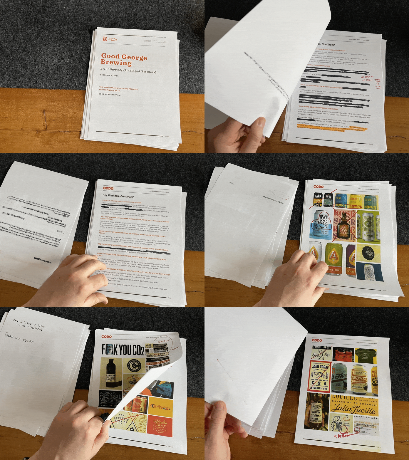
We began this project by mapping out Good George’s active and planned product categories and sub-categories in a single document to get a clearer understanding of who each product line is for, the role they play in the larger portfolio, and how they might work together to support the brand (and business).
This simple step of taking stock of what’s at play helped us in a few ways. How can we earmark certain product categories to carry a specific vibe or tone? Can we influence customers to remain loyal to a specific product by positioning it a certain way? What opportunities exist for future products, or even just for R&D?
We can’t dive into specifics here (sorry for the redacted Brand Architecture Map). But we can say that at a high level, we determined that a Branded House strategy with Co-Driven Sub Brands would best suit Good George’s needs for most products.
(If this is all Greek to you, you might consider grabbing a copy of our Beyond Beer Handbook to learn more about Brand Architecture.)
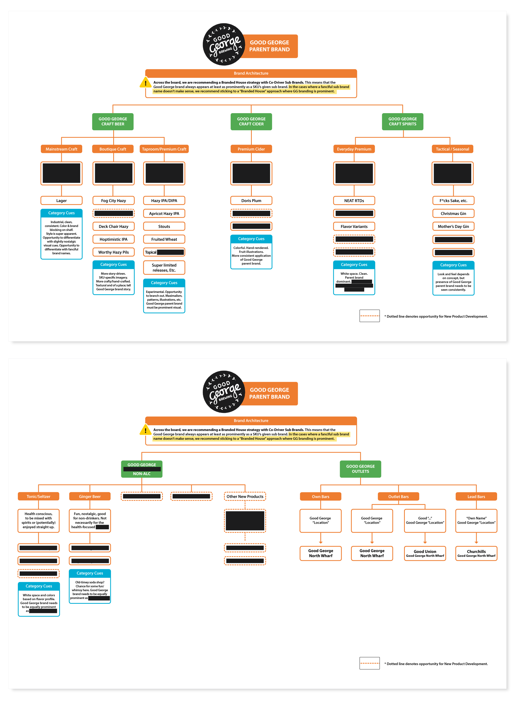
With their Architecture map set, we began to define an overarching voice and creative direction for the brand. We explored Good George’s roots in hospitality, and what that meant for brand messaging — and the ultimate goal of helping customers to feel welcome — whether on-premise or out at retail.
We explored what it means to be independent; to be fun and edgy and honest to a fault, in a way that would separate Good George from the corporate dinosaurs in the New Zealand market.
Moving forward, we knew that the answer would lie somewhere between these two ideas: Hospitality and Edge.
How can we be hospitable and welcoming without being milquetoast and unremarkable?
Now we needed to sort out what these ideas would actually look like.
Brand Identity Design. At this point in the process, we begin to dig into the fun visual stuff. We started by exploring some fun (if literal) interpretations of the St. George story to use as supporting elements.
Now for a (small) bump in the road. Remember the adage: Never discuss politics or religion in polite company? We knew there would be a very fine line with using these religious indexes in Good George’s identity. And, well, we found that line (and moonwalked right past it) in our very first identity presentation. Oops. In this case, the religious iconography — crosses, bloody roses, swords — went a little too hard and heavy.
I contend that we’re not assholes here, read the story of Saint George and tell me you wouldn’t also feel compelled to present a direction with spears and dragons and roses. Remember: The creative process is iterative. (We’re going to start selling shirts emblazoned with this dictum.)
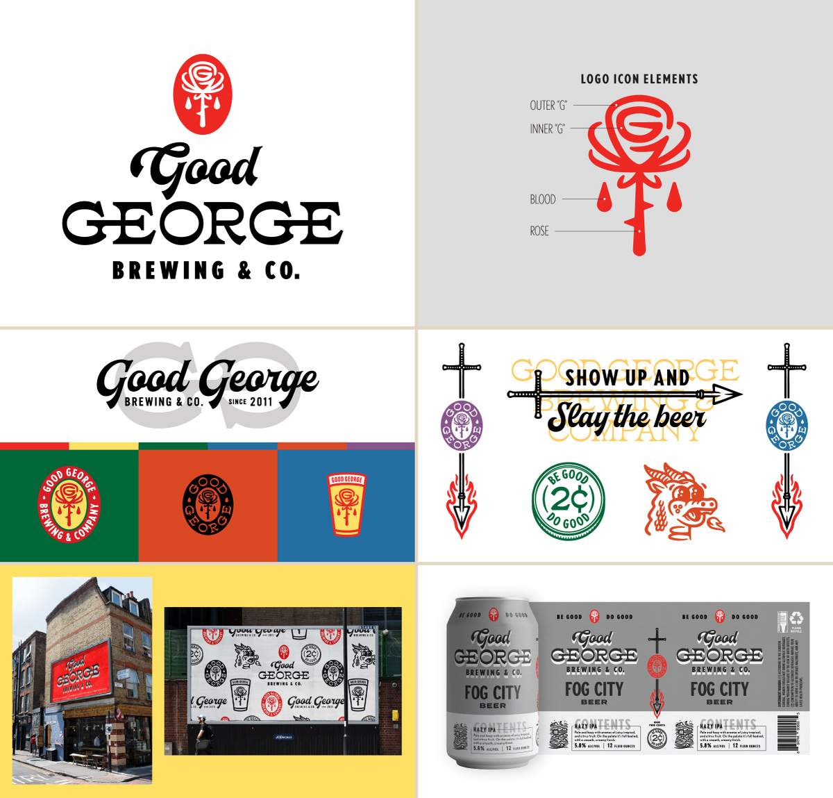
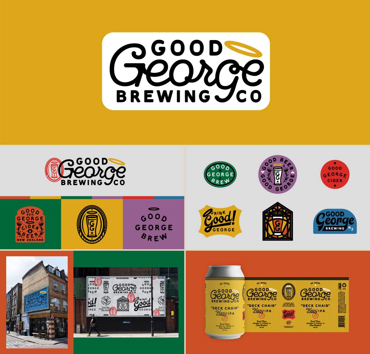
We backed off of this on-the-nose religious angle at the behest of the Good George team. Remember, we’re trying to balance Edge and Hospitality. And we landed too far on one end of that spectrum.
As we moved through revisions, we all grew enamored with a more subtle reference to their origin — a halo — tilted ever so rakishly (a nod to Good George’s collective sense of wit and mischief). Think Bart Simpson in church clothes, but with a slingshot tucked in his back pocket. Or perhaps Aziraphale drinking lots (and lots) of wine for the Neil Gaiman fans out there.
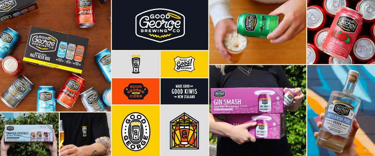
We were collectively excited about the potential of the crooked halo as a key visual to revisit and activate in different situations, which was something Good George never had before. We agreed—client and CODO team alike — that this was the way to move forward. We developed a loopy script typography to build on the previous logo’s equity and generated a confident badge to contain this concept neatly. —Here’s a not super sexy, but practical aside: Whenever you know your identity will be deployed across a variety of different formats — clear glass, dark glass, painted cans, pressure sensitive labels, corrugate, large signage — you need to think about how your logo can remain consistent on all of those mediums. A logo might look lovely in a sterile (and oh-so-controllable) PDF, only to disappear on a gin bottle.
—
We created a bunch of stuff here. And after carefully editing and killing anything that wasn’t 100% in line with the story we’re trying to tell, we landed on a group of energetic and straight-to-the-point supporting assets to go along with Good George’s core mark.
This included a monogram pint glass mark, some fun tagline-ish vernacular artwork, and other icons and bugs that could be deployed tactically where needed on packaging, merchandise and way-showing opportunities.
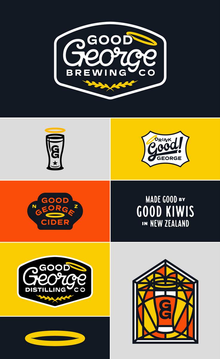
With their Modular Brand Identity System wrapped up, we jumped headlong into a nearly eight month package design process (as you’ll see shortly, Good Gorge produces approximately one million different SKUs and products).
We’ll fast forward here and sort of montage our way through all their packaging.
Beginning with beer, we nailed down a template for their cans and secondary packaging, and were then off to the races developing bespoke concepts that tied into local New Zealand culture.
Highlights include Virtual Reality, a (now best selling) non-alcoholic IPA with an eye-catching painted purple and teal color way.
Other concepts, like Haymaker IPA, focused on the rural and agricultural roots of the region. And my personal favorite, the sleek (and sexy?) Fog City IPA, a name that references Hamilton’s tendency to collect fog as it rolls in across the Waikato River valley.
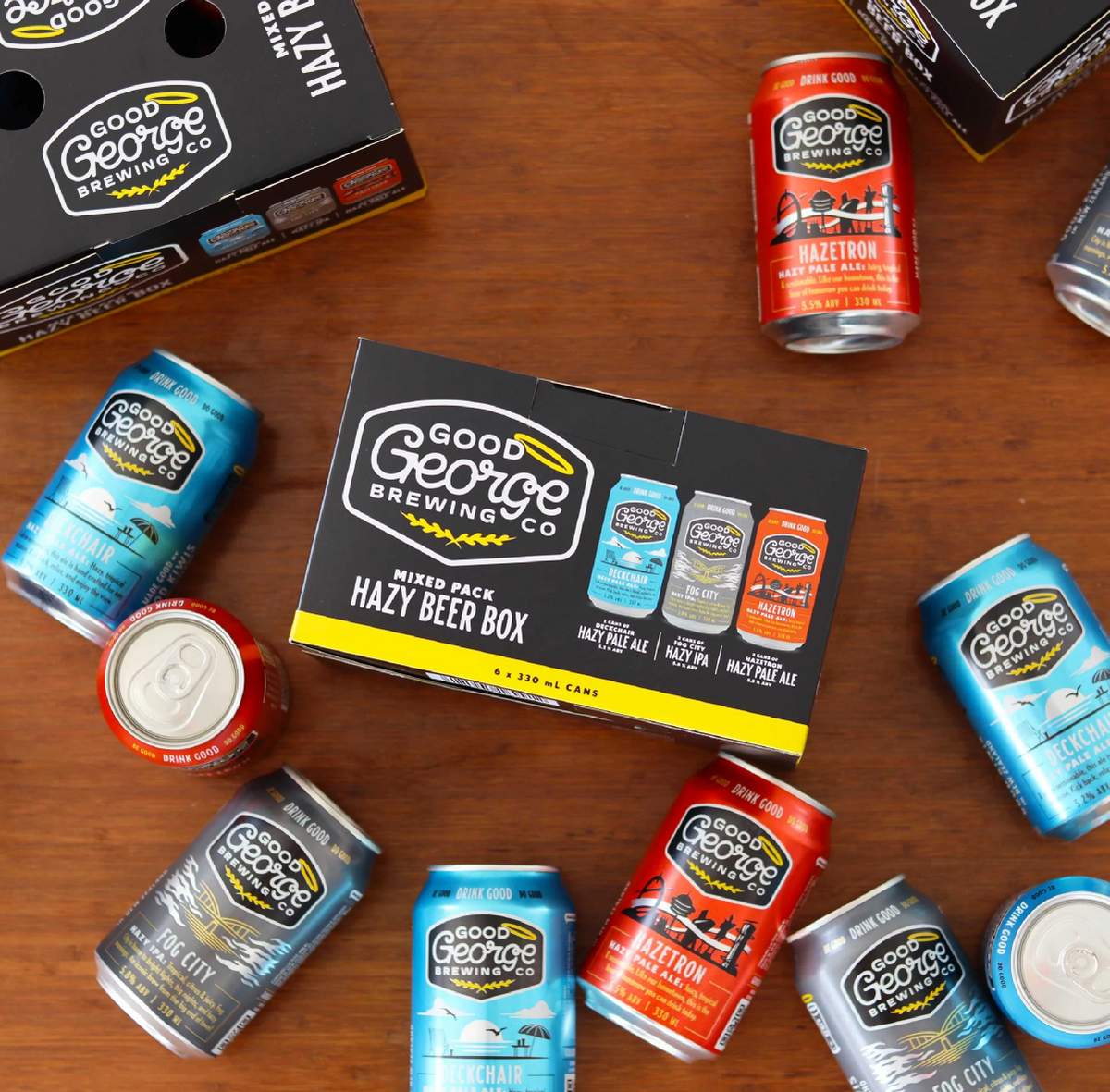
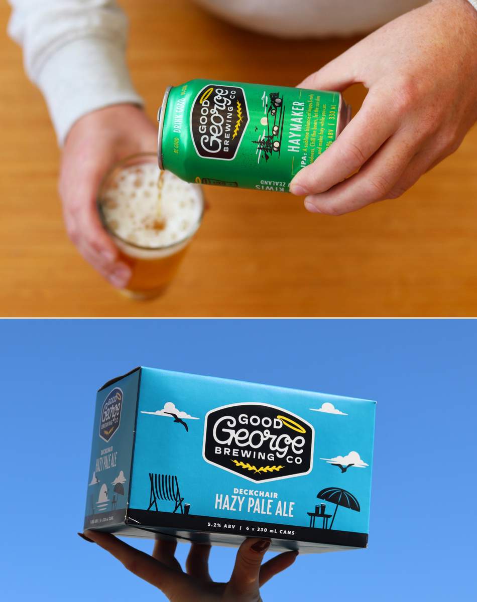
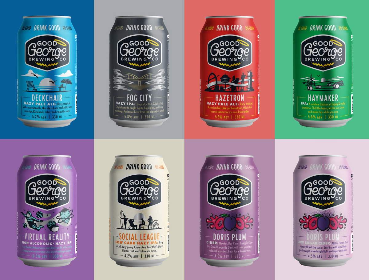
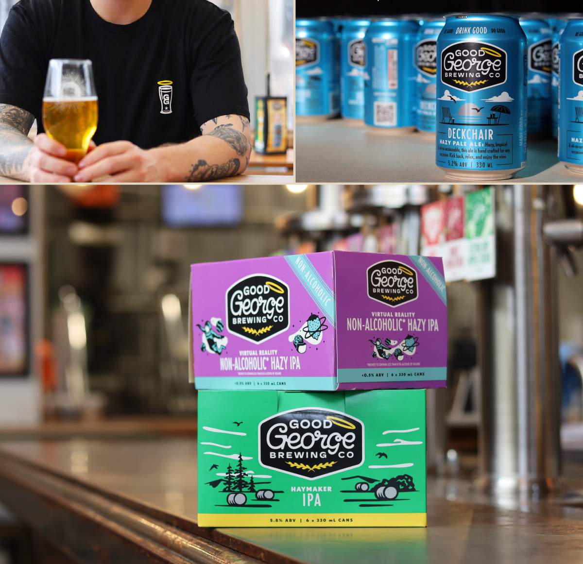
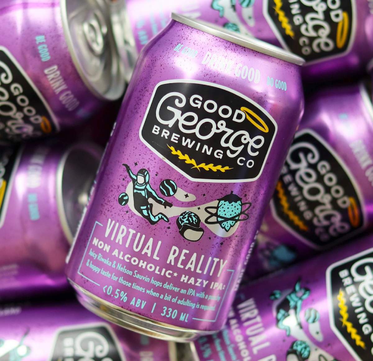
With the beer portfolio figured out, we made a hard shift into Good George’s RTD line.
While we made a conscious effort to keep the beer trade dress energetic, colorful and decidedly local, the parameters for these RTDs were a bit different. This category is still relatively fresh in New Zealand and the competition has a very specific look. Our goal was to highlight the natural flavorings used, and to make sure people understand the provenance of the local, hand-crafted spirits in these drinks.
We ended up striking a slightly elevated, more-premium look for these cans and packs in order to stand out against the backdrop of (growing) corporate competition. For the sake of brevity, we’ll include some images of Good George’s cider, spirits and RTDs below.
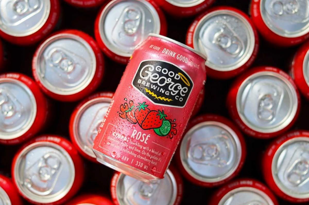
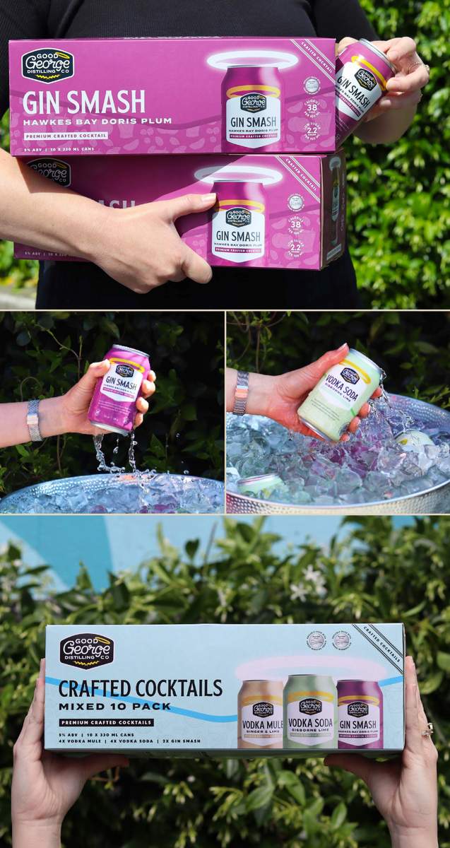
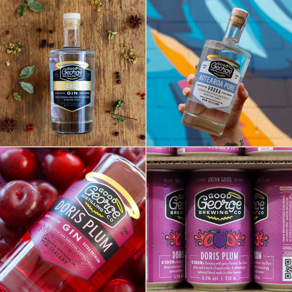
Aaaaand, montage over. Did Good George need to undergo a top to bottom brand refresh? Maybe, and maybe not. Yet the advantages of doing so are self-evident. Now they can keep doing their thing as they see fit, with the confidence of knowing they have a foundational brand identity and Brand Architecture to grow into.
For a company looking to break through to that next level, this could be just the edge that they need.
See more work like this over on CODO’s site: https://cododesign.com
For more insights like this, join more than 6,000 other subscribers who receive CODO Design’s Beer Branding Trends newsletter each month covering trends, currents and actionable advice from the front lines of beer branding.

Leave a Reply
You must be logged in to post a comment.