This is an excerpt from the newly published Craft Beer Branding Guide. CODO Design has spent years working with startup craft breweries on naming, branding and positioning, responsive web design, and package design, and have gathered their experience into a comprehensive guide to help startup breweries navigate the entire branding process. Check it out and learn how to make your brewery stand out.
We’ve spoken with several large breweries this year who wanted to update their packaging, website or core identity. After our initial conversations, it became apparent that in some cases, a simple refresh was more inline with what they needed. For others, a deeper rebranding effort was called for. We’ve run into this often enough that we wanted to take some time to discuss the subtle differences between these two approaches and which is right for your brewery. Let’s look at these by discussing two real life examples we’ve run into over the last year.
Scenario one
“Our brewery just celebrated its ninth anniversary. We brew around 30,000 barrels a year and are distributed across half a dozen states. While people love our core lineup, our packaging is all over the place. You can’t really tell it’s all from the same brewery when looking at them on shelf. On top of that, our logo seems a bit unprofessional (especially considering the major strides we’ve made as of late). We don’t just want to debut a more professional look for our 10th anniversary, we want to blow this out of the water!”
Branding approach
You’ve been at this long enough that your current brand identity and packaging likely have some brand equity, that is, certain visual cues that are essential to preserve through the rebranding process so as to not completely confuse your customers. Think about brand colors or logo elements that people instantly recognize.
We would work with you to define your brand essence and frame your core values (though you likely have a good handle on these) and then determine what elements need to remain intact as we work together to develop a new brand identity and packaging (and likely a website, merch, POS material, and festival kit) as well as a formal brand launch plan. We’d need to roll the brand out internally among your team, including B2B partners (distributors, draft accounts, etc.). We’d consider this a full rebranding effort.
Scenario two
“We’ve got a logo that we love, but our packaging is a huge pain. We still bottle some of our beers, but are moving quickly toward cans for everything. In either case, our artwork is clunky and includes lots of colors — I always dread the proofing process. We’d like to keep our beer names but are open to changing everything else — new illustrations, new graphics, a simplified color palette (for more affordable printing), etc.”
Branding approach
At first blush, we would consider this more of a brand refresh. The issues you’re trying to solve are more surface level than deep and existential. While we would still work with you to define your brand messaging, essence and voice, we’d primarily use these to inform the new look and feel across your packaging system.
A quick note on keeping your logo completely as-is; while every situation is unique, it’s unlikely that your current logo will work seamlessly with the new packaging. This doesn’t mean we need to throw the entire identity out and start from scratch. Assuming the logo effectively communicates your core values and brand essence, we may suggest some slight tweaks along the way to bring it more inline with the updated packaging. This can include new typography, subtle color changes and dropping or adding texture, while retaining the core concept.
Final thoughts
Rebranding represents a shift in your core messaging. This can include refocusing your positioning and brand essence, possibly offering new products and representing all of this through a new name (optional) and a new look and feel, including your core logo, packaging, website and beyond.
A brand refresh is more of an update — call it a fresh coat of paint. Your core brand values and positioning still hold true, but your identity may be showing its age. Maybe your packaging isn’t moving as well as it used to and all your communications seem a bit tired? This can culminate in an updated identity (that builds on what you currently have) and extend to all your other touchpoints.
As you can see, the differences between a rebrand and a refresh can seem a bit semantic. Another way to determine which is right for your brewery lies in why you’re considering a change in the first place. Consider the following questions:
- How long have you been open?
- Are you a regional brewery who’s been at it for many years?
- Are you newly open but growing fast?
- What issues are you trying to fix through this update?
- Your homespun look no longer reflects your core values?
- Your identity, packaging and/or website are dated?
- Your competition is aggressively marketing and selling more beer than you?
- You’re repositioning (new beer styles, new location, new concept/etc.)?
Maybe you’re looking to save money on packaging production costs through a smart redesign - There are no big issues, you just want a new look to celebrate a more mature version of your brewery
- Do you want to change your brewery’s name?
- Do you want to change your brewery’s logo?
- Are you making changes to your beer portfolio?
If you can answer these questions, you should have a better idea of which approach is the best course of action for your brewery.
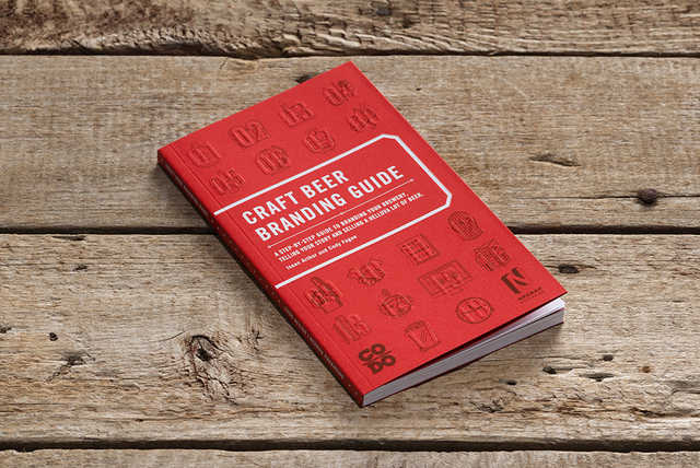
This column was provided by the folks at CODO Design, a five-man branding firm based in Indianapolis, IN. They’ve worked with breweries across the United States and around the world, on naming, branding and positioning, responsive web design, and package design. They’ve gathered their experience into a comprehensive Craft Beer Branding Guide to help startup breweries navigate the entire branding process. Check it out at www.craftbeerbrandingguide.com.

Leave a Reply
You must be logged in to post a comment.