This column was provided by CODO Design, a food and beverage branding firm, and authors of Craft Beer, Rebranded. This book (and companion workbook) is a step-by-step guide to help you map out a successful strategy for rebranding your brewery. If you’d like to discuss your brewery’s branding, shoot Isaac an email anytime: [email protected]
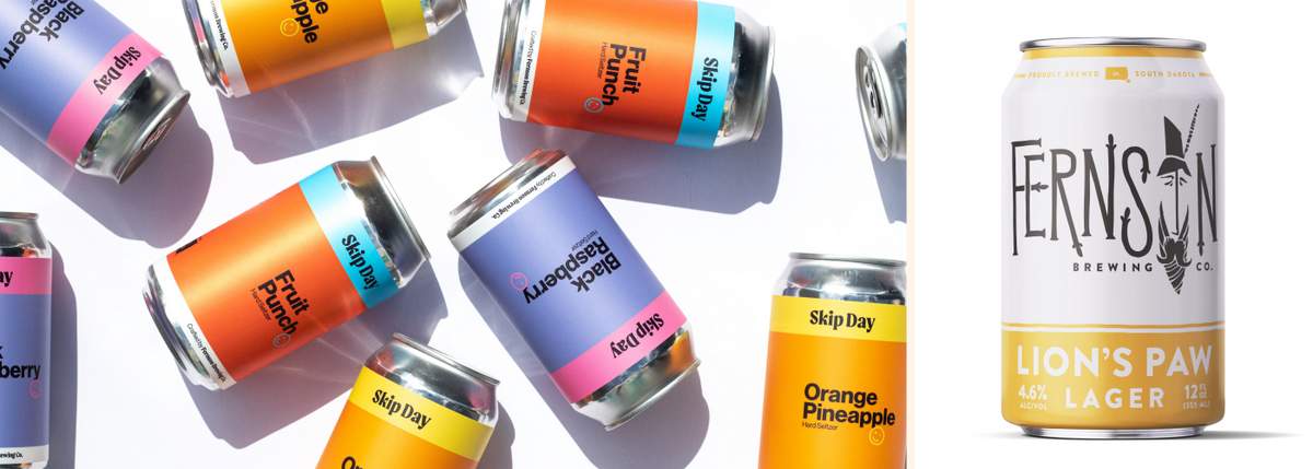
One of our earlier brewery branding projects was Fernson Brewing Co. out of Sioux Falls, South Dakota. And the story we wrote about that work, including driving across the country to present branding concepts to Derek and Blake before staying with their families for a few days thereafter — and the panic that preceded it — has been viewed nearly 100,000 times in the years since. So our work with Fernson will always hold a special place in our hearts for that reason alone.
But we’ve watched Fernson grow since then and have continually been impressed at just how squared away they are. Shortly after our foundational branding project, Fernson hired an in-house designer who has slowly evolved the brand beyond what we had built into something nimble and fun. They’ve adapted to the micro trends that define the craft beer industry, continually refined their messaging and positioning and enmeshed themselves in South Dakota (and beyond).
For today’s In-House conversation, we’re sitting down with Fernson’s In-house designer, Mitch Torbert, to discuss his role in refining the Fernson brand. We touch on the balancing act between servicing “horse” brands and smaller releases, why CODO’s early Fernson “face” logo was put out to pasture and the thinking behind their new extension, Skip Day Hard Seltzer.
Isaac (CODO): Hey Mitch, thanks for your time. Please introduce yourself and tell the readers what you do at Fernson Brewing.
Mitch: Hey! I’m Mitch Torbert from Fernson Brewing Co. in Sioux Falls, South Dakota. I’m the graphic designer most days, but we’re a small company, so I also manage special projects, shoot photos and video, help with marketing, or even stand on the canning line. We all wear a lot of hats!
CODO: Can you give us a run down on Fernson Brewing — who are you, what kind of beer do you brew, annual bbls brewed, distribution footprint, etc.?
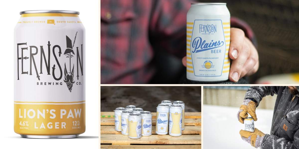
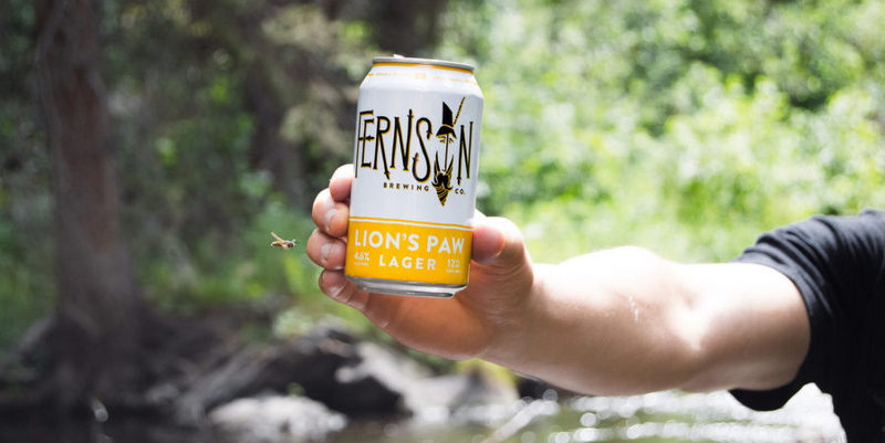
Mitch: Fernson will be six years old this February! We were the first full production craft brewery in town (second in the state) which has often given us the exciting opportunity to educate South Dakotans about beer. We have a flagship lager called Lion’s Paw that’s done the heavy lifting of converting folks to craft. Sours weren’t widely available or welcome in South Dakota back when we got started, but we’ve grown an excellent kettle souring program that now makes up a good chunk of our portfolio. And yeah, we make a killer hazy.
You can #findfernson all across South Dakota, parts of North Dakota, western Minnesota and NW Iowa. We’ve got our eyes on Minneapolis/St. Paul. All combined, we make about 5,000 bbls per year with our 30-bbl production brewhouse and 5-bbl pilot brewhouse.
CODO: What drew you to going in-house vs finding an agency gig?
Mitch: Initially, I just really wanted to work with the company who was creating the most fun in Sioux Falls. We’re a small but growing city and it was easy to see that Fernson had the position of leading some great culture-building moments–I wanted to be a part of that. That’s turned out to be the most rewarding part of my job, but I also love the diversity of my workflow. A week rarely goes by where I don’t get to shut my laptop and help another department out, or build something, or fix something, or serve beer to our guests. A small team (only 11 full time staff) running a big company means it’s all hands on deck, almost all the time, and that kind of hustle is addicting.
CODO: 2020 was one hell of a year for breweries. How did your role as an in-house designer change as the country made its way through the pandemic?
Mitch: On a graphics level, not much changed besides volume. When our kegged beer took a dive, distributors and retailers were more than happy to take any limited releases we could make — so we put out more packaged (and labeled) beer than ever before. There was also a sense of forced innovation in the height of it. While it was scary, it was also exhilarating finding solutions to problems we hadn’t encountered. We started canning our pilot batches for to-go sales, struck up new display partnerships with other breweries and retailers, and released new products that we didn’t have time to develop before. All of these things required me to make illustrator files that I wouldn’t have otherwise!
CODO: We work with in-house designers all the time and find that the ongoing maintenance of existing brands tends to be a drag (compared to the energizing work of releasing new products and brands). I’m NOT saying you feel this way, but let’s talk about keeping those flagship brands relevant amidst all the other fun stuff that’s dominating Fernson’s social channels. How much of your weekly work is spent on promoting your cores (Shy Giant IPA, Curio Sour Ale and Lion’s Paw lager)?
Mitch: On a company strategy level, we find that embedding ourselves in our community as deeply as we can generates us the most loyal customers. We think excellent beer is table stakes for this business, and I’ll be the first to bet on the quality of Lion’s Paw, Shy Giant, and friends. But we think most folks drink Fernson because they love Fernson. They might’ve gotten hooked when we created a custom beer for a summer festival, or when we sponsor an organization they care about, or because they had a great time in the taproom we brought to downtown Sioux Falls. So, not much of my week goes to traditional signal-boosts of core brands. When it does, we try to make it content-rich. Rather than simply promoting Curio again, we created fruited variants to raise excitement and remind people how great of a beer the base is. We modernized the Shy Giant recipe with Citra hops not long ago and used that as an opportunity to promote it.
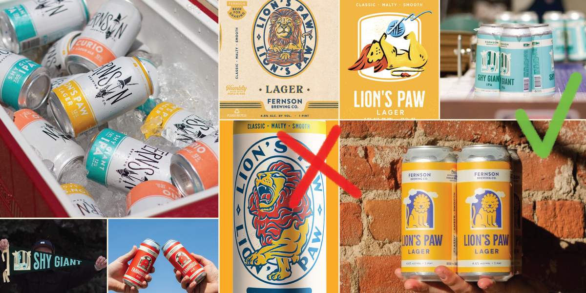
CODO: Lion’s Paw Lager has become a monster in terms of sales. What are you doing to amplify that from the design and marketing side?
Mitch: Short answer here is not very much from design and marketing. It’ll undergo a refresh soon and perhaps some brand extensions, but the ongoing success of this beer is thanks in large part to a recipe that’s familiar and elevated enough to reward drinkers, excellent effort from our sales team and distributor, and loyal bars and restaurants in the area that have thrown their weight behind it. We support it with great POS, some billboards, and bar promos, but that stuff doesn’t take much time.
CODO: What resources has your distributor(s) brought to the table to help rev up your core sales (e.g. wrapped box trucks, great retail placements, POS materials)?
Mitch: We’re incredibly grateful for our distribution partners. Especially our close relationships with the folks at Dakota Beverage here in our backyard. They’re right down the street from us, so we’ve found collaboration to be really natural. Thanks mostly to our great volume track record, we’ve got prominent shelf placements at all the big spots in town. We’ve got a delivery vehicle wrapped, and we often get the first call when a promotional placement opens up in stores. As with many things, close relationships with individuals at Dakota Bev tend to return the most powerful opportunities for our beer in the market.
CODO: Are you involved in developing new beer releases / styles from a branding standpoint or is that driven entirely by the brewing staff?
Mitch: Yeah! As a member of a small team we have a great collaborative environment. We collect feedback from the folks behind the bar and the sales team tells us what retailers are excited about. Blake and Derek (cofounders) are very brand-aware, so conversations about new recipes are often broad enough to include creative direction and brainstorming. It’s a lot of fun.
CODO: Our foundational branding for Fernson centered around the brand essence called “Modern Prairie Storybook.” This told the story of Fernson, an agrarian folk hero with a dash of Johnny Appleseed, Don Quixote and Gandalfian lore. How much of that initial messaging still stands today, five years later?
Mitch: The Modern Prairie Storybook was so crucial for getting our team to wrap our heads around the same brand voice and effort. It helped us name beers, decorate our space, and integrate the brand into experiences. Last year we used the Brand Deck to unpack this ethos into a set of six words — Approachable, Fun, Imaginative, Simple, Humble, and Sincere. These are all great descriptors of a Modern Prairie Storybook, and we use them to gut-check ourselves on copywriting, partnerships, design, and more.
In the early years, we leveraged “Fernson The Man” quite literally (we even wrote stories for each beer), but we found folks weren’t attaching themselves to the fantasy the way we were expressing it. And it was fair, it was a lot to ask our guests to verse themselves with a fantasy realm in order to understand our brand. We’ve found it more impactful to let the curious and kind spirit of “Fernson The Man” guide us, rather than his literal story.
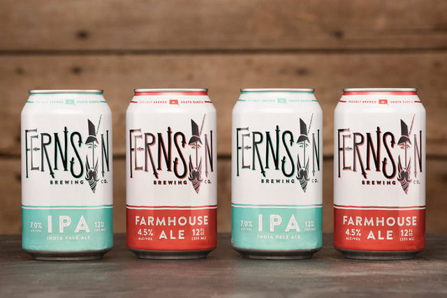
CODO: On a tactical identity level, you’ve moved away from the “Face of Fernson” over the years. Can you give us some insight into why you ditched the old fellow? (Was it his crooked nose?)
Mitch: In frank terms, there was some misunderstanding with what letter his face was representing. I think part of it came from this really beautiful steel sign that a friend of the brewery made for us, hanging above our tap lines out at the brewery. It was in a lot of pictures and despite our best efforts, the face looked a bit like a fish skeleton. We fielded a lot of questions like “what’s the deal with the fish?” or folks calling us “Fernsin” — an uphill battle having chosen a portmanteau of “Fernholz” and “Thompson,” the cofounders. This paired with a number of partnership opportunities that required a smaller logo made it more practical for us to use the “text build” of the logo most of the time.
CODO: You’ve gone through a few subtle packaging evolutions over the last few years. It looks like you’ve got a core flagship portfolio (and look and feel) and then a constantly varied rotational line. How is this strategy working out?
Mitch: It’s working well! Sioux Falls has a really active young population that gets excited for the next new sour release, or the freshest hazy IPA, so it’s fun to engage with that part of beer culture. These limited releases (either very small batch at 5bbl or normal size at 30bbl) help us invite folks into the taproom and stay top-of-mind.
Sioux Falls also has a good number of “beer flavored beer” drinkers who want something familiar and friendly that they don’t need to think about much. Our core lineup checks all the boxes for these folks. I see other breweries abandoning their core, and their market probably dictates it, but Sioux Falls appreciates a good humble lager like Lion’s Paw.
Do you love brewing equipment? Ok, that’s a little weird, but it’s cool. We get it. Dig all these stories on brewing equipment. Get sick with it!
CODO: Do you have rulesets or decision trees in place for what a particular style or series looks like for your non-flagship releases? (e.g. every can starts with a white base and features a prominent illustration…) or is the process looser than that?
Mitch: We have some guide rails around the process for sure. Primarily, we get our 12- and 16-oz cans base-white printed. So in almost all cases we use a transparent label on that white background. This connects nicely to our core beer cans which are about 2/3 white background. With this opportunity, we try our hardest to keep the graphics from accentuating the top edge of the label. The result is a can that seems “finished” using artwork that feels like it belongs on the can, rather than just stuck onto it.
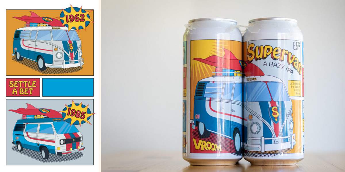
After that, we keep our options open. I’ll endorse most of the “keep the brand consistent” conversations out there, but with something as casual as beer, I think people love to see a familiar brand wag its tail a bit! So, while we won’t totally bootleg another brand, you’ll see Supervan Hazy IPA has a classic comic book vibe, or our Milkshake IPA feels like old vanilla ice cream packaging. Illustration is one of my strengths and there aren’t many brands in the area leveraging that on packaging, so that’s an opportunity that we often exploit.
CODO: Do your limited releases ever make a comeback year after year, or is that driven by sales and general buzz surrounding a particular release?
Mitch: Occasionally they come back! The most successful ones will certainly get re-brewed or scaled up. We check both the “limited release” and “core” boxes with a few series’ that people have become familiar with. We released Cherry Pie Sour, and followed it with Peach, Key Lime, and Blueberry. We released Vanilla Milkshake IPA, then Pink Guava and Cara Cara Orange. We call Gallivant Hazy IPA a “Rotating Hop Series” where the base recipe doesn’t effectively change, but we highlight new hop combinations in each.
CODO: Do your limited releases make it out into chain retail or are those primarily sold out of the taproom?
Mitch: 5-bbl pilot batches stay in-house. Once we jump up to 30 bbl we usually rely on at least one distributor to move it around. Larger batches make it out to our full footprint. The rate obviously varies, but we tend to send at least a dozen different limited release beers out to the market.
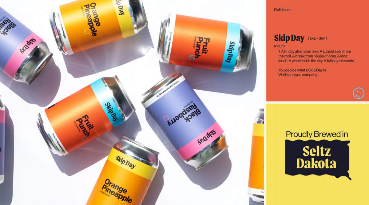
CODO: You recently released a hard seltzer called Skip Day. I love (love!) that name. What was that naming process like and how do you see this seltzer standing out in a sea of similar offerings?
Mitch: Early in the process we noted a couple of opportunities. First, we noted how occasion-based drinking was becoming more popular (folks drink beer at the lake, wine on the patio, bourbon during the holidays or whatever combination is natural for them). So, as a member of the better-for-you category, it felt cheeky and liberating for our seltzer to give the drinker permission to take time for themselves, whether on the couch or on a hike. Self-care and personal agency have maybe never been as popular as during a pandemic, so that brand voice resonated even better than we expected.
Secondly, the seltzer shelves are blurry with a mess of white cans and bubbles and sans serif fonts. When the category was new, I understand it was prudent to communicate that the beverage was sparkly, light (low-calorie), and modern. But folks know what to expect from a seltzer by now, giving us the freedom to stand off the shelf with bright flat color.
It should be noted that Skip Day Hard Seltzer was designed by Evan Richards who’s since moved on from Fernson. Follow him over on IG.
CODO: We believe good design is good business. What have you seen, or directly influenced at Fernson, that backs up this claim? (if you’ve got nothing, no sweat — we’ll make sure Derek and Blake don’t see this).
Mitch: Good design at Fernson connects directly to our vision statement; “The most thoughtful beer experience on earth.” This means we give ourselves the freedom and time to think through a process just a bit further, or put a bit more love into a label or ad campaign, or turning a beer release into an experience, not just an errand.
CODO: What other breweries (or non-beer brands) branding and packaging do you admire?
Mitch: Illustratively, I think Evan M. Cohen is doing some of my favorite work for Hudson Valley Brewery. I’ve gushed over Colin Healy at Prairie Artisan Ales for years. Before I was involved in beer, I thought Odell Brewing Co. had the coolest labels, and I still think those illustrations from TBD Agency are next level. Matt Irwin at Schell’s Brewing Co. also nails this classic woodblock-inspired style.
Read the rest of this post over on CODO’s site right here.
Join CODO’s Beer Branding Trends newsletter for monthly field notes covering trends, currents and actionable advice from the front lines of beer branding.

Leave a Reply
You must be logged in to post a comment.