Creativity and craft beer go hand in hand, and there’s a constant pursuit of innovation, experimentation and excellence that drives the industry forward. So, it’s no wonder that the standard of both the beer and the label packaging design is consistently high.
From the never ending possibilities of flavor combinations to the artful label designs, the sheer choice available to consumers can be overwhelming. Even for the more discerning drinkers among us, picking out the perfect brew can present a difficult (but very rewarding) challenge. Quite often, all a final purchasing decision comes down to is the packaging.
If you’ve been brewing up a fresh new batch or simply want to give a current range a new lease of life, try tapping into one of 2022’s biggest packaging design trends to ensure your label reflects the true quality of your expertly crafted beer.
The new era of ’60s psychedelia
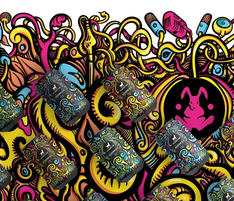
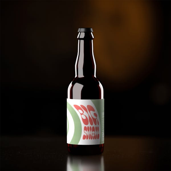
Retro as a whole never goes out of style, and each year it’s interesting to see which decade is cycling back into popularity. For 2022, that era is the 1960s. Design trends are often a direct reflection of what’s happening in society and much like the swinging sixties, we find ourselves in a world seeking peace, freedom and happiness after two long, challenging years in the pandemic.
Therefore, it’s not surprising to see a resurgence of psychedelic surrealism offering stunning escapism. In 2022, these nostalgic wavy typefaces, twisting, melting illustrations and retro colorways are increasingly being set against contemporary products to give them a comforting sense of familiarity.
When it comes to vivid design styles, there are few as eye-catching as psychedelic art. From the explosive and complex arrangements as seen on Trickstore’s beer packaging to the bending bubble typeface on Jackie O’s Big Snail Imperial Stout, these psychedelic designs take on a groovy life of their own.
Mischief illustrated
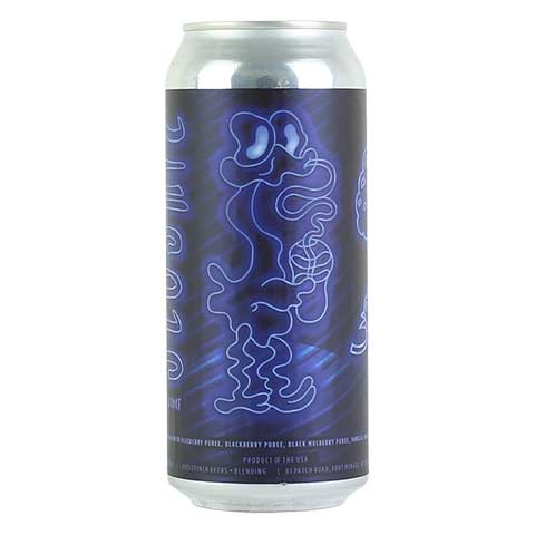
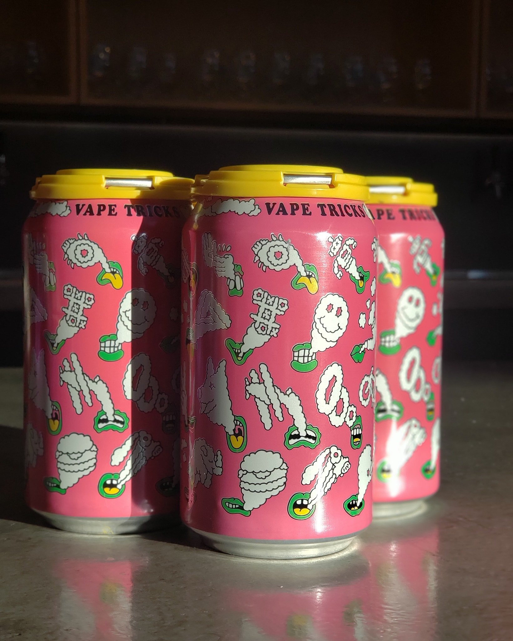
If there’s one thing that craft beer does really well, it’s quirky character design, making browsing the shelves at your local craft beer store almost as enjoyable as sampling the contents within (we did say almost).
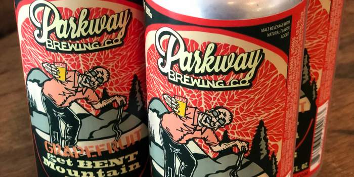
2022’s spin on these mischievous characters is a youthful, hand drawn 2D version with an emphasis on street style. These impish and ironic characters also appear to be a reflection of the satirical memes that permeate popular culture right now and are a great way to communicate the playful side of your brand.
The imperfect and hand-drawn nature of the characters on the labels of Oozlefinch’s Sloshie Sour Blue or Prairie Artisan Ales’ Vape Tricks Sour let us know that these are brands that don’t take themselves too seriously!
Eccentric text centric design
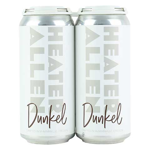
The fact that craft beer as a whole does character design so well can sometimes present a challenge for brewers; you have to make sure your character is unique enough to stand out. To combat this, an increasing number of brewers are choosing to go in a completely different direction. In 2022, expect to see more designs that do away with illustrations, imagery and patterns completely and instead leverage typography as the focus of the label art. While this style is certainly more understated than many, its strength lies in its simplicity.
Typography can be just as powerful as illustration at communicating the personality of your beer brand. For example, Heater Allen’s packaging design for its range of Ales and Lagers stands out for all the right reasons. Balancing white space, contrasting typography and the occasional introduction of playful colors the result is an effortless minimal aesthetic that is in complete contrast to most beer labels on the shelf.
Y2K is back!
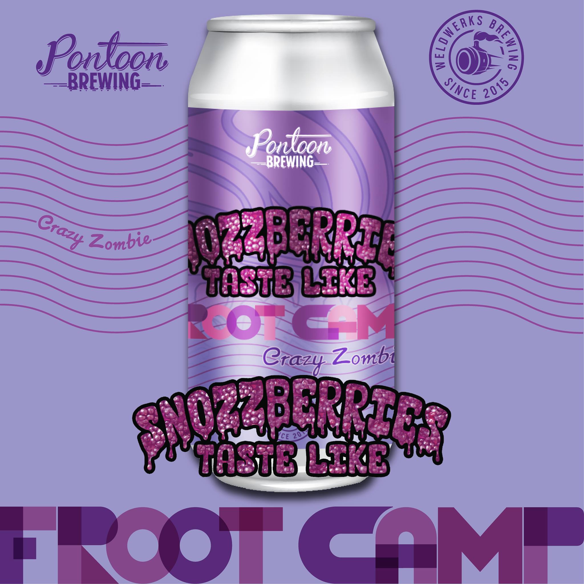
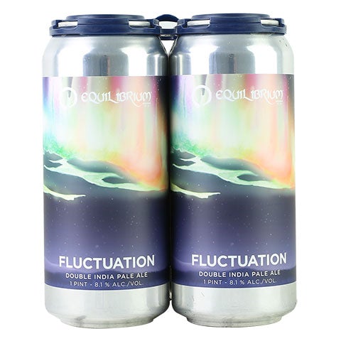
Despite being only two decades old, the Y2K aesthetic seems to be permeating popular culture once again, and the beer industry is no exception. We’ve seen this design style growing in popularity with Gen Z’s for a few years now and as they start to come of age, they’re bringing their tastes (for beer and design) with them.
Therefore it’s no surprise to see increasing numbers of beer labels featuring the iconic, kitschy and metallic aesthetic as brewers respond to this growing appetite. From the hazy, neon purple and green mist found on the label of Equilibrium’s Fluctuation Double IP to the pink bling on Pontoon Brewing and WeldWerks Brewing’s Crazy Zombie collab. This design style is simultaneously nostalgic and futuristic with an appealingly cheap feel to it.
Faux 3D deco
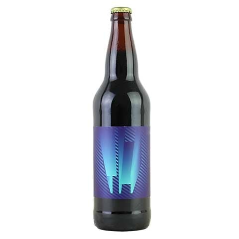
Another design trend we’re anticipating for 2022 is the use of faux 3D deco. Humans rely on visual cues in order to tell the difference between flat images and tangible 3D objects. By replicating the same visual cues in your beer label through clever design, you can trick the brain into thinking the images have more depth than they really do.
Whether that’s a blend of light, gradients and shadow to give the illusion of depth to flat illustrations, incorporating realism or adding textured effects, these optical illusions will have designs jumping off the label
Making beer labels appear three dimensional not only looks great, but creating the suggestion of texture can also increase the likelihood of someone reaching for your beer to ‘feel’ the illusion for themselves!
The label design on Cycle Brewing’s range of ales and stouts is a great example of clever use of perspective geometry to take it’s 2D label into the 3D realm.
While your label’s primary job is to catch the eye of a prospective drinker, it should also quickly communicate your brand story and your beer’s unique flavours. That’s a lot of responsibility for a little label, so it’s important that your design does you justice in getting prospective customers excited and interested in trying your product.
Author: Shayne Tilley, Head of Marketing at 99designs by Vista: Shayne Tilley is Head of Marketing at 99designs by Vista, the global creative platform that makes it easy for designers and clients to work together to create designs they love. He is a wrangler of collaboration, diversity, and creativity who helps bring more opportunities to people all around the world. For more information please visit 99designs.com


[…] more and more brewers favor straying away from imagery, patterns, and illustrations. Instead, brands would rely on text and use it as the primary focus of the label […]