This piece was originally published on CODO’s blog. Check it out to see dozens of other behind-the-scenes looks at brewery branding projects.
We’ve all seen the same story play out across many different industries: a new indie band/restaurant/brewery comes on to the scene, and everyone is enamored. Then its luster begins to wane as more and more people flock to this new “thing.” As that indie band releases its third album and starts playing larger venues, as that small craft brewery adds a few more 60-bbl fermenters and launches into new markets, people start to lose that cozy feeling of intimacy you get when you discover something new. In becoming more well known, the experience of going there is no longer a special thing between you and your friends, and alas, the thrill is gone.
We’re now seeing this happen at such a fast clip that in some markets, breweries that opened just five years ago are now considered the old guard. And, if that’s the case for breweries that have only been at this for a few years, imagine how a craft brewery with 10, 15, or 20-plus years under its belt is feeling.
Add to this frustrating equation the fact that for the last decade, larger regional breweries have been getting squeezed from both ends of the market. New breweries are stealing away off-premise sales and creating more buzz and excitement, while big beer (including other large craft breweries) have been driving down prices through their vast distribution networks and volume play. All of this begs the same set of questions:
- How can a brewery grow while remaining relevant to its fans?
- How can a brewery stay enmeshed in its local community as it expands into different markets?
- How can a brewery continue to call its product “craft” if it makes 15,000 bbls (or 30k, or 70k, or…) per year? Or, can it?
So with this scene set, what’s an older brewery to do?
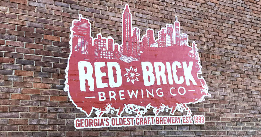
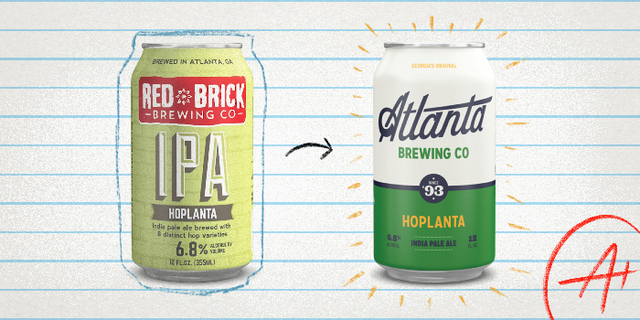
Red Brick’s previous identity
Atlanta Brewing Co. was founded in 1993. At that time, there were only about 200 “microbreweries” and brewpubs throughout the entire United States (there are more than 6,600 today). There was no Brewers Association, and home brewing was still largely illegal across the country. Dr. Dre was all over the radio, Michael Jordan was dishing up Ls to everyone he faced and I was seven years old — it was a long time ago.
Atlanta Brewing’s founding story is not unlike the lore of other legacy breweries — located in an old brick warehouse in a rundown part of town, a brewery cobbled together with old dairy and brewing equipment from England, bootstrapped beyond belief but hell bent on making the best beer possible.
While Atlanta Brewing enjoyed a lot of growth over the next 15 years, it also ran into a few bumps in the road. It had to move to a new facility due to an imminent domain highway project from the city and of course, it had to weather the economic downturns that all businesses face. Another challenge was that like most legacy breweries, it had to contend with the tide of cool, high-energy startups fighting for shelf space and mind share.
All of these issues came to a head in 2010 when, in a misguided attempt to respond to them, the brewery changed its name from Atlanta Brewing to “Red Brick Brewing” (named after its best-selling Red Brick Ale). On top of running away from a fantastic name, the rollout and subsequent packaging changes weren’t handled well. A few agencies took stabs at revamping everything, but as is the case with rebranding, unless there’s a core internal change; unless there’s a fundamental shift in positioning, vision and values, a rebrand is nothing more than window dressing.
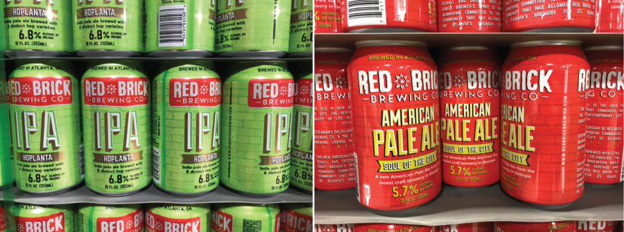
Red Brick’s previous packaging
Over the last four or five years, Red Brick began the long process of climbing back and working to regain their previous market share. It named a new president, Garett Lockhart, who immediately began assembling a dream team. One of his first moves was bringing on Cameron Davis to revamp their marketing. Then, he found a great sales guy, Matt Wells, with years of experience selling big craft brands, and finally, he brought on a renowned brewer in Gavin McKenna. Then, they squared away operations by promoting (from within) Andy Sadler, and continued to round out the brewing and sales team. We’ve worked with nearly 50 breweries now, and this is one of the most squared away groups we’ve ever had the privilege of partnering with.
On top of all this, a recent change in Georgia brewing law made it legal to sell beer directly to consumers through an onsite brewery tap room (join me in welcoming Georgia to 2018!). This means a large regional brewery like Red Brick that has to dedicate a lot of time to brewing flagship beers can spread its wings and create a vibrant tap room experience by brewing whatever it can dream up without being driven solely by what will move off-premise.
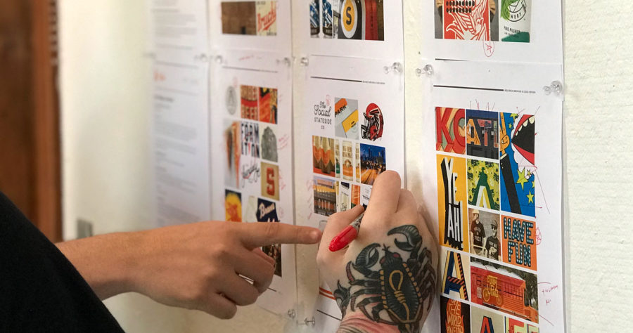
We kicked the rebranding project off by spending a few days down in Atlanta with the Red Brick team. We watched them brew beer, we sampled everything they had on draft, and we visited local bottle shops, bars and breweries to get a sense of the competitive landscape. We also sat down with every single person on their team to get a sense of what makes this brewery so special. A few big ideas emerged from this fieldwork:
- The only real brand equity to retain was their flagship beer names and a few SKU-specific colors.
- Being the oldest brewery in Georgia is a completely ownable differentiator — no other brewery can make that claim.
- We didn’t want to appear trendy — buzzwords like “Juicy,” “Hazy” and other such terms are unbecoming of a 25-year old brewery.
- We needed to create a strong flagship shelf presence while also speaking to the beer nerd crowd through the taproom.
- And finally, our battle cry was to take back Atlanta. Red Brick lost a lot of ground in its hometown over the last 15 years — everyone in the company loves Atlanta and strives to make it a more vibrant place to live.
Out of all the positioning and messaging opportunities that emerged through the brand strategy process, the Red Brick team felt the idea of “Persistent Spirit” best captured what they stand for. This brand essence would tell the story of a 25-year old brewery that, like its hometown, has weathered everything thrown at it and come out stronger than ever. Visually, this would look a bit vintage to speak more to Atlanta’s history than the time of Atlanta Brewing’s founding (though we must say, 1993 did have some sick graphic design). And, to make sure we got this right, we would drop the Red Brick moniker entirely and reclaim their original brewery name, Atlanta Brewing Co.
Brand attributes and visual cues we explored throughout the identity design process included: pride, nostalgia, vintage sports, script typography and whitespace with pops of vibrant colors. Our parameters set, we began the fun work of developing Atlanta Brewing Co.’s brand identity system.
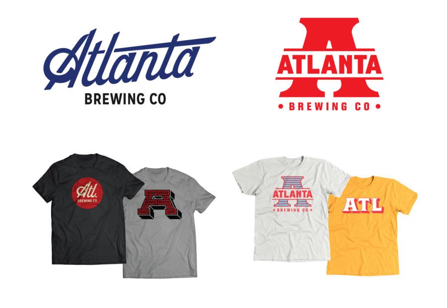
We presented two brand directions — one that centered around a classic script typeface (one part vintage Atlanta sports, one part aeronautical) and another that was more iconic and industrial (and a subtle nod to their original, 1993 mark).
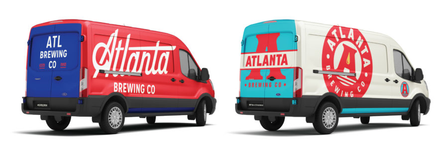
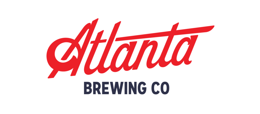
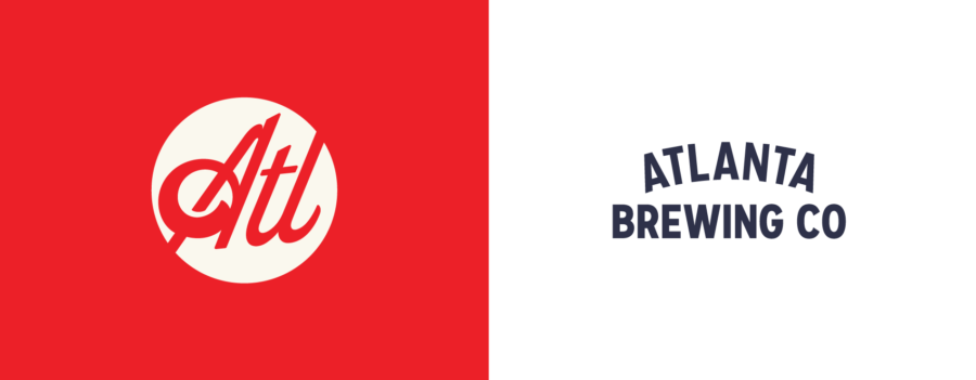
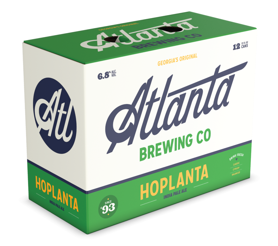
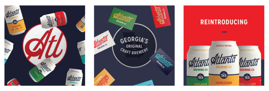
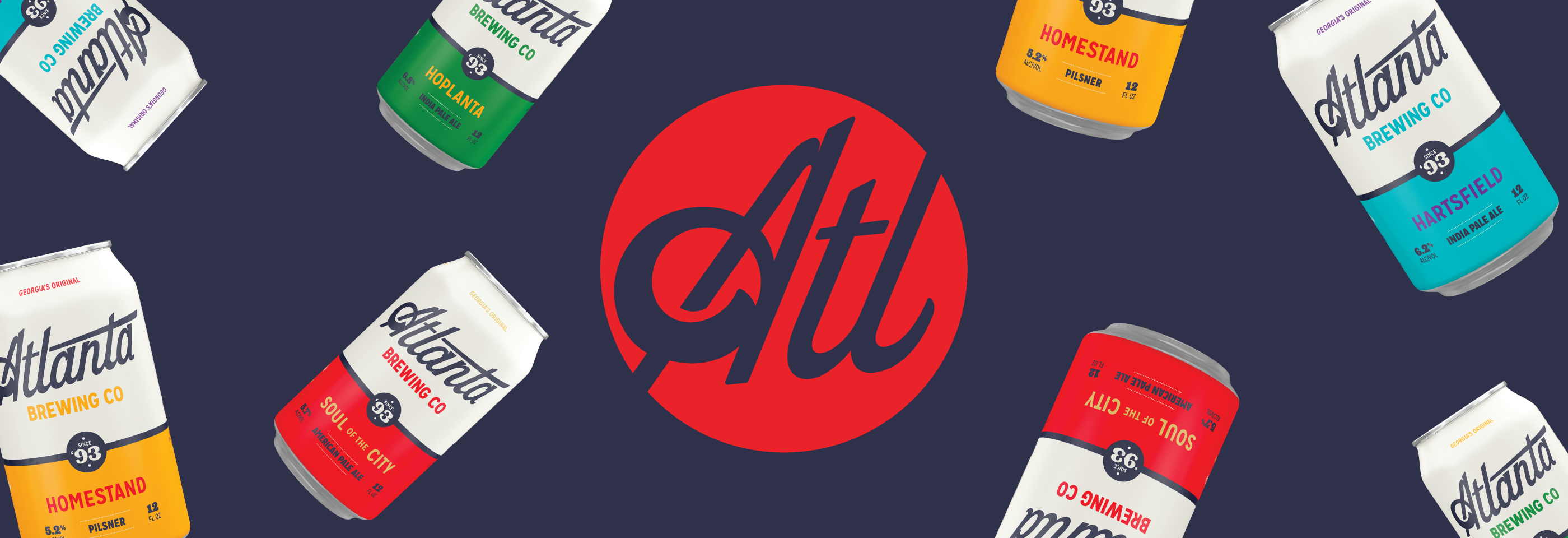
The final Atlanta Brewing brand identity system was designed to be used across multiple channels, from packaging and digital, to merch and environmental design. We created a system that was consistent enough to hang together as the brewery team puts it to use, but loose enough that it doesn’t become stale and repetitive over the next several years.

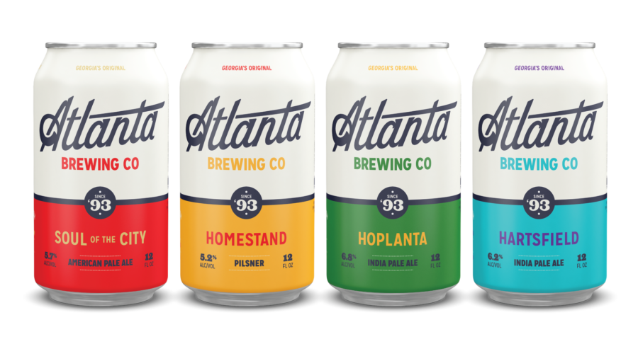
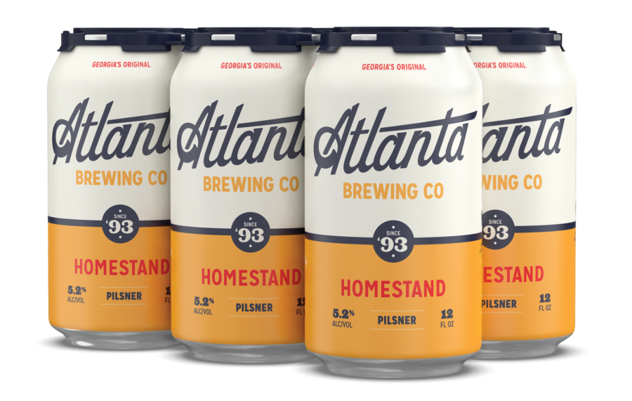
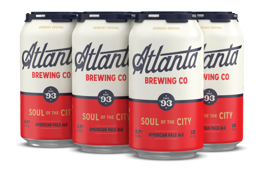
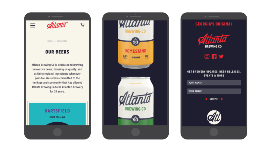
Atlanta Brewing’s flagship cans feature a “duped” design, essentially giving it no “front” and “back.” Since we weren’t using a box, we wanted to create something that would avoid the facing issues you get with six-pack carriers in a retail setting. This way, if a can spins around, you’re still able to see who the brewery is and what style you’re grabbing
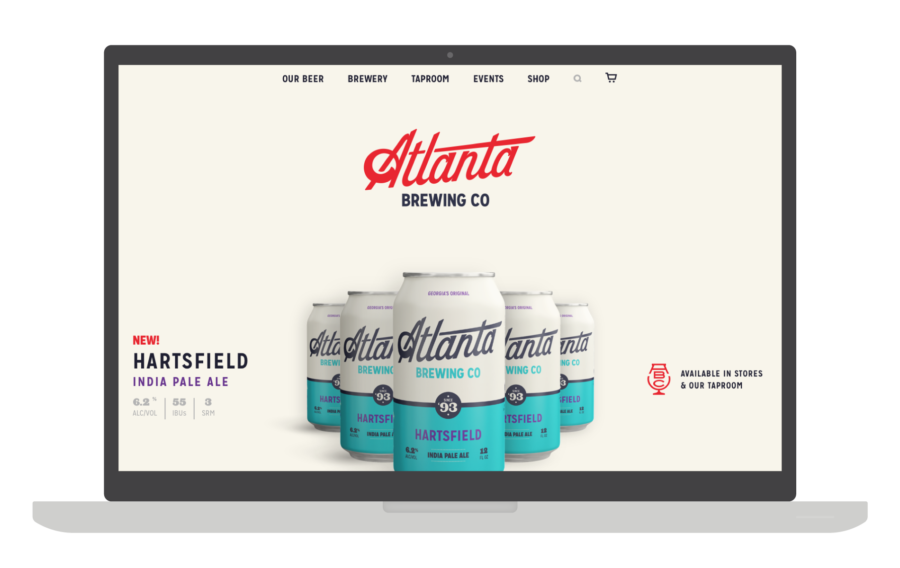
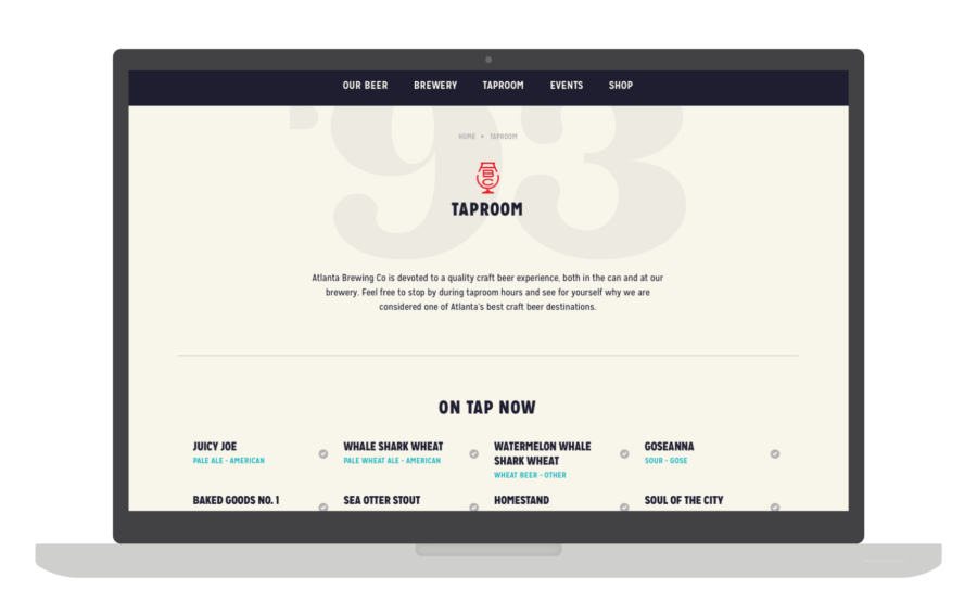
Atlanta Brewing Co.’s new website is home base for all its promotion and includes a 25-year timeline, tap list, a robust events calendar (including a way for folks to book an event), and a full eCommerce store. This was all completely custom-designed and responsively developed using WordPress. After a user tutorial, the Atlanta Brewing team was able to take over the site and run things without needing to know any code or having to pay us (or anyone else) to make updates. This leaves them with more time to focus on brewing great beer.
One of the most important aspects to consider when rebranding a brewery is how you announce the change to the community. There will always, ALWAYS be a contingent of people who hate the update (and if that bothers you as a brewery, imagine what it does to us snowflake designers). If not handled properly, the change can leave people confused (I loved what they were doing, is their beer going to change? Was I wrong for liking their old cans?). And increasingly, in-the-know beer fans may be weary of private equity investment/a big corporate buyout/etc.
By developing a proper promotion plan, you can get out ahead of this and generate a lot of buzz and excitement leading up to the new brand launch. With Atlanta Brewing, we developed a series of teasers to be used across their social channels beginning about six weeks out and ramping up in volume as we drew closer to the big day. People caught on pretty quickly and it was fun watching as the community engaged with the idea of their favorite brewery becoming new again and began voicing their opinions — “Hurry up and share it!” or “Hmmm, smells like a rebrand. Can’t wait to see it.” or “I already hate it.” Terrific…
This approach was successful in landing several major feature articles in the Atlanta press and prominent industry blogs, and I imagine it will only get more coverage as they lead up to their official 25-year anniversary party on September 29, 2018.
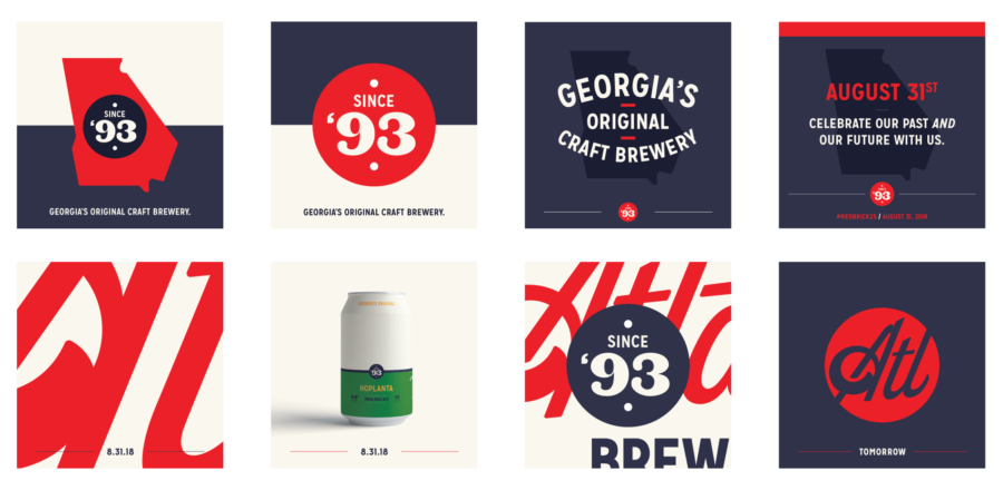
A few of our favorite social promo pieces from the brand launch campaign.
Can a brewery remain “authentic” while growing? Can it remain true to its values while aggressively launching new markets? Can a regional brewery breathe new life into its brand and story when it seems that every force is working against it?
Yes.
If you have the right team assembled and you’re making the best beer you can, then you can tell a wonderful story to both old fans and new ones alike. It was an honor working with the Atlanta Brewing team and we’re looking forward to seeing what they accomplish over the next 25 years.
This column was provided by the folks at CODO Design, a branding firm based in Indianapolis, IN. They’ve worked with breweries across the United States and around the world, on naming, branding and positioning, rebranding, responsive web design, and package design. They’ve gathered their experience into a comprehensive Craft Beer Branding Guide to help startup breweries navigate the entire branding process. Check it out at www.craftbeerbrandingguide.com.


[…] CODY FAGUE AND ISAAC ARTHUR https://www.craftbrewingbusiness.com/featured/classic-rebrand-how-codo-design-breathed-new-life-into… […]