With an increasingly competitive market that is being pushed to package and sell off-premise with a new COVID economy, craft breweries are fighting for shelf space and then fighting to jump off that shelf with bold designs and brand stories. Examples include a heritage brand like New Holland Brewing Co, which rebranded in 2020 embracing a “gezellig” approach to its brand and sales concept. It’s a Dutch word — an all-encompassing feeling that spans from cozy to friendly, relaxing to comfortable, enjoyable to gregarious.
We’ve got New Orleans’ Dixie Beer that needed to drop that problematic name, doing a complete rebrand (reshaping its culture and positioning) to Faubourg Brewing. Dixie, now Faubourg, engaged with hundreds of New Orleanians, including beer drinkers, hospitality workers, culture bearers, local historians, among others, to participate in the rebranding process. The brewery then enlisted the public’s help again for a rename, gathering thousand of online submissions it hoped would represent the community and culture of New Orleans.
In fact, brand refreshes and complete rebrands have become so popular that CBB contributor and industry thought leader CODO Design produced an entire video series around rebranding. All of those vids are equally excellent and informative, and I’ve embedded them or added links to them throughout this post. Clearly, the rebrands will continue. As proof, I’ve also included four examples below (pretty much press releases). Peruse this entire post to generate ideas for your brand’s next progression.
Ballast Point gets a new look after 25 years, but with the same classic artist
Some 25 years ago, a pioneering brewery was born within the hopped walls of San Diego’s Home Brew Mart. As Ballast Point enters this milestone year under new ownership (it was acquired by Kings & Convicts Brewing Co. in 2019) and with a regained spirit of independence, the team is looking to build upon its label legacy with a fresh new look across cans, bottles and overall packaging. The designs remain anchored in reverence to its iconic flagship, the Sculpin, and celebrate the complete art reflected both inside and out. The first in the new series which hit shelves last fall includes Ballast Point’s gold medal-winner, Longfin Lager. This January, refreshed designs of familiar favorites including the Sculpin IPA family, along with brand new year-round releases to be announced in February, will add to the Ballast Point portfolio.
One of Ballast Point’s biggest differentiators since its inception is the art reflected in and on its packaging. With the first sparks inside an unassuming homebrew supply store that ignited a movement in earnest, Ballast Point grew from a 20-bbl brewhouse in 1996 to now operating six brewpubs, a 300-bbl production brewery and a 5-bbl R&D innovation brewery that enables exploration of styles and non-traditional methods. From a Helles-style lager and an ESB-inspired amber ale, to the legendary West Coast-style IPAs and a clear hazy on the way, to one notorious sour wench and a victorious imperial porter, the exploration of liquid art swims in the DNA of Ballast Point.
A mirrored reflection of the interior, the integration of hand-drawn illustrations into the labeling is as ubiquitous to Ballast Point as its roots in homebrewing. Resident artist and Home Brew Mart statesmen, Paul Elder, has created the majority of Ballast Point labels for the past 25 years. Buoyed by a pursuit of happiness that only a simple, stress-free life by the sea can provide, Paul animates sport fish and seaworthy skeletons into two-dimensional sketches and full works of art with watercolor and rough acrylics. Each one full of story and a wicked sense of humor. And for 25 years this symbiotic relationship of maritime personification and dedication to the craft has endured.
And it will endure for many more.
“I’ve admired Ballast Point for a long time, and I wouldn’t change what’s made it unique for the past 25 years. In our anniversary year, let’s celebrate it,” said Brendan Watters, cofounder of Kings & Convicts Brewing Co. and CEO of Ballast Point. “What we’re doing now is really putting the art front and center. We have this crazy talented, natural-world obsessed artist in Paul Elder who dives into what our brewers dream up. It just works.”
With the launch of Complete Art, 2021 will mark the return to shared innovation for Ballast Point and the first new package release in the past 300 individual beer recipes developed by the brewing team, led by brewmaster, Aaron Justus. As always, Elder’s signature art will bring the story of the beer to life on the outside, and the new packaging will reflect the full scope of his process from sketch to full color art.
Ballast Point’s new look, including those for the flagship Sculpin IPA family, arrive this month with additional designs and new beers to be released throughout 2021 in celebration of a quarter-century in San Diego.
Seattle’s Fremont Brewing announces brand evolution to be more distinguishable on the shelf
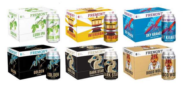
Fremont Brewing is recently announced its first major brand evolution since opening its doors 12 years ago in 2009. The refresh will update the visual look of the logo, can art, tap handles, website, marketing materials and merchandise. Each core beer brand was redesigned to be more distinguishable on a shelf, with clear beer-specific illustrations and color coding. The new packaging system highlights Fremont’s new wordmark, Fremont’s unique brand illustrations and names on both cans and box wraps.
“We have experienced phenomenal growth over the past 12 years across many styles of beer,” said Matt Lincecum, CEO, Fremont Brewing. “With this refresh we have created a new logo and wordmark that focuses our style into a packaging, website, taphandle, and beer logo universe that is cohesive. The refreshed look is an evolution, not a revolution, so our fans don’t have to worry; same delicious beer, just really cool new cans and box wraps.”
To celebrate its brand evolution, Fremont will be giving away a free pint glass when you purchase a beverage at their Urban Beer Garden starting, January 19th, while supplies last. Want to check out Fremont’s new look live and in person? Join them at the Urban Beer Garden on Saturday, January 23 between 12 and 9 p.m. for the release of the new packaging. Of course, any celebration deserves a new beer release, so to commemorate this momentous occasion Fremont brewed up evolution, a small batch, hazy IPA brewed with Mosaic hops that will only be available on draft at its Urban Beer Garden. Fremont’s Urban Beer Garden, located at 1050 N 34th St, Seattle, WA 98103.
Fremont is now the second largest independent craft brewery in Washington state and is available to hardcore fans at select accounts in eight states throughout the West, noting the vast majority of its beer is sold in Washington. Fremont partnered with awesome Portland-based creative consultancy, Parliament, on their brand evolution.
California’s New Glory Craft Brewery rebrands with Kansas City’s Carpenter Collective
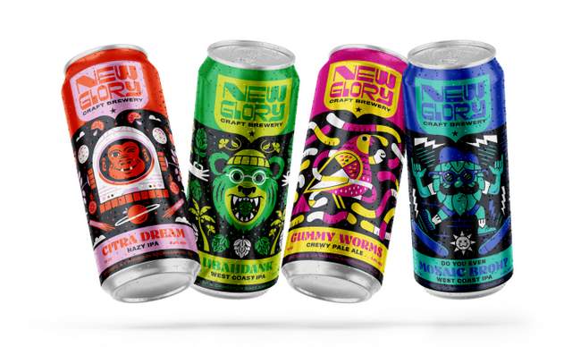
Sacramento’s New Glory Craft Brewery rolls out its rebrand this month with four new can designs for its year-round styles. The brewery’s new look is clean and fresh. Even though it is now one of the largest breweries in the Sacramento area, New Glory is made up of a small, daring and tightknit team with a penchant for pushing flavor paradigms. This family-owned business is refreshing its brand image with a completely new look.
At the start of 2020, New Glory enlisted Carpenter Collective, a nationally recognized design and branding studio based in Kansas City to bring a refresh to their “core four” beers: Ubahdank West Coast IPA, Citra Dream Hazy IPA, Gummy Worms Chewy Pale Ale, and Do You Even Mosaic, Broh? IPA. The new designs feature a cool California theme and they work as a system for a cohesive brand.
“This is the kind of project we get excited about! We loved bringing out all of the colorful, edgy, innovative, playful and urban attributes in this brand,” said Tad Carpenter of Carpenter Collective.
Each can boldly displays the New Glory logo and a clean, bright design paying homage to California. Ubahdank features a California grizzly bear as a hop-loving dude surrounded by California poppies, palm trees and hops. Gummy Worms Chewy Pale Ale displays colorful “gummy” worms with the California state bird, the quail, as its center icon. Do You Even Mosaic Broh? IPA includes an updated “hop broh” throwing up shaka hands and doing a kick flip while surrounded by surfer punk imagery. Lastly, the beloved Citra Dream showcases a bold space chimp (as used by NASA in 1960’s) floating amongst “California Dreamin’” VW buses in a citrusy space.
Look for these updated cans as they hit the market throughout January.
New York’s Blue Point Brewing revamps to be cleaner and leaner with Brooklyn-based Bardo Industries
It’s going to be a new year with a new look for Blue Point Brewing Co. in Patchogue, Long Island. The 23-year-old craft brewery is updating its logo and all packaging with a cleaner, leaner look that communicates its heritage with a pointed focus towards the future. Each beer in its core and seasonal series and all innovation brands are getting the refreshed treatment.
“When Blue Point went through a logo update and packaging refresh in 2017, we were playing catch up to the craft industry at that time — we were still using the original graphics from 1998,” said Blue Point general manager Carrie Shafir. “We have always been a company that prides ourselves on being forward-looking and innovative, and with this update that we are rolling out, we are finally getting back to that position.”
The brewery tapped Brooklyn-based design studio Bardo Industries to help give a “glow up” to the brewery’s logo and packaging system. The new logo reimagines the buoy and replaces weathered textures with sharp lines. The packaging system gives a clean and consistent look across SKUs and for an eye-catching billboard effect on the shelf. Labels, case wraps, and trade materials feature illustrations commissioned from artists around the world to reflect each brand.
“We moved into our brand new, beautiful brewery in 2018, which was a huge moment for the brand in that it was a major investment in our ability to brew a lot more quality beer,” Shafir added. “How we show up on the shelf wasn’t necessarily reflecting that. We needed a packaging system that was consistent and graphics that matched the quality of what is inside each can or bottle.”

Ballast Point Beer says
@BardoIndustries @BluePointBrewer @NewGloryBrewery @fremontbrewing @CODODesign 🙌 🍻
CODO Design says
@BallastPoint @BardoIndustries @BluePointBrewer @NewGloryBrewery @fremontbrewing Rebrands are goin… https://t.co/oDEr5OiAFQ