This piece was originally published on CODO’s Blog. Check it out to see the rest of the 2017 beer branding trends as well as dozens of others behind-the-scenes looks at brewery branding projects.
Summer 2017 finds us in an interesting time for craft beer. On one side of the industry, one new brewery is still opening every single day across the United States. On another side, headline grabbing acquisitions are causing people to reexamine what it means to be “craft.”
Our 2016 craft beer branding trends analysis featured a lot of design work that hinted at a brewery’s authenticity (hand-rendered elements, kraft paper, nostalgic, by-gone aesthetics, etc.). Now, the idea of authenticity itself is more of an overarching ethos. Not that it always wasn’t, but it’s becoming more important than ever as big beer continues its lumbering creep into craft’s personal space.
This manifests in many different ways; some subtle. Some not so subtle. And it’s an interesting way to view craft beer branding because beyond the surface level visual aesthetics, you’re able to see how someone is positioning themselves, and the story they’re trying to tell.
For this year’s review, we’re digging into some of the more pervasive visual trends we’ve seen throughout 2017 and then touching on some non-visual industry undercurrents that are driving the aesthetics themselves.
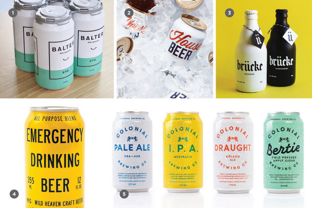
Ultra-clean and minimal (white space abounds)
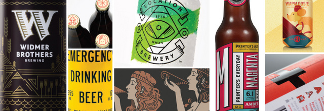
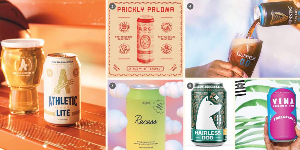
2017 has seen dozens, if not hundreds of breweries come to market with ultra clean branding and packaging. It seems as if we’re in an arms race to create the most reductive, simplified cans and bottles possible. This look is signified with a large amount of white space, one, or if you’re feeling snazzy, two colors, maybe an icon and some typography.
This stands out on a busy, illustration and color-heavy beer shelf — for now. This look is becoming so common that it will likely become the norm in a few years prompting a shift back to busier, more complex and illustrated packaging (you heard it here first).
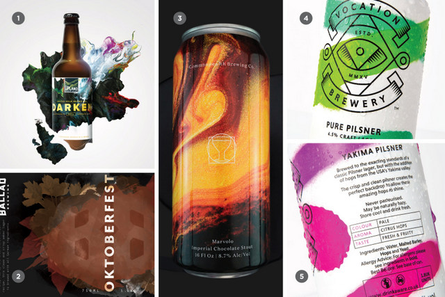
Painterly (swirly and colorful)
Swirly and colorful, this aesthetic creates sophisticated packaging. We’ve seen it implemented to hint at the mercurial element of a beer itself (a hazy IPA or crazy Brett experiment, for example), and we’ve seen it used to speak to the artistic side of brewing. This stands apart from your run of the mill craft beer branding, generally speaking to a more experienced consumer.
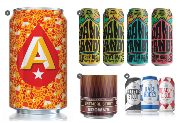
Patterning (a flexible constant)
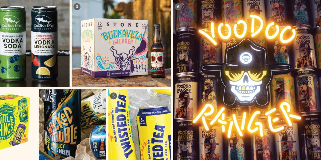
Patterning is a fun way of expanding your portfolio while not having subsequent releases look identical. Some breweries have embraced this for their flagship beers while most use it for specialty programs. You begin by creating certain constants — logo placement, beer name and style, TTB info, etc. Then, the background is completely up for grabs. This can be small and intricate or large and geometric. Either way, it’s a lively way of standing out from the previously mentioned minimal and clean packaging that’s beginning to dominate off-premise shelves.
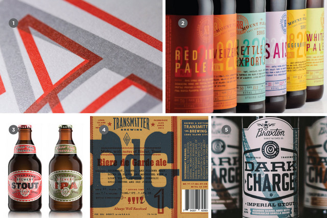
Layering (overlap-lap-lap)
This is more of a design technique than a trend, proper, but we’ve seen it so much over the last year that we felt it was worth discussing. Layering is when you purposely overlap elements on your packaging — typography, color swaths, etc. to create a rich and interesting composition. This can have a vintage feel (drawing inspiration from Hatch Show Print-esque gig posters) or ultra-contemporary (often being used in conjunction with the aforementioned ultra-clean and minimal aesthetic).
See the rest of the 2017 craft beer branding trends over right over here.
This piece was provided by the folks at CODO Design, a five-man branding firm based in Indianapolis, IN. They’ve spent years working with startup craft breweries on naming, branding and positioning, responsive web design, and package design. They’ve gathered their experience into a comprehensive Craft Beer Branding Guide to help startup breweries navigate the entire branding process. Learn how to brand (or rebrand) your brewery at www.craftbeerbrandingguide.com.


Leave a Reply
You must be logged in to post a comment.