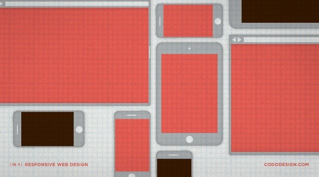
When I originally sat down to write this piece, I wanted to touch on the latest and greatest web design and development technology, but after sketching an outline, I figured that wouldn’t be very useful. Most of what I was going to write would be woefully dated within a year, if not sooner. So, rather than talk about the tenants of responsive web design, weigh the pros and cons of one content management system versus another and discuss social media API integration, let’s look at the web design process as well as what information you should be thinking about and prioritizing to achieve whatever goals you set out to reach.
Starting out, what should precede all of this is an art direction and branding process. More than just designing a logo, this process should aggressively position you away from competing breweries and solidify your brand essence. And in doing so, it will outline a look and feel for all other deliverables, be they merch, packaging, signage, advertising or web design. Once your brand foundation is in place, you can move on to the website.
Every design firm has its own process, and while there may be some tweaks here and there, they should generally be the same. For the sake of this article, I’ll run through our own web design process.
Step 1: Comprehensive site mapping and informative architecture
One of the most important steps in this entire process is determining what content (blog, beer descriptions, events, location lists, general about, social media integration, etc.) you need on your site as well as where it all belongs. This all takes the form of a site map which, along with user testing and your brand foundation, will drive design and functionality considerations through the next phase.
Step 2: Rough website design
Some people will make wireframes at this stage, though we never found them to be a useful tool. Wireframes act as a rough sketch to determine what content will go where (imagine a page with a bunch of boxes strewn about). Instead, using the site map, we move straight into sketching based on the outlined goals, art direction and brand foundation. We generally present the homepage and a few key secondary pages (as well as mobile breakpoints) to give you a sense of how the site will look and feel across different screen sizes.
Step 3: Revisions
After a direction is chosen, along with any feedback, the design is refined into a near final form. With responsive web design, we also lay out the site across various “breakpoints” — the dimensions (or display resolution) of various screen sizes between big screens down to tablets and mobile phones. These breakpoints are determined by analyzing user display data from a number of sources to decide which resolutions appear to be the most common currently and in the immediate future. Having a responsive website is extremely important because more and more people are experiencing your brand, and the internet itself, on mobile devices. Optimizing your site to be fluid across different screen sizes makes for a more pleasant experience and can increase sales.
Step 4: Developmental ‘DEV’ site
Once the design is approved, we begin to develop the site in a “dev” environment. The site is hidden from search engines and only the design team and yourself will know it exists. This allows the design team to refine and build a fully functional site before it ever goes live. One of the worst feelings in the world (for you, the site owner, and us, the designers) is when you get an email or tweet complaining about some bug someone found with your site. Building in a dev environment goes a long way to eliminate that issue with thorough browser compatibility testing and real time use by everyone involved. At some point nearing launch, we run your team through a tutorial so you know how to update the site content yourself, whenever you need.
Step 5: Site launch!
Once everything is ready and the dev site is squared away, we migrate that bad boy to the live URL for launch. After a boisterous round of beer and several platters of the most exotic meats and cheeses, we handle things like Open Graph data for Facebook and install Google Analytics so you can monitor your site’s success and determine potential avenues for future revisions.
Step 6: Monitor and service as needed
From here, your site is out in the wild telling your story, leaving you time to focus on more important things like brewing great beer and growing a herculean beard. With clean code and smart design, it’s rare that you’ll have any major issues. However, sometimes small elements on your site can break. If this happens, don’t panic — we’ll get it fixed immediately.
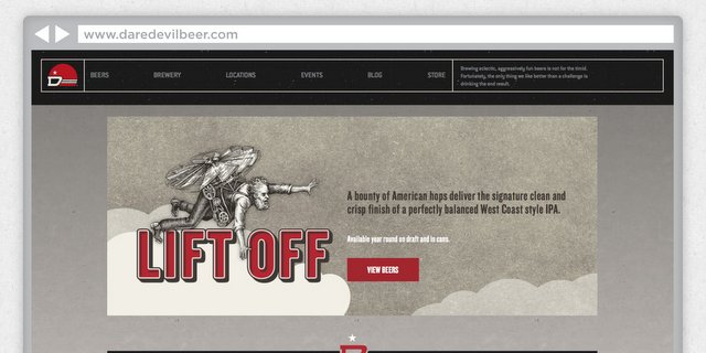
It’s also good to regularly review your analytics to see how people are using your site. Is there a page that gets no visits? How about one that people spend several minutes on? Maybe there’s a call to action that’s not working as we had planned? This information can guide future content and design revisions. We recently launched Daredevil Brewing Co.’s site using this process. Check it out and let us know if you’d like to discuss your own website!
Other Thoughts
A note on content management systems
As recently as a few years ago, businesses often had to pay design firms to update their site’s content. Adding a new seasonal to your beer page? An hour of billable time. Adding a new employee’s bio? An hour of billable time. Those days are largely gone, due to the rise of content management systems (CMS). We’re big advocates of WordPress and build nearly every website [LINK TO: http://cododesign.com/category/web-design/ ] that comes though our studio’s doors on its robust, user-friendly backend. [Editor’s Note: The site you are looking at right now was built using WordPress.]
A note on templates vs. custom-designed sites
I won’t lie and say that every brewery in the world needs a fully custom-designed website. Sometimes, a template can be a perfect solution for your design problem. However, templates can be a double-edged sword — while they’re relatively cheap (or free, in some cases) and easy to get up and running, there’s nothing to stop a brewery (or bistro, or barber shop, or sad cash-for-gold kiosk) down the street from using the same one. If the goal is total differentiation, your site should further this notion, rather than hinder it.
From your perspective, as a design buyer, make sure to ask whether or not your design firm is going to use a template. Again, while using a template may be a good solution for you, paying a design firm an absurd amount of money to “skin” one is borderline unethical and definitely unnecessary.
A note on user research
User research is an important step that happens during the site mapping and information architecture phase. There are many ways to go about it (which could comprise its own article), but suffice it to say that asking how your audience will use your website can drive many of your decisions.
This column was provided by the folks at CODO Design, a five-man branding firm based in Indianapolis, IN. They’ve spent years working with startup craft breweries on naming, branding and positioning, responsive web design, and package design. They’ve gathered their experience into a comprehensive Craft Beer Branding Guide to help startup breweries navigate the entire branding process. Check it out at www.craftbeerbrandingguide.com.

Jack Arthur liked this on Facebook.
Six steps to creating a responsive website design for your craft brewery! – http://t.co/dJVyCplWfK
Isaac Arthur liked this on Facebook.
RT @CraftBrewingBiz: Six steps to responsive web design for craft breweries. Great article @CODODesign — thanks guy http://t.co/rx6UIuMBoN
Six steps to responsive web design for craft breweries http://t.co/dCGzlYT1ro via @craftbrewingbiz
Brew & Be Covered – Texas liked this on Facebook.
RT @CraftBrewingBiz: Six steps to responsive web design for craft breweries. Great article @CODODesign — thanks guy http://t.co/rx6UIuMBoN
Steve O Garcia liked this on Facebook.
Six steps to responsive web design for craft breweries http://t.co/VJGw5Jy059 via @craftbrewingbiz
Greg John Kevin …