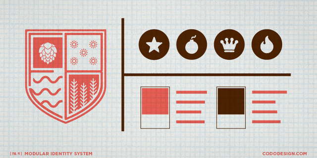
Have you ever heard of a “Brand Identity System,” “Modular Identity System” or a “Logo System?” Whatever the phrase, the key word here is “system.” If you’ve been following our series on how to brand and position startup craft breweries, you already know that your brand is more than a logo. You know your name, identity and package design all need to reflect a compelling, core brand essence. Assuming all of this strategic brand foundation work is in place, let’s get down to the nuts and bolts of how to actually put your brand identity into play.
To start, your logo (a.k.a., identity) needs to be flexible enough to use across any print and web applications you may run into. It needs to be as recognizable and reproducible in one color as it does on your website or tap truck. I won’t dive into raster vs. vector file formats, but suffice to say that the design firm you partner with needs to give you vector files. These are infinitely scalable without losing detail, meaning your identity will look as crisp on a business card as it does on a billboard.
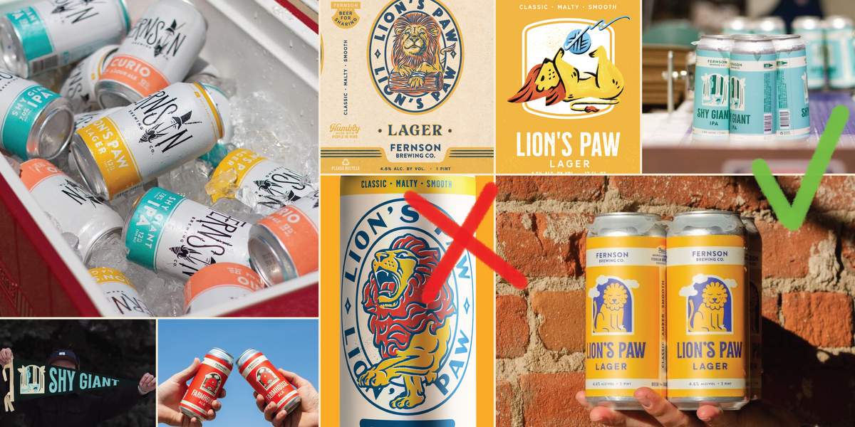
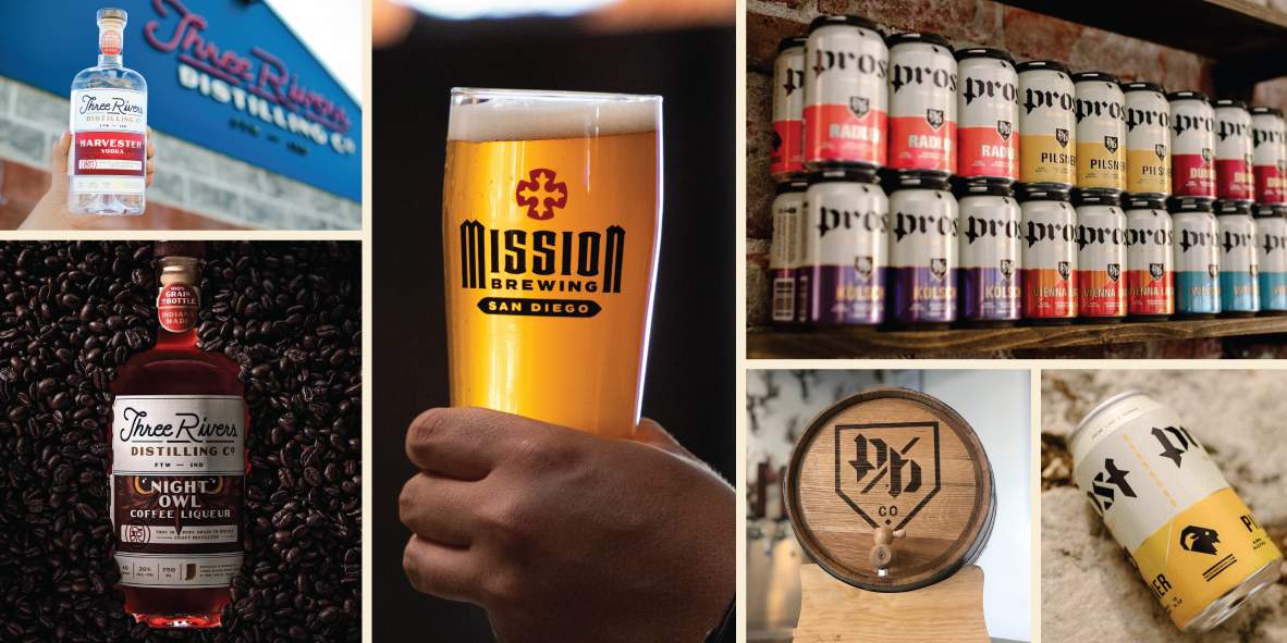
An “identity system” is a suite of visual elements that can be used across your brand’s touchpoints. These can include a main logo, alternate logo builds (horizontal and vertical builds, for example), icon system, textures, typography and a specific color palette. Used smartly, these elements keep your branding fresh (not repetitive) and fun across different pieces while still being consistent and familiar.
Some examples of how these different components can be deployed include things like the main logo on the front of your beer can with supporting typeface, describing the beer and style. Maybe there’s a small, secondary icon on the back of the can as well. That same icon can be used as your Facebook and Twitter avatar or your site’s favicon, for that matter. The typeface from your can should be used (along with the main logo) on promotional posters that hang in bars and liquor stores. Maybe you use the icon for the tap handle design since it can be blown up larger than the main mark itself. And all of these pieces are further tied together through color and texture. While all of these examples are made up, the main takeaway is that you’re not stuck with one logo that you have to use for everything.
This approach also comes in handy for merchandising. Some folks may not want to buy a shirt emblazoned with a big logo, but a more subtle shirt with a cool icon on it may outsell your session IPA. Well, hopefully not. But you get the idea.
This column was provided by the folks at CODO Design, a five-man branding firm based in Indianapolis, IN. They’ve spent years working with startup craft breweries on naming, branding and positioning, responsive web design, and package design. They’ve gathered their experience into a comprehensive Craft Beer Branding Guide to help startup breweries navigate the entire branding process. Check it out at www.craftbeerbrandingguide.com.

RT @CraftBrewingBiz: Keep your brand/logo design fresh and consistent with a Modular Identity System http://t.co/xiKnaqGDPq #sundayreading
RT @CraftBrewingBiz: Keep your brand/logo design fresh and consistent with a Modular Identity System. @CODODesign http://t.co/hc2LpOFrm6