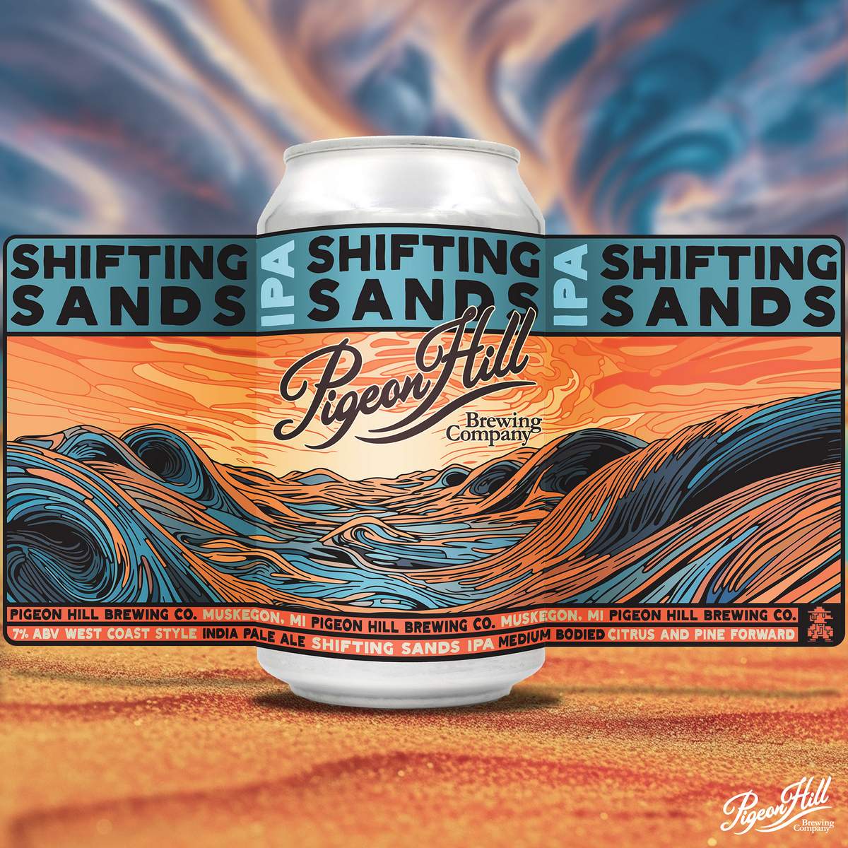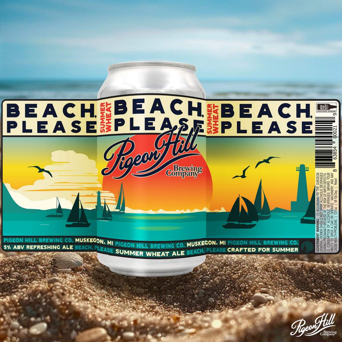
Muskegon, Michigan-based Pigeon Hill Brewing Co. recently announced a grand redesign of its core brand labels, impressing all of us here at CBB and marking a significant milestone in its evolution as a company just in time for its 10th anniversary. Over the past decade, Pigeon Hill has experienced a lot of growth and transformation as a company. In keeping with this journey of self-discovery, the brewery has embarked on a bold new era for its labels.
“We’ve grown up as people and as a company, and it’s time for our labels to grow up with us. This redesign is about maturation, but most importantly it’s a maturation that allows us to embrace our misfit nature and stay true to who we are. At the end of the day, we’ve figured out how to put on dress shirts when we have to, but we’ll always be goofballs at heart. We wanted our new labels to capture the same feeling for our beers,” said Michael Brower, Chief Brand Officer at Pigeon Hill.
Art has always been at the heart of Pigeon Hill’s ethos, and for the label redesigns, the focus has been on creating a basic format shared across all core brands, allowing for individuality while maintaining a cohesive identity. The spirit of each beer has been considered, with the brewery asking what type of art each beer would want and which artists’ styles the beer might be drawn to.
To achieve this, the brewery has incorporated artificial intelligence into the creative process. Despite initial reservations, Pigeon Hill recognizes the potential of AI as a powerful tool for discovery and unleashing creativity. Through the use of AI, Pigeon Hill’s team is able to create hundreds of concepts and iterations for each label, with their imaginations as the only limiting factor. Each selected concept is meticulously hand-drawn, reviewed, and critiqued by the brewery’s team, undergoing multiple iterations until the final product perfectly embodies the essence of the beer.

The first two label redesigns to be unveiled are for Shifting Sands IPA and No Diggnity Juicy IPA. Shifting Sands, inspired by the movement of sand in the namesake Pigeon Hill dune, features a design reflecting the abstract intermingling of sand, water, and wind — all with a grassroots music feel intended to capture the spirit of evenings spent enjoying music on the beach. No Diggnity, to be unveiled in the next week, pays homage to the film “The Goonies,” and boasts a brighter, less dignified vibe, capturing the spirit of bold brightness associated with the 1980s.
Shifting Sands and No Diggnity cans with the new labels will be progressively released throughout Michigan over the next month. Pigeon Hill’s remaining core lineup, including SCP, Beach Please, and OCP, will follow suit with fresh new labels, showcasing the brewery’s commitment to creativity, innovation, and the celebration of individuality. As Pigeon Hill Brewing continues to redefine its visual identity, beer loves throughout Michigan can anticipate a sense of discovery with each new label unveiling.


Leave a Reply
You must be logged in to post a comment.