While the most important element for any craft brewer is of course the beer, what you package it up in is undoubtedly (almost) as important. Craft brewers have never been ones to shy away from bold, quirky and out there packaging and the design trends set to shape beer packaging in 2021 are no exception.
Whether cans or bottles, craft beer labels are almost always thoughtfully designed and therefore competition (in flavor AND design) is always hot. So, whether you’re thinking of giving your brand a refresh or un-kegging a whole new product to the world in the new year, why not try tapping into some of the year’s biggest packaging design trends to stand out in the fridge.
Story-driven packaging featuring irreverent characters
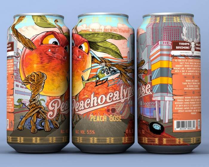
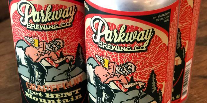
Beer brands tend to do mascots really well, and in 2021 we’re going to be seeing a lot of packaging that takes this to the next level. Storytelling is a key part of any good branding – done well it can communicate who you are, what you stand for and target your ideal customer. This trend applies this part of the branding process quite literally, evolving standalone characters into comic-book-like scenes to help convey a brand’s personality.
From the irreverent characters on the side of Virginia-based Parkway Brewing’s range of brews (seen at top of page) to a Peachpocolypse landscape on the cans from Yampa Valley Brewing Co in North West Colorado – these designs leave you feeling like you’re holding a page of a graphic novel in the palm of your hand.
Product names front and center
Another of the biggest packaging trends we’re seeing for craft beer in 2021 is design that places product names front and center.
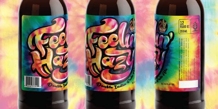
The reason this works so well for independent and craft breweries is this design style is great for product-focused businesses looking to increase brand awareness. While drinkers may not (yet) be familiar with a particular brand of beer, by straight up telling them what to expect when they crack one open, you can assure them that trying something new is going to pay off.
Whether that’s simply telling them it’s a stout or an IPA, or whether your products have unusual and quirky names, it’s also a great way to showcase a bit of your brand personality and flair through strong typography.
2Row Brewing from Utah makes the product name the star of the show with its Feelin’ Hazy NEIPA, using tie dye colors and psychedelic feeling font to let buyers know they’re in for a ‘wild, juicy ride.’
Anatomical ink drawings
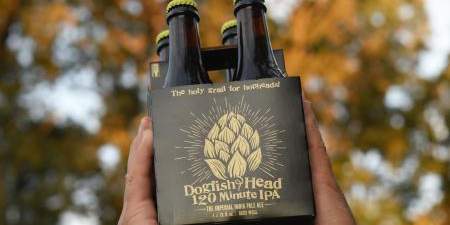
In the new year we’re also going to see some super technical and precise illustrations grabbing our attention on beer labels. While these are much more pared back designs than some of the other trends on our list, there’s a lot more to them that first meets the eye.
The incredible detailing of these designs makes them look as if they were sketched by hand, and is a perfect match for the craft beer industry: the technicality of the drawings reflects the art and care that goes into the brewing process itself.
Dogfish Head Craft Brewery from Milton, Delaware recently brought back it’s 120 Minute IPA with new packaging featuring a detailed drawing of a hop which looks like it was painstakingly illustrated with a gold ink pen.
Organic shape color blocking
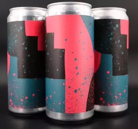
Color blocking as a design trend has been around for a while. We’re used to seeing bold blocks of color catching our eyes on all kinds of packaging, but next year’s trend takes it to a new place and gives it a much more fluid feeling.
In 2021, gone are the precise lines and solid colors and instead we have softer, more uneven shapes, new textures and unique color combinations. Eighth State Brewing from Greenville, South Carolina uses unbalanced, uneven collages overlayed with paint spray effects to create a much unexpected look and feel on the labels of its range of fruited sours.
Your label design is crucial for setting you apart from the rest of the beer on the shelf and pulling the customer’s eye directly to your product. But it’s also so much more than just about capturing their attention – it can give drinkers a glimpse into what they can expect when they take the first, refreshing sip of one of your lagers, ales, porters or stouts. You could have the world’s best beer, but if you don’t have the packaging to match, you’re going to miss out on finding new customers in 2021.
# # #
Shayne Tilley is Head of Marketing at 99designs.


[…] One of the simplest ways to build brand and product awareness is by highlighting the product’s name. […]