This column was provided by CODO Design, a food and beverage branding firm, and authors of Craft Beer, Rebranded. If you’d like to discuss your brewery’s branding, shoot Isaac an email anytime: [email protected]
Hi there. This is an excerpt from a 9,000+ word piece that was originally published on CODO Design’s site. Read the rest of the 2020 Craft Beer Branding Trends review over there: https://cododesign.com/2020-beer-branding-trends/. A brief prelude:
We wrapped up our 2020 craft beer branding trends review the first week of March. Leading up to that week, in the background since early January, was the steady drumbeat of COVID-19. It wasn’t an issue though. Like some horrible disaster that befalls the other side of the world — it was heartbreaking to hear about, but ultimately hard to empathize with because it was so. far. away. But it drew closer and closer, eventually posing a very real threat to — if not your life — likely the life of someone you love, as well as all of our livelihoods and the ability to provide for our families.
I know you didn’t come here to read about COVID-19, and I definitely don’t want to talk about it any more myself. But the thought of publishing this year’s beer branding trends piece when so many of our close friends and clients in the industry are fighting for survival without even mentioning the current state of affairs could seem tone deaf.
We had considered rewriting this piece entirely to focus on the cool pivots we’ve seen over the last few months — the breweries-turned-grocery-stores, the hand sanitizer being produced, the relaxing of distribution laws and home alcohol delivery seen around the country. But we just don’t have the energy.
This has all been disheartening. As a father, and a husband, and a son and a small business owner. It has been terrible. I don’t need to tell you — it’s been bad for all of us (the fact that I’m sitting in my home office writing about craft beer branding, of all things, should be sign enough that I shouldn’t complain too much).
Anyway, back to the point. Aside from this brief prelude, we’ve decided to publish our 2020 craft beer branding trends review completely as is. It’s frustrating that as of just 10 weeks ago, everything we say here was accurate and actionable. Now? Who knows? Consider this a time capsule from the before times? Or, if you’re more optimistic (like I’m trying to be), consider it a high mark that we can all work together to regain once the world is back in order.
Stay safe out there. Stay strong. And stay positive.
Isaac Arthur, CODO Design
::::::
We first started writing about and defining craft beer branding trends back in 2016 as a natural extension of the work we were doing every day. We began working with breweries in 2010 and have been on the road ever since, helping brewers, owners and operators with their foundational branding and rebranding. This field work gave us a macro view of the industry — on a daily basis, we were surveying (and drinking) our way through hyper-local, regional and national competitive sets in markets all across the country. All of this work, coupled with well-curated beer-centric design blogs — as well as attending and/or speaking at dozens of state brewers’ conferences — made it fairly easy to pinpoint the different aesthetics that would arise each year.
It was gratifying to see a rise in the overall level of branding quality as the industry began to flourish, hitting its stride somewhere between 2014 and 2016. The space was growing so fast at that time that one year, most of the new packaging you’d see would be heavily illustrated and story-laden. Then, the winds would shift, and ultra-minimal packaging would become the norm the following year. One group of breweries would release ultra premium beers while another group was doing everything they could to be positioned alongside cheaper macros. Through all of this, branding and packaging were shifting to communicate to consumers exactly what a brewery is about, and exactly why you should drink their beer.
Beer branding trends used to be easy to call out. But with 8,000 breweries open at the start of 2020, there really is too much beer being packaged to identify clear cut visual trends like we have in years past. There are, of course, still cool things that pop up from time-to-time, but these aesthetics no longer rise to prominence and influence the rest of the industry like they did even four years ago.
So instead of a yearly trend roll call, this year, we thought it would be valuable to review the last decade of craft beer (it is 2020, after all). We’ve decided it would be best to identify the most staying and pervasive branding and packaging trends of the era. These are the ones that have been there since the early days and spawned hundreds (even thousands) of lookalikes as the years went on. They are the aesthetic markers that define the craft category.
After that, we’re going to walk you through the broader movements, branding and otherwise, that are shaping the industry today from our perspective. And to wrap this up, we’ve reached out to clients, colleagues, friends and thought leaders from all three tiers of this industry in the United States and abroad (including China, Argentina, Australia and Canada) to find out what they’re seeing in their neck of the woods.
Let’s kick off by reviewing the most important branding trends of the last decade.

Nostalgic Regional
Then was better than now
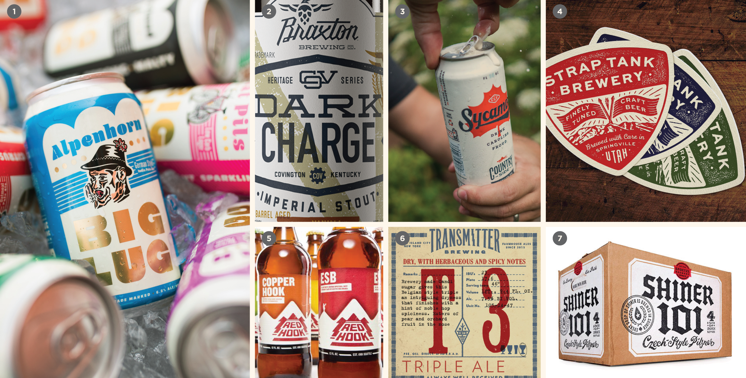
This branding and packaging trend stems from the earliest days of the craft beer boom as breweries were bringing back the well-worn romance of locally-produced beer. All across the country, people were rehabbing old warehouses, auto shops, and various other buildings (sometimes, even spaces that had, in another life decades before, housed a brewery) that had sat dormant for years. Visually, this was all wrapped up in nostalgia to speak to the brewery’s authenticity, or to lend a sense of provenance.
We view this movement in line with the zeitgeist; large swaths of Millennials (and their older, like-minded counterparts) are boycotting the globalization and offshoring practices that come with supporting Big Box stores, faceless corporations and macro beer itself. This movement, coupled with one of the longest periods of economic prosperity in American history (following the 2008 housing crisis), have set the stage for craft beer to flourish.
Visually, this can take any number of directions, but the key point is that it looks “old” and established (though we’ve predominantly seen 1940’s through 1970’s as the main period of influence). It can look like an authentically old brand, or a contemporary reimagining of something old. It tends to be tactile and blue collar, often evoking a mostly bygone industry, e.g. automotive, manufacturing, lumber and agriculture.
This positioning works because beer is, historically, a blue-collar product. It also works because of nostalgia: it harkens back to a “Golden Age” (real, imagined or both) where deals were done on a handshake and good breaks came easier. Logically, we know that the past wasn’t perfect: but this aesthetic addresses the nagging feeling that things used to be just a little bit better.
Regional Powerhouse
Using branding to punch above your weight
In the early days of craft beer, the very notion of investing in any sort of professional branding was anathema. It meant that you weren’t “authentic” or “craft.” We even had one brewery-in-planning tell us that “branding is for people who can’t make great beer” (ouch; shockingly, they never opened). The misconception that appearing too “professional” or “corporate” would risk credibility amongst the diehard craft fan took hold in this era. This stigma created an opportunity for larger regional and nationally-distributed craft breweries to start investing in their branding, packaging and marketing — and to reap the sales and ROI that came with it.
Today, this approach is table stakes.
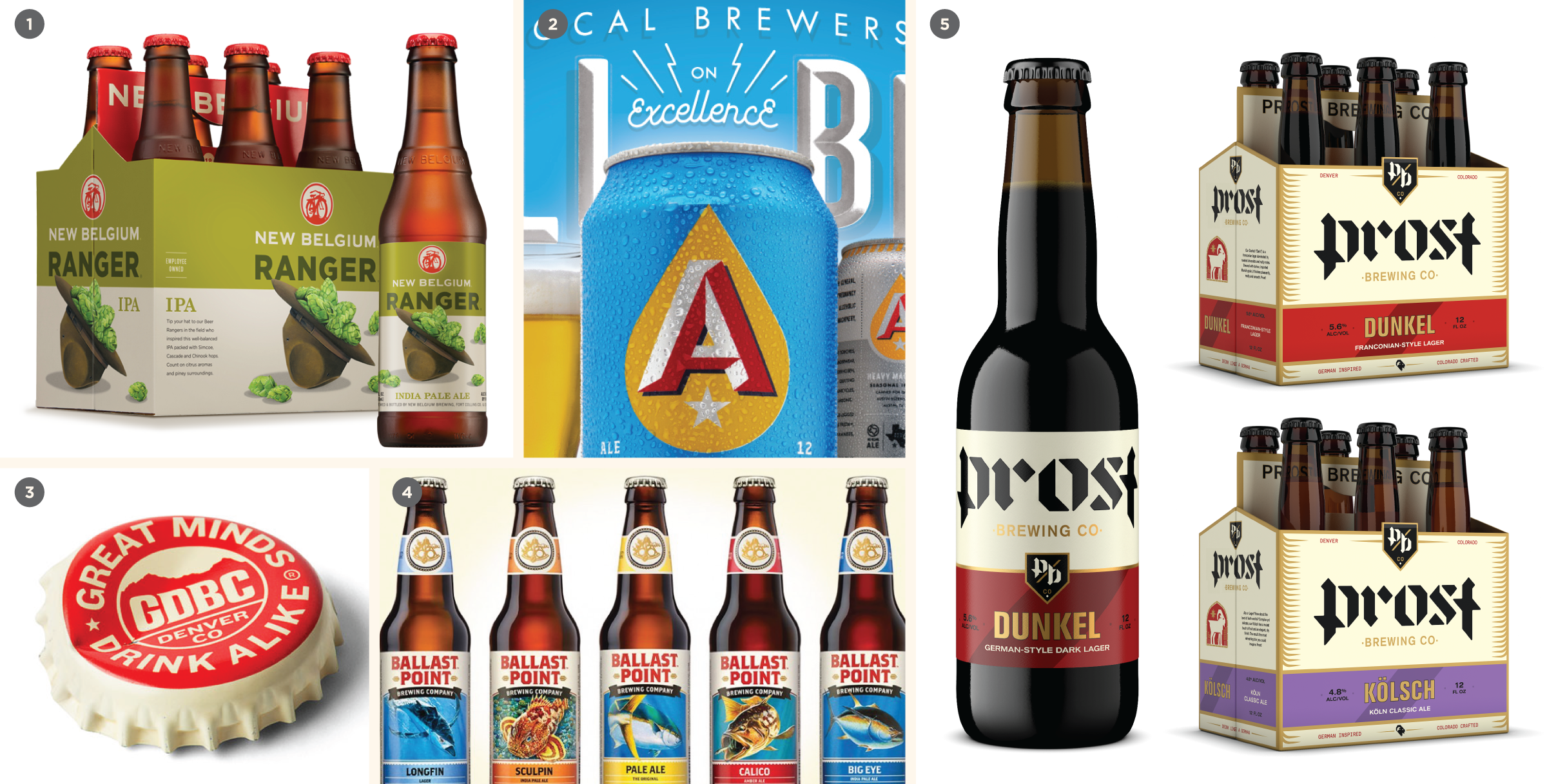
We first defined this trend in 2016 as simply having a cohesive, consistent packaging system on shelf. I think this is indicative of how far then craft beer industry has come since then. Like clockwork, our start-up clients would point to breweries like Rhinegeist, Ballast Point, New Belgium and Modern Times as brands they revered and to some degree, wished to emulate. These brands served as the ultimate examples of the regional powerhouse aesthetic on shelves. These days, even small outfits founded on shoestring budgets know that they need to hire a designer for their foundational branding. New breweries are coming out of the gate with thorough go-to-market strategies, often building their portfolio around gaps in the market. Overall, the industry is getting much, much smarter on matters of design and branding.
Bifurcation
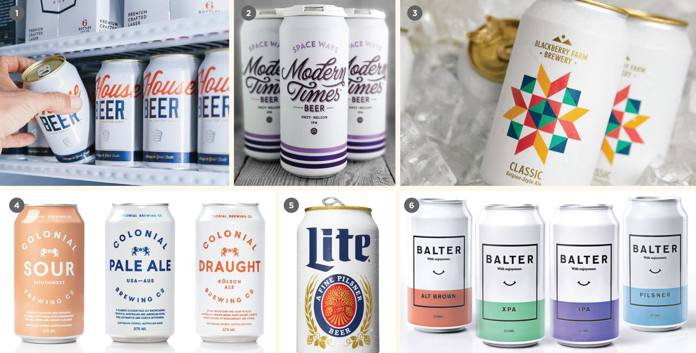
Color for SKU differentiation
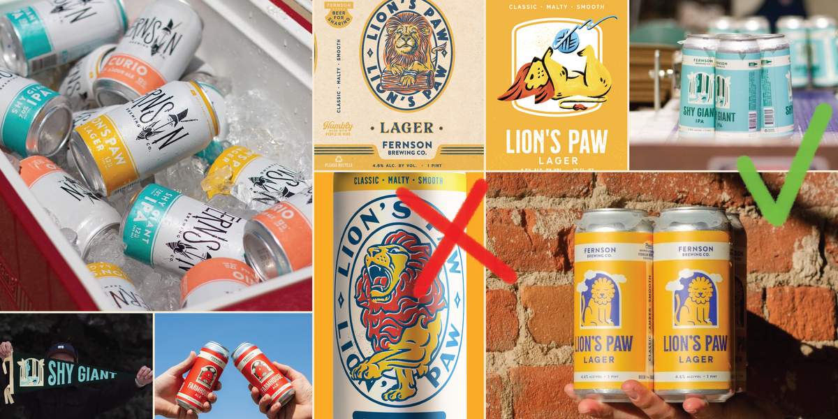
This has been one of the most pervasive design trends of the last decade, rising to prominence as more breweries-in-planning embrace branding as a competitive advantage out of the gate. And it’s so ubiquitous that no one brewery really “owns” the look.
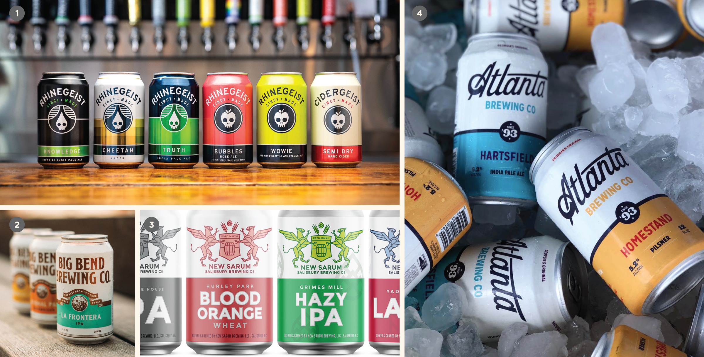
In that sense, it overlaps with the “Regional Powerhouse” trend in that it emphasizes a clear design system for customers to look for in off-premise settings. From a pragmatic standpoint, it makes sense for production breweries who are building portfolios around flagships and a few seasonal/specialty beers throughout the year. You start with a base template (logo, beer name, typography) in a consistent layout across each SKU. To differentiate between these, you simply switch a color out for each brand (IPA is green, Porter is blue, etc.). This is an effective approach because it pushes the brewery brand more than specific styles, ensuring that no matter what SKU people see on shelf, they’ll be presented with your brewery’s brand first and foremost.
It’s cheap and easy to reproduce across multiple SKUs (you can often kick out new cans in-house without paying heavy design fees after the fact), and it lends itself to billboarding , where the consistent packaging creates a contiguous “band” of space on shelf. This is particularly valuable if you don’t use an over-box or carrier for your beer (e.g. 6-pack of cans in a PakTech), because it gives beer buyers a big area to draw their eyes, versus a 6-pack that has been shoved haphazardly into a cooler, where facing issues are already a problem.
Some downsides of this approach? It has been done by hundreds (and hundreds) of breweries across the country. To be fair, your local competitive set should dictate just how negative this “negative” really is (two similar cans in different states that will never overlap in distribution aren’t that big a deal). Additionally, if you don’t properly iron out how your seasonal/specialty beers relate to the flagship packaging, and instead just make them all fall under the same template, you risk undercutting what makes a seasonal beer special in the first place. They’re new, rare, and they might not be here tomorrow — so they likely should stand out from your flagships in some fashion.
This approach is so emblematic of craft branding that we often have clients in other industries want to adopt it for their portfolio, including cannabis, kombucha, RTD cocktails, craft soda and seltzer.
Bright White & Minimal
Less is more
These were initially two different trends (to wit, you can be minimal without having an all white can) but have increasingly blurred together over the last few years.
As a general rule, it’s important to look at your immediate (local) competitive set when developing your branding and packaging. Or, whatever context makes sense for your brewery, be it regional, national or beyond. All this said, a stark white can does tend to cut through the visual noise of today’s beer shelf. This doesn’t mean it’s going to automatically sell. But getting noticed is a crucial first step to the overall beer-buying experience.
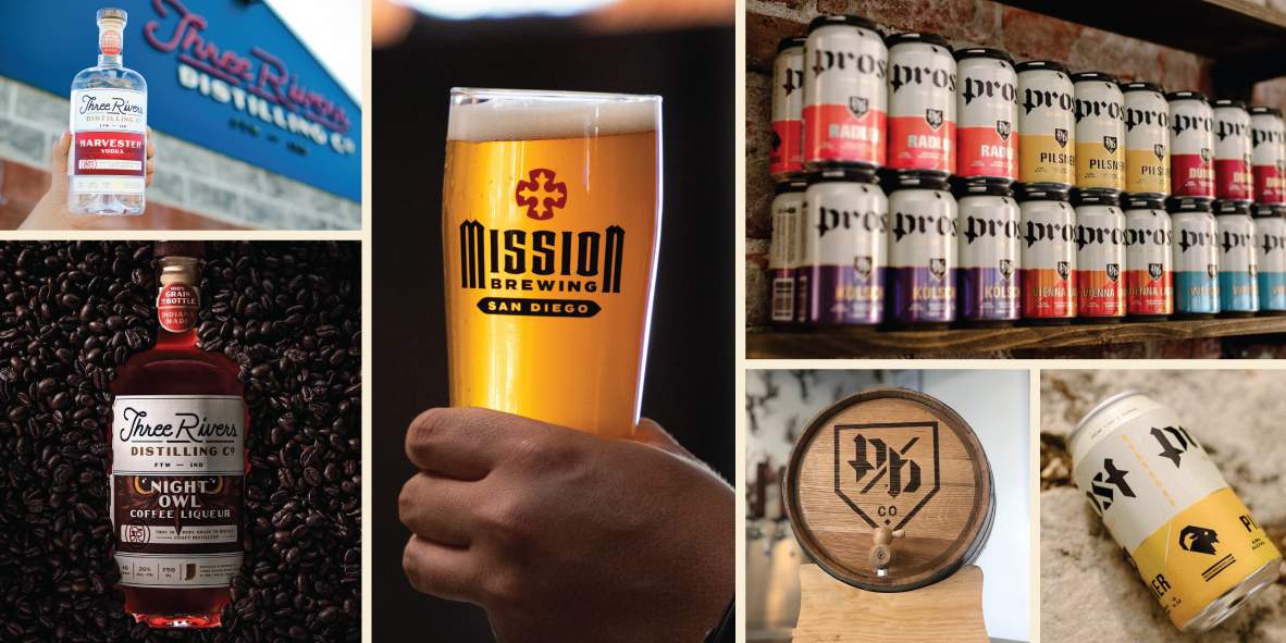
There’s a fine line here — too minimal and you come across as generic or store brand. Not minimal enough and you lose the clean design that stands out from busier packaging in the first place. The power of this trend comes when you combine it with other important elements (a beautiful brand identity, a deliberate use of color and typography, tactile production techniques, a delightfully classy gold top, etc.). In these cases, it can be a magnet for people’s eyes.
Thickly-Illustrated
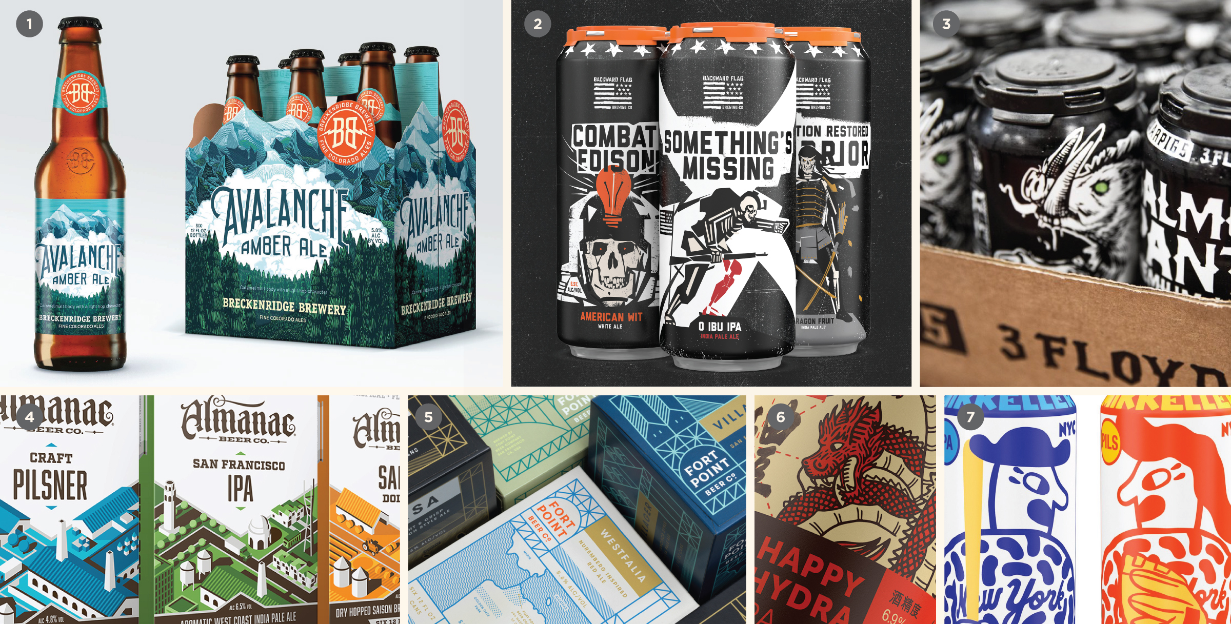
Lush and detailed
Calling out illustrated packaging as an all-decade trend is fun because it actually stems from the earliest days of craft beer — think Flying Dog or Sierra Nevada in the 90s. A lot of this early packaging isn’t necessarily “good” by today’s design standards. More often than not, these early illustrative examples evoked the idea that your “nephew who can draw good” made your packaging. Authentic? Yes. Bad? Who cares? It was the nineties — this shit didn’t matter back then.
Over time, this approach became a way to showcase your brewery’s personality and world view. Lifestyle and visual style-wise, it doesn’t have one distinct flavor. It can lean on death metal iconography, tattoo culture, outdoorsy stuff, frilly and ornate, simple, low-brow, high art, and everywhere in between. The main point is that illustrations are core to the package design.
When done well, this look can be arresting. It can just as easily become a hot mess. It’s been interesting to watch over the last five years as more and more breweries began leaning more towards clean, minimal packaging, heavily-illustrated packaging would go from blending in on shelf to standing out again. This back-and-forth swing will likely continue as long as there are breweries putting out new packaging.
Maximalism (& Minimal Branding) + Pressure Sensitive Labels
Is scarcity an adjunct?
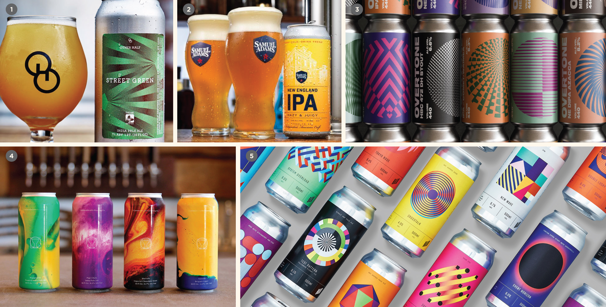
The “minimal branding” look was pioneered by a few popular breweries (e.g. Other Half, Cloudwater, Omnipollo) and is almost always identified by a 16oz bright can wrapped in a colorful pressure sensitive label that is, in some cases, completely devoid of branding (namely, a big brewery logo).
This was kicked into high gear as “Rotation Nation” gained steam and Juicy NEIPAs became the style du jour (~2017). Now, you don’t just have a beautiful can to boast on Instagram, but you also have a gorgeous glass of what appears to be extra pulpy orange juice (or, beet juice?). This trend soon gave way to the oft-confusing world of hype beers, whale hunting and the ISO secondary market.
Pressure sensitive labels played an important role here as well. What started out as an affordable (and often necessary) way of bringing cans to market, a label slapped on a can soon became canon for these sorts of in-demand beers. It was beer as art and spoke to the ephemeral nature of the release — this is a limited run, possibly only available at the brewery. And once it’s gone, it’s gone. For our favorite example of how this look is so emblematic of juice bomb IPAs, look at Sam Adams’ New England IPA can that is printed to look like the pressure sensitive labels that define the style.
Will this aesthetic approach work for every brewery? No. But as the industry matured over the last few years (and shifted, and hit growth spurts and road blocks all in the same period), this style is indicative of an entire era of American craft beer where shelf space is never guaranteed, consumer attention is fleeting and there’s no one-size-fits-all branding approach.
::::::
Read the rest of this piece over at: https://cododesign.com/2020-beer-branding-trends/
Snapshot: we review the last decade of beer branding and name the most pervasive and staying trends of the era. Then, we dive into what we’re seeing just beyond the visual front to talk about broader industry trends. And finally, we’ve reached out to industry experts at all 3 tiers and from around the world for their take on what’s happening today.
Craft Beer, Rebranded (and its companion workbook) are a step-by-step guide to help you map out a successful strategy for rebranding your brewery. Based on CODO Design‘s decade of brewery branding experience, this book will help you weigh your brand equity, develop your brand strategy and breathe new life into your brand. Whether your brewery is three years old or 30, Craft Beer, Rebranded is your guide to attracting new audiences, selling more beer and positioning your brand for the long haul. Read and buy it now at: www.craftbeerrebranded.com

Leave a Reply
You must be logged in to post a comment.