This piece was provided by CODO Design, a branding firm based in Indianapolis, Ind. They’ve worked with breweries across the United States and around the world, on naming, positioning, branding and rebranding, responsive web design, and package design. If you’d like to discuss your brewery’s branding, shoot Isaac an email: [email protected]
To read this entire post, head over right here.
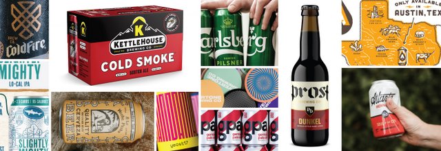
When our team first sat down to map out this year’s craft beer branding trends, the conversation quickly ballooned into several full whiteboards and the frustrating refrain, “So, everything is a trend, then?” And there’s something to that idea. From a strictly aesthetic standpoint, it’s harder than ever to call out specific visual trends, considering there are 7,000+ breweries in the United States, all constantly jockeying and innovating to grab consumer attention.
Visiting a crowded liquor store or grocery set lends little clarity to the conversation. Nor does the absurdly fast rate at which beer styles are now rising to national prominence — and the even faster rate at which breweries shift their distribution and sales models to accommodate. With so much going on at the same time, one could make the (not entirely useful) argument that everything is, indeed, a trend.
This being said, we have noted several specific visual trends that are cool, beautiful, or otherwise interesting to look at. Beyond this analysis, there is important stuff happening just behind the aesthetic front. What are the machinations that are driving such continual, fast-paced change in the beer industry? How does this turnover effect visual styling, and what does this all mean for 2019? Perhaps most importantly of all, how might you apply these ideas to your own brewery’s storytelling?
Let’s begin by discussing a few of the visual trends we’ve seen rise in prominence this year.
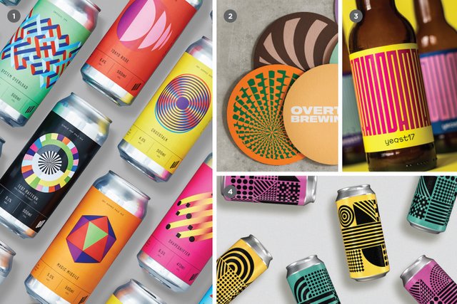
Maximum design, minimal branding
This is awesome! Wait, who made this again?
This colorful styling took root as a way to denote a brewery’s special releases by seeking to stand starkly apart from core flagship packaging. Originally, this created a one-off sense of “beer as art” — often signifying an extremely experimental beer, or a limited release that stands apart from business as usual. We are now noticing that smaller/younger breweries are applying this approach to their core/flagship offerings, for better and for worse.
Such an approach produces vibrant cans that leap off the shelf with incendiary full-scale patterning, vibrant color and few (if any) branding elements to clutter things up. But this abstraction cuts both ways: without careful implementation, customers are left with no idea who made the beer, or (perhaps more concerning) are easily wooed away by upstart competitors who will inevitably release similar style-driven packaging.
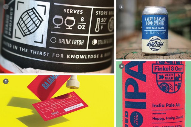
Gridded
Everything in its place
This regimented, organized approach to information design is sure to satisfy your inner neat freak. As craft breweries grow and evolve, the methods and context behind the production of beer become more complex. What started as a mere refreshing beverage can quickly morph into a history, geography, chemistry and sociology lesson—all rolled into one. This makes a lot of sense: on the other side of the equation, consumers are increasingly interested in growing their knowledge and seeking a deeper understanding of the beer they love so dearly.
The “Gridded” approach is an efficient way to convey a wealth of information without overwhelming the eye. We see this executed in a variety of flavors, be they mechanical/engineering focused, influenced by historical apothecary ledgers, or even borrowing from mid-century comic book design.
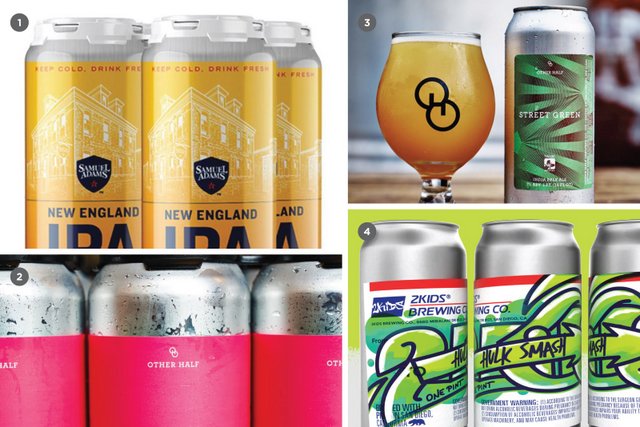
Pressure sensitive
We can’t stop here — this is Rotation Country
At some point over the last several years, a pressure sensitive label (essentially a waterproof sticker) applied to a brite can became the official trade dress of nimble craft breweries everywhere. It’s easy to see why: smaller players can’t afford truckloads of printed cans, let alone warehouse them. Plus, what happens if the beer destined for those cans loses sales velocity in the meantime? The pressure sensitive label has given these breweries a quick, no-minimum platform that remains affordable and looks decent on the shelf.
Standard for the ubiquitous Hazy NE IPA (and increasingly Brut IPAs or mixed fermentation beers), the pressure sensitive label has become emblematic of something special and ephemeral. This beer is fleeting, grab it now—because it might not be here tomorrow. It has now become such a marker for “cool NE IPAs” that Sam Adams even faked it on their printed NE IPA cans for a period of time. That’s correct: at one point Boston Beer Co. direct printed their cans to appear as cheaper pressure sensitive labels. We see you, Koch!
Gold
All that glitters
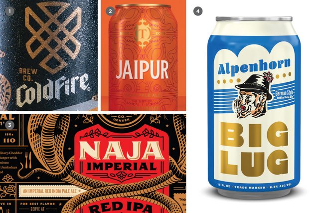
This just in: CODO Design’s hot beer branding trend to watch for in 2019 … “Gold!” Sorry. I know calling out a single color may not sound like a major trend, but we’ve seen it all over the industry from small to large breweries, on cans and bottles, printed and embossed with metallic foil — even adorning beer brewed with gold flakes, Goldschläger style. It’s everywhere. Maybe it’s an echo of the Gilded Age revival of the early 2010s. Maybe it’s a throwback to old regional beer brands that went heavy on gold to suggest luxury and decadence. Hell, maybe people just like to look at shiny stuff. Listen, we’re trying our best over here.
Slashes
Welcome to the diagonal
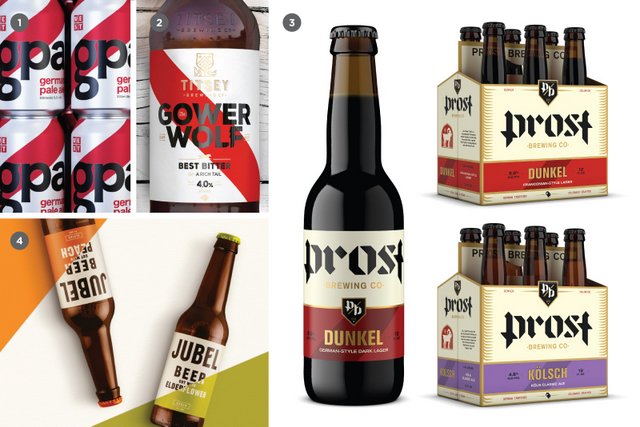
Hot on the tail of “Gold,” slashes (or similar diagonal elements) are another drilled-down graphic approach that we’re seeing crop up all over the place. Slashes could be a means of adding a dynamic swath of color to an otherwise stark, minimal design. Or, they could be a Swiss-inspired abstraction of downward-slanted ribbons found in traditional beer packaging. Whatever the origin, we expect this approach to become more common as breweries look to simplify their image without sacrificing visual impact.
Austin design wave
Something something something, Sam Elliot
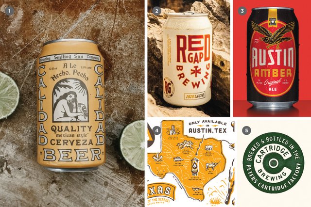
There’s a surge of similar, weatherworn Texas-looking branding coming out of, well, Texas (and particularly, Austin). It has been championed by a few shops and breweries in the state for the last several years and is now making its way across the country. It’s distinctive, young and cool — one part sun-faded sign painting and Tex-Mex-Americana, another part tattoo flash, austere Cormac McCarthy landscapes and expressive, mish mash letterpress typography. What makes these identity systems particularly cool (and well suited for younger brands) is a somewhat hard-to-pin-down main mark. Instead, the identity systems are comprised of a robust set of iconography, textures and icons that can be slotted in as needed across social, merch and advertising channels.
Over-boxing
Lower margin. Higher impact.
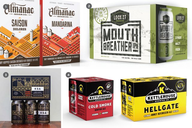
Over-boxing cans is by far the most effective way of achieving billboarding (a big solid block of your branding) on a retail shelf. Another clear benefit: over-boxing eschews the frustrating facing issues that come with PakTech or Hi-Cone binding. While it certainly cuts into a given SKU’s margin, we’re starting to see a number of breweries (new and old) take the plunge by introducing over-boxed six-, eight- and twelve-packs at retail.
Bonus points awarded for breweries who print an easy-to-spot canning date on the box itself to prevent me from buying a nine-month-old sixer of stale IPA.
Format changes
Little Kings are dead. Long live Little Kings!
Vessel changes used to be the domain of big beer. Throw your beer in a bottle with a twisted neck? Boom, see a profitable quarter. Serve up swill in a can that turns blue when it’s gotten so cold that you can no longer taste it? Now you’re cooking with gas.
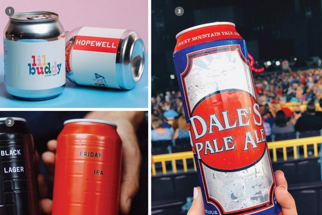
For those of us who are getting older and can no longer put away high-gravity DIPAs 16 ounces (or even 22 oz) at a time, we expect to see such beer presented in smaller, more manageable portions (think 8-oz cans). Along with format change comes an increase in specialty printing techniques that affect the form factor of the package itself—die cuts and embossed texture abound. And don’t discount a unique bottle shape (or other non-traditional package) for its power to stand out on a shelf full of the standard fare.
Augmented reality
Because you’re not on your phone enough
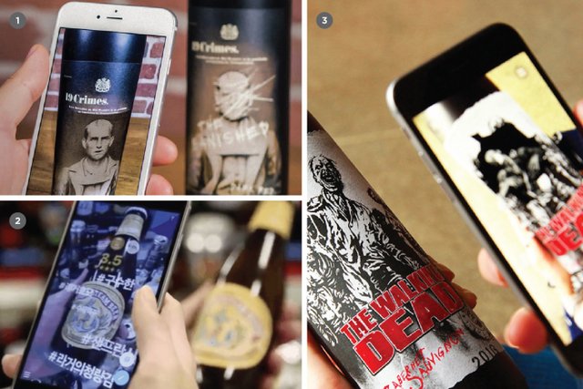
Consider this a bonus, on-the-horizon trend (prognosticators that we are). Augmented reality is an intriguing (if not somewhat gimmicky) interface to spur customers to interact with your label in a retail setting. First implemented in the wine industry, this technology has garnered so much mainstream attention that there’s no way breweries won’t follow suit. Prediction: Big Beer will use Augmented Reality as part of a huge campaign before this time in 2020. You can take these odds to Vegas, baby!!!
Next week, we will go beyond aesthetics to discuss some of the larger trends that are effecting all three tiers of this industry.
If you’d like to learn more about branding your craft brewery, check out CODO Design’s Craft Beer Branding Guide. This practical, step-by-step guide will help you navigate the entire branding process from naming and positioning, branding or rebranding, developing your responsive website and package design.

[…] Read the full list. […]