Established in May of 2009, Dust Bowl Brewing Co. is fast approaching its 10-year anniversary. And while the milestone is just around the corner, the growing company took last year to evaluate its industry positioning and brand development.
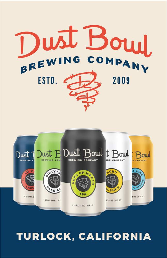
“We knew 2019 was going to be a big year for us,” said Brett Tate, founder and owner of Dust Bowl Brewing. “We’re celebrating our tenth year in business, we’ve purchased our own canning line and are launching our core brands in cans this spring. We’ve expanded into southern California, and we’re opening our first satellite taproom in Monterey, California, so we wanted to make sure we approached these projects and growth strategies with the best brand messaging for our rising consumer base.”
Dust Bowl Brewing turned to its long-standing relationship with Blindtiger Design, a craft-focused marketing and design agency from Seattle to collaborate on an updated look. Oceania Eagan, the firm’s creative director and founder, has worked closely with the Dust Bowl family since the brewery’s start in 2009 in the creation and design of the brand.
“We knew an update was needed to reflect the maturity the company has gained as a regional brewery and better communicate the brand story within this increasingly competitive craft beer market,” said Eagan. “When updating the Dust Bowl brand, our goal was to make the brand more cohesive and versatile as a foundation for their continued growth. 1930’s industrial vintage fonts, colors and labels inspired the new look, while maintaining the integrity of the brand story and character. Packaging updates focused on establishing a uniform look across the core line up for both new and longstanding beers.”
The new brand look features a deep navy blue, a rich cream and a rusty red, which Tate likens to the color tone of Oklahoma dirt, another tie back to Dust Bowl Brewing’s brand roots. Various logo iterations were created to give the brewery the flexibility to maintain brand recognition across multiple platforms and layouts. One of the most recognized features of the original branding is the company’s famous “twister,” a small tornado shaped in barbed wire as a reminder of the dust storms Tate’s family withstood before heading west for a new life in the 1930s. The twister icon received a refreshed look as well along with a little subtle messaging built in. Savvy consumers will notice a “D” and “B” woven into the new, sleeker tornado.
Dust Bowl Brewing previewed the new branding to wholesalers in 2018 and has been transitioning to the new branding since the beginning of the year. The shift is expected to be complete by summer, with all packaging, marketing materials and merchandise reflecting the new brand look.

Leave a Reply
You must be logged in to post a comment.