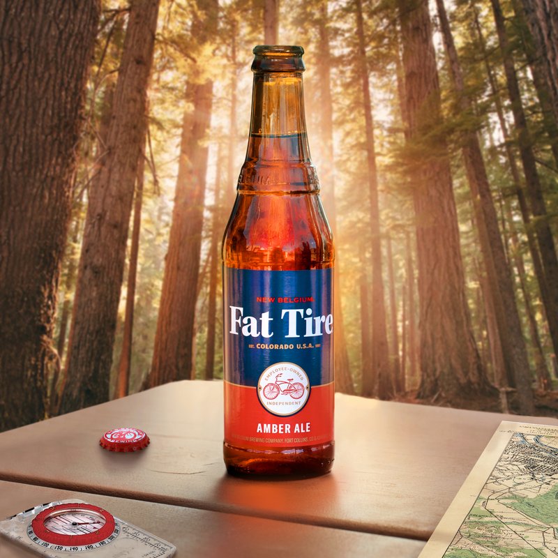
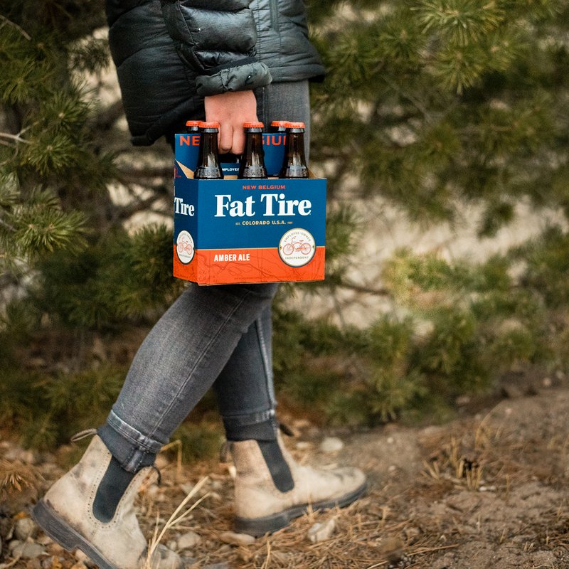
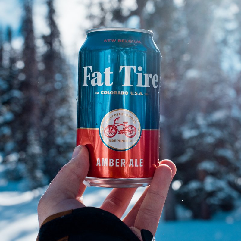
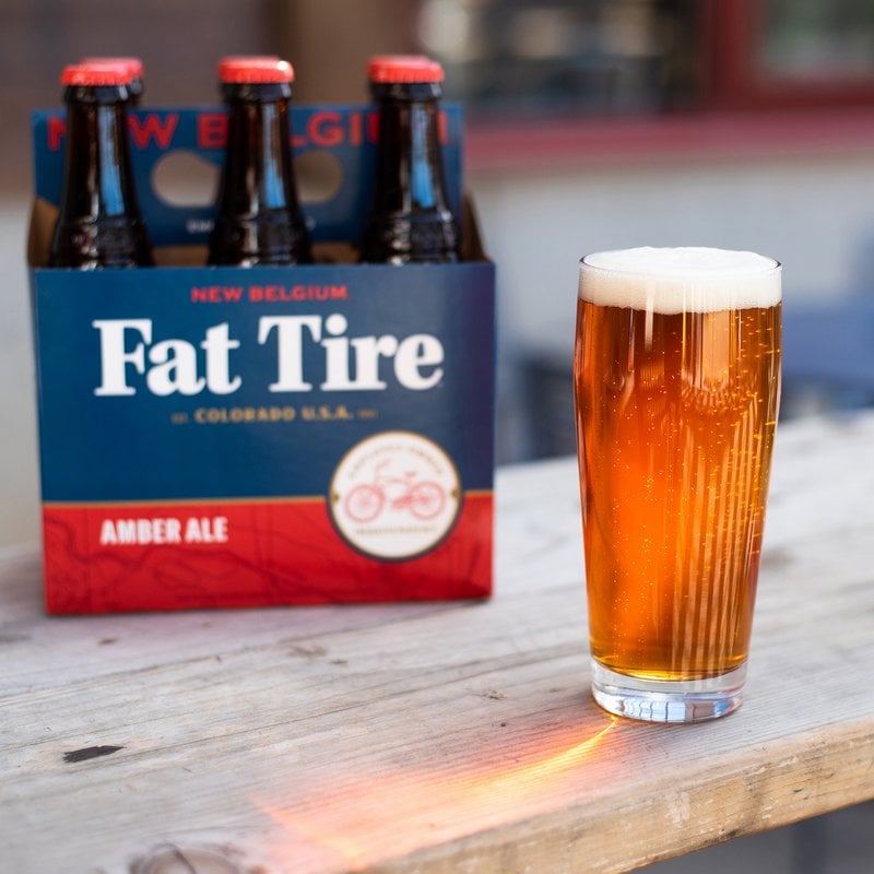
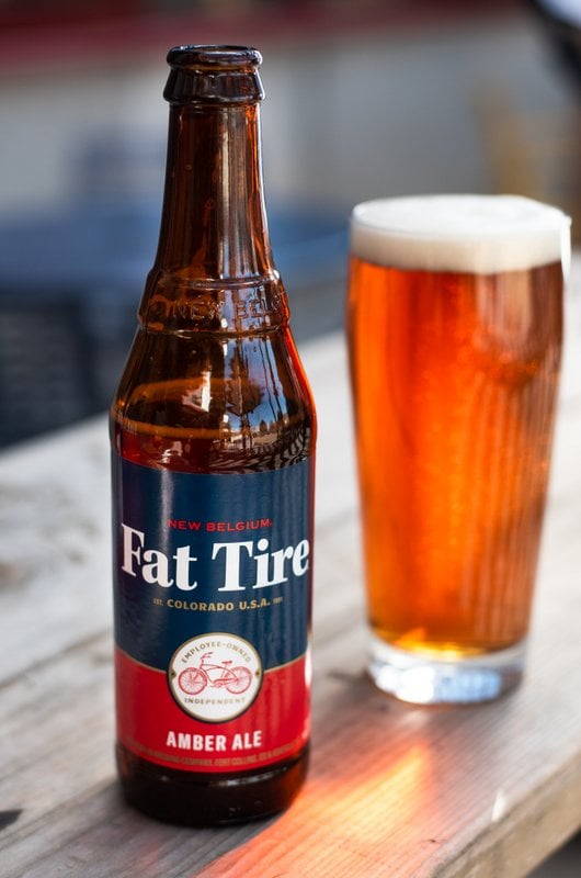
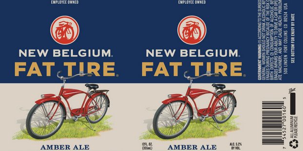
Yesterday, New Belgium Brewing Co. dropped us an e-mail, unveiling Fat Tire Amber Ale’s 2019 label refresh hitting shelves throughout the month of March. The new bottle and can designs feature a bold blue-on-red graphic look that celebrates many of the original label’s classic elements.
Evoking the 100 percent employee-owned brewery’s Colorado roots, the phrases “independent” and “employee-owned” are called out within a stylized medallion of the brand’s famed red cruiser bike. The phrase “Est. Colorado, U.S.A. 1991” reminds beer drinkers of New Belgium’s mountain origins and the lettering on the Fat Tire mark evokes the original label font. Fat Tire Amber Ale’s sister brand Fat Tire Belgian White is receiving a similar label treatment.
“We’re excited about Fat Tire’s new look,” said New Belgium’s Director of Brands, Kyle Bradshaw. “It’s a great blend of contemporary and classic design elements that we believe our loyal drinkers will appreciate, and it gives us a platform to introduce our brand to a new generation of beer loving, outdoor enthusiasts.”
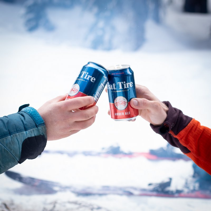
Fat Tire Amber Ale first appeared as an award-winning Colorado homebrew named in honor of a bicycling trip through Belgium. The beautiful balance of hop to malt created an immediate sensation with climbers, cyclists, outdoor adventurers and itinerate “dirtbags” traveling throughout the west. Stories of beer drinkers “bootlegging” the beer across state lines are legion, and Fat Tire has been an integral part of the American beer scene ever since.
In addition to the new look, bottled Fat Tire is now receiving the same live yeast dosing as the original homebrew version. Adding live yeast to the bottle will greatly extend Fat Tire’s freshness, ensuring that beer drinkers from coast to coast experience the beer at peak flavor. Fat Tire tastes even better knowing that 1 percent of all sales benefits 1 percent for the planet, a global network of businesses, non-profits and individuals focused on giving back to the environment.
The new label designs will be hitting shelves throughout March as inventory sells through.



Mike Girard says
@CODODesign @newbelgium I mean… I do like it. But I was pretty fond of the previous packaging.
Rick Boyd says
The new packaging is great. Sadly most of the packaging for their core line up is awful. The original Ranger packaging was great and the concept behind it was really cool. Now, Voodoo Ranger is just terrible. Bad design and completely nonsensical concept.