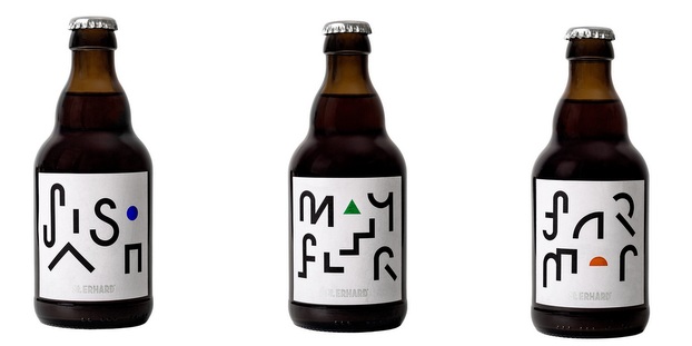
We travel to Bamberg, Germany, where St. ERHARD GmbH relaunched the visual identity for its iconic beer bottles. The brand-new labels were created by award-winning Swedish designer Perniclas Bedow. With his Stockholm-based design studio Bedow, he creates designs for products of all kind — especially beautiful packaging.
The simply transparent bottle of the St. ERHARD Original set the bar high for the new design when it was awarded the German Design Award in 2014. The basic idea was to adopt the minimalistic concept of the clear glass bottle and to apply it to a classic paper label to give the St. ERHARD brand a consistent look. However, the design of the St. ERHARD Original remains unchanged since it has developed into a style icon.
“I met Perniclas when he presented the label design for Danish brewery Mikkeller at a beverage congress in Düsseldorf. That’s when the idea of working together arose for the first time,” Christian Klemenz, founder and CEO of St. ERHARD GmbH explains. “We are more than happy that we had the chance to work with Perniclas to create something completely unique for the St. ERHARD brand.”
RELATED: Can pressure-sensitive beer labels tell your story better?
The starting point for the development of the design was an analysis of what was characteristic for Germany and German brewing tradition from an outside perspective. The Bauhaus style with its elaborated balance between form and function was the main source of inspiration. Starting from there, the basic guidelines for the St. ERHARD label design arose: simplicity, reduction and precision.
Those guidelines are reflected in the simple, clean form of the labels. Genuine white paper, the name of the beer, its letters reduced to the mere essence of their shape. On many other brand labels the name of the beer pulls away to make way for an illustration or even completely vanishes. With the new St. ERHARD design the name actually is the illustration. Bauhaus for beer labels.
Perniclas Bedow explains the design idea as follows: “The vast majority of the German beer market communicates heritage in its design — so we wanted to go in the opposite direction and show that St ERHARD is a modern brewery but still built on German tradition. The new packaging design takes inspiration from the Bauhaus era but has a contemporary style with more playful typography. Each beer has an expressive wordmark accompanied by a colored geometric shape — a visual system that allows the brewery to easily grow its range with new beers.”
The newly designed beers can already be bought at the Bierothek retail stores as well as at Bierothek’s online shop.


Hector Aguilera says
Rodrigo Nogueira