We love a good brand refresh. We also love Cascade Brewing. So, when we caught wind of Cascade Brewing’s brand refresh and new labels, well, we had to share the news.
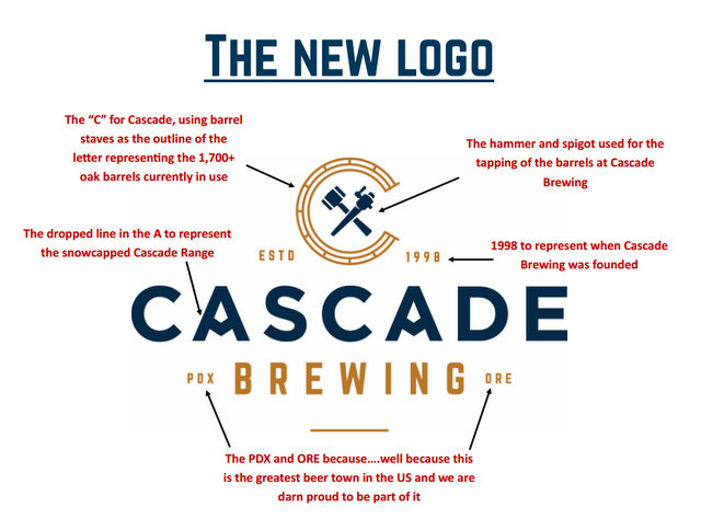
What we love most is how much thought went into the new logo.
“The new logo was incorporated to represent who we are and what we do at Cascade,” said Tim Larrance, vice president of sales and marketing. “The C logo is shaped with barrel staves to pay homage to our barrel aging process [no kettle sours here]. The crossed hammer and spigot represents the tools used for the tapping of the barrels, while the dropped line in the A in Cascade reflects the snowcapped Cascade Range where our name comes from. In addition to adding the year we were founded [1998], we have also included PDX and ORE because we are incredibly proud to be from this city that is home to some of the best beers and breweries anywhere in the world.”
New labels
Cascade Brewing has been a pioneer in the sour beer renaissance since 2006 and the proud innovator of the Northwest Sour Ale. Its distinctive sour beer blends feature fruit forward, barrel-aged ales with an emphasis on project year-to-year variation. These beers offer a complex array of flavors derived from the acid, the fruit and the residual flavors present in the barrels in which they age. The resulting beers offer a complex array of flavors and aromas derived from with each project year release capturing the unique subtleties of that year’s growing season.
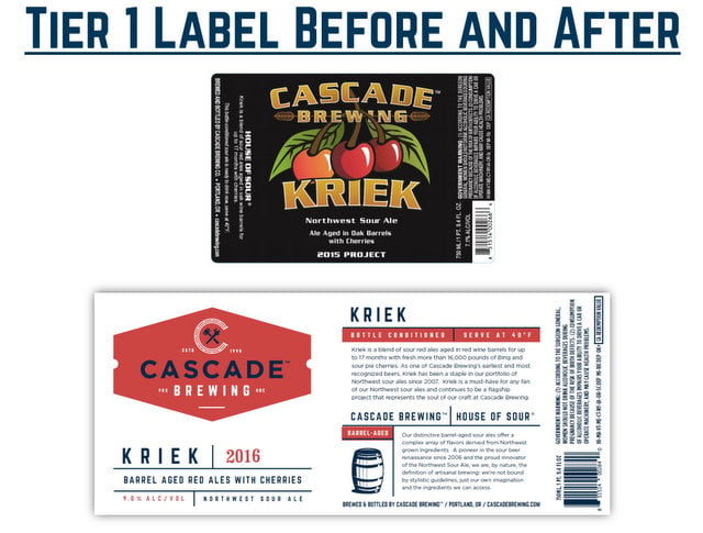
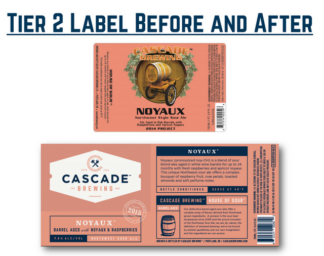
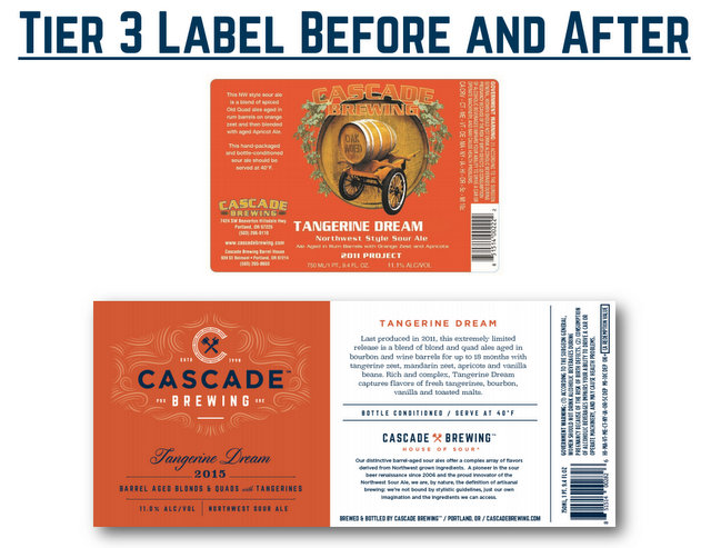
We are no experts in design, but in our opinion, the new Cascade labels are an upgrade and really match everything explained in that previous paragraph. The Cascade experience is best felt at the brewery, where you can get a good sense of the care and intricacies of the blends and techniques. The new labels convey a ton of that information, while also looking clean.
Cascade has unveiled three distinct label formats, one for each of the three tiers of products it produces. The three tiers are based on the ingredients used in the beer, the time the beer is aged in the barrel and the type of barrel used — all of which establish the pricing tier of the project.
The new graphics will be on all subsequent releases throughout the year; each beer within the tier will have its own color to delineate between brands. Sang du Chêne will be the first Tier 2 to be released, while Kentucky Peach (set to release in early March) will be the first Tier 3, followed by Apricot in April, which will be the first Tier 1.
The new label and logos were developed by the team from Murmur Creative of Portland, as well as Kirsten Karkanen (granddaughter of the Cascade’s owner Art Larrance), who helped with the initial designs.
“We are very happy with what the creative teams have come up with during this six-month process and extremely excited to show our wholesaler partners, retailer and consumers the new look,” explained Larrance. “However, please know that we have only changed the outside; the wonderful barrel aged sour beer inside the bottle will remain just as good as ever.”



Leave a Reply
You must be logged in to post a comment.